Request to use font with outline of the opposite color (White text with Black outline or viceversa) to increase readability #120
Comments
|
Hi there, thanks for flagging this. We've been looking at this ourselves too, and have been moving Skills like Wikipedia away from having text directly over images. The new version starts with a white title on a black background, and the article image being presented below that - so no text is overlapping the image at all. Where we want longer text content, that goes on a secondary screen that is just white text on a black background. On the Mark II Homescreen we use a strong shadow on all sides of the text. This isn't quite as strong as a solid black/white border, but it does improve readability quite noticeably. These two different approaches highlight that we want to enforce a particular font or style for all scenarios. However it's certainly something that we need to follow best practices on in official Skills, and encourage others to do the same through better documentation. |
|
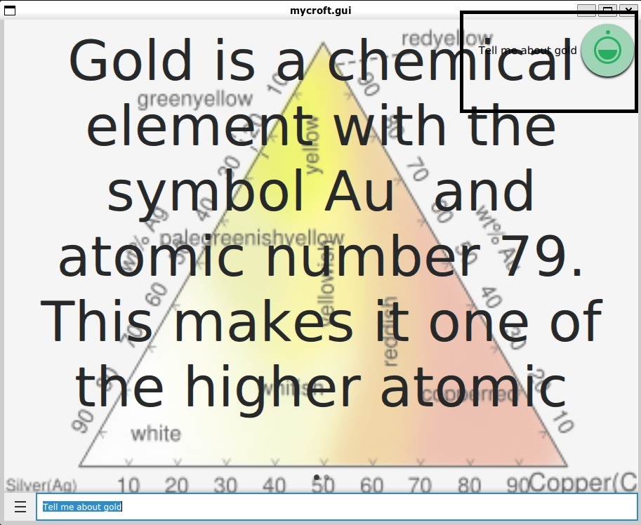
I found another similar issue. The prompt/notification of what I said is a black text without any white background or the general notification flair you get in UI designs on other devices. This makes it totally unreadable in Black Background or in case of Wikipedia when the two texts are overlapping. Maybe you should add a rectangle with circular edges as the background to give it a notification flair. Another issue is when I type in 'tell me about God'. It tells me about gold. I would understand if it were voice, but why is this happening when I type the Text? |
Is your feature request related to a problem? Please describe.
Some times the text is hard to read, especially on the "Tell me about" skill(Wikipedia?). Especially when the background or parts of it is black and the font is also black.
Describe the solution you'd like
Instead of using a font thats all the same color like black, use a font with the opposite color as the outline. Say the font color is black, then the outline of the letters in the font should be white and if the font is white, then the outline should be black. This ensures readability in all backgrounds.
And the following image being in all caps makes it a bit harder to read, but you get the idea.
Additional context

It seems white text with black outline works better than vice versa or maybe the white outline shown here is too thick, not 100% sure about it
Describe alternatives you've considered
11 Hacks to Make Text Over Images More Readable & Craft a Stunning Slide
The text was updated successfully, but these errors were encountered: