Skip to content
New issue

Have a question about this project? Sign up for a free GitHub account to open an issue and contact its maintainers and the community.

By clicking “Sign up for GitHub”, you agree to our terms of service and privacy statement. We’ll occasionally send you account related emails.

Already on GitHub? Sign in to your account

Inserter: go larger font-size and single column #1497

Closed
mtias opened this issue Jun 27, 2017 · 24 comments · Fixed by #3080
Closed

Inserter: go larger font-size and single column #1497

mtias opened this issue Jun 27, 2017 · 24 comments · Fixed by #3080
Labels
[Feature] Inserter The main way to insert blocks using the + button in the editing interface [Focus] Accessibility (a11y) Changes that impact accessibility and need corresponding review (e.g. markup changes). [Priority] High Used to indicate top priority items that need quick attention

Comments

@mtias
Copy link
Member

mtias commented Jun 27, 2017

I struggle with the current inspector in quickly finding the right blocks. Somehow having to scan both horizontally and vertically is adding cognitive load. I propose we explore going single column and larger font-size:

image

@mtias mtias added Design [Feature] Inserter The main way to insert blocks using the + button in the editing interface labels Jun 27, 2017
@mehigh
Copy link
Contributor

mehigh commented Jun 27, 2017

Thank you for the proposal, mtias.

I agree that the increased font size is an accessibility improvement.
On the other hand setting these up to be on a single column would make this insert balloon element very long, causing more interactions needed from the user to scroll down and then find what they're searching for.

@jwold
Copy link

jwold commented Jun 27, 2017

This is an interesting problem. On the one hand you don't have to worry about longer text descriptions, but you also increase the scroll length. A few thoughts:

  1. Once we have keyboard input.
  2. Adding the search field to the top will help.

From a visual perspective I want to like the one column, but it feels unfinished.

@nylen
Copy link
Member

nylen commented Jun 28, 2017

One way to flesh out this design would be to add a short "description" for each block explaining what it does or when you would want to use it.

@jwold
Copy link

jwold commented Jun 28, 2017

One way to flesh out this design would be to add a short "description" for each block explaining what it does or when you would want to use it.

Are you thinking something like a line of text next to each block? That's an interesting idea. On the one hand it would aid discovery. My biggest concern is that you'd only be able to see a few items on the picker (insert modal) at a time.

@karmatosed
Copy link
Member

I am really keen this happens. I think if a description is one line it would work visibly.

@melchoyce
Copy link
Contributor

We currently use descriptions for widgets — do folks find those helpful? If so, we could consider adding them here. (I find them helpful for search sometimes.)

I'm a +1 to increasing font-size and totally fine with one column. One thing I've struggled with, though, is how small the search field is and how little affordance it has. In addition to increasing the text size, could we consider making search more prominent?

@ellatrix ellatrix added the [Focus] Accessibility (a11y) Changes that impact accessibility and need corresponding review (e.g. markup changes). label Jun 29, 2017
@karmatosed
Copy link
Member

We currently use descriptions for widgets — do folks find those helpful? If so, we could consider adding them here. (I find them helpful for search sometimes.)

A good question. My un-researched reaction would be yes. I say that from personal use.

What we are getting from the tests this week is a lot of 'mystery' around what does what, they could ease that. Anything we can do to stop the 'guess the block' game users are already playing would be good.

One thing I've struggled with, though, is how small the search field is and how little affordance it has.

Totally agree this would be good to see increase also.

@jwold
Copy link

jwold commented Jun 29, 2017

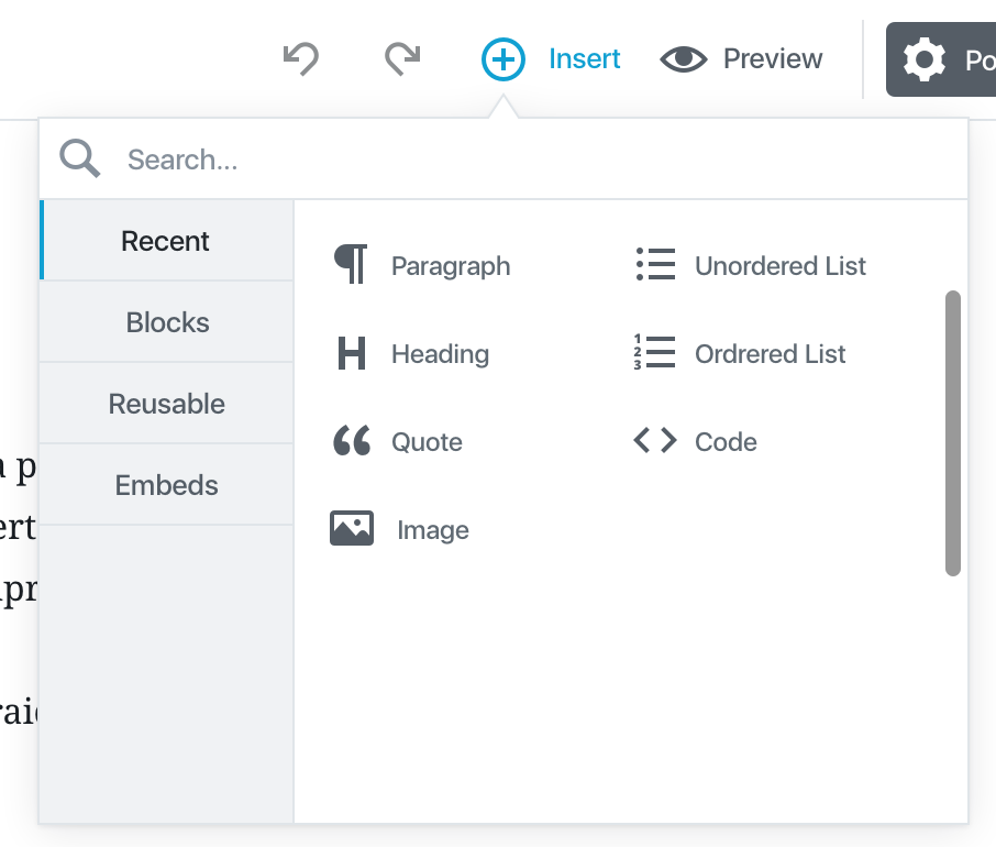
I've made some changes to the inserter design based on this, and other feedback. Please let me know what you think and if there are any tweaks I should make:

inserter

@jwold
Copy link

jwold commented Jun 29, 2017

And here is what it looks like in the context Gutenberg

gutenberg

@StaggerLeee
Copy link

StaggerLeee commented Jun 29, 2017

Can you maybe do it like Adobe Lightroom did ?
"Solo mode", all (groups) collapsed expect this one clicked, and first one on initial load. When another group is clicked it expand, last one collapse.

Adobe Lightroom is literally hundreds and thousands of mouse clicks (very fast work) on those options, they are many, and you never feel tired of doing this. Or experience it as difficult.

@jwold
Copy link

jwold commented Jun 29, 2017

@StaggerLeee when you refer to the groups, are you talking about recent/blocks/embeds as separate groups that you can click to expand/collapse one at a time?

For reference here's solo mode in action on Lightroom:

solo mode

Apologies for the mega gif! :)

@StaggerLeee
Copy link

StaggerLeee commented Jun 29, 2017

"Common Block", "Formatting", "Layout Blocks", "Widgets", "Embeds", etc...Those blocks.

And no matter how will it end, do not allow plugins to hook anything inside first block open on initial page load. It would make a mess of cosmic proportions.

This animated gif is somehow incorrect. You can click anywhere on tab to open group, not only arrow.

@jwold
Copy link

jwold commented Jun 30, 2017

@StaggerLeee thank you for sharing!

  1. This is an interesting UI concept. I'm torn on whether it would make sense here. Would love input from others.

  2. Would love input on the UI concept I shared above, especially the 1 line descriptions, increased font sizes, changing the icons to black backgrounds, and changing the search input field. To me it feels very friendly and easy to navigate.

cc @jasmussen, @melchoyce and @karmatosed ^

@afercia
Copy link
Contributor

afercia commented Jun 30, 2017

My 2 cents: while some of the blocks would probably need some explanation, others don't. For example: "Image" doesn't really need any explanation, in my opinion. Using a description like "Pixels and bits create art." (I understand this is for demoing) or any other description doesn't add any value, in this case.
One more concern is about translations. In some languages, some strings will be for sure longer than one line, and a description wrapping in two lines won't look so "pretty" as in the mockups.
Are we really sure descriptions are necessary?
I'd rather keep it simple. As a general consideration, I think we're probably trying to "add" too many things in the inserter, maybe we should try to remove instead.

@jasmussen
Copy link
Contributor

Love the explorations going on here.

We just merged a big revamp to the inserter, featuring tabs, and much bigger touch targets and margins/paddings around the individual blocks. I think we should let that interface sit in the plugin for a bit as we give it a proper shake, and then if we decide there are still challenges with it, I agree looking at a single column interface seems the obvious next step, at which point it will be great to refer back to this thread.

@StaggerLeee
Copy link

I just realised Solo Mode as in Lightroom would be perfect for whole right sidebar, Post settings mataboxes. Or what they are called now instead od metaboxes.

@jwold
Copy link

jwold commented Jun 30, 2017

I think we should let that interface sit in the plugin for a bit as we give it a proper shake

Sounds good!

@dinhtungdu
Copy link
Contributor

dinhtungdu commented Jul 10, 2017

I think two columns is okay, and we rarely need a description for a block as @afercia said. Instead of having a description for block, we can allow longer block title as I suggested in #1721

@afercia
Copy link
Contributor

afercia commented Aug 1, 2017

@mtias what's the status on this? After #1582 and other changes to the inserter, accessibility of the whole component is broken and would need some love. See also your reminder on Slack.
I'm hesitant to rebuild a11y it the inserter is not in a stable shape yet.

@mtias
Copy link
Member Author

mtias commented Aug 1, 2017

We wanted to do one more exploration with @jasmussen with a layout like:

[ icon ]
-Text-

Which better accommodates longer words without having to go single column. I think once we figure that out we can consider it stable enough.

@afercia afercia changed the title Inspector: go larger font-size and single column Inserter: go larger font-size and single column Aug 29, 2017
@afercia afercia added the [Priority] High Used to indicate top priority items that need quick attention label Aug 29, 2017
@afercia
Copy link
Contributor

afercia commented Aug 29, 2017

Marking with the high priority label to indicate it's an a11y priority. As mentioned in a previous comment the whole Inserter accessibility is completely broken after the last changes and needs to be rebuilt. However, still no news about potential new pending changes proposed here, it would be great to know when the inserter will be in a stable state.

@mtias
Copy link
Member Author

mtias commented Aug 30, 2017

@afercia yes, I'm going to try to prioritize this for the next release. I feel we are going to end up with two inserters (one for inline keyboard operations, and another one in the toolbar).

@mtias mtias modified the milestones: Beta 1.1, Beta 1.2 Aug 30, 2017
@karmatosed karmatosed modified the milestones: Beta, Needs to happen, Beta 1.3 Sep 24, 2017
@karmatosed karmatosed modified the milestones: Beta 1.3, Beta 1.4 Oct 2, 2017
@mtias mtias modified the milestones: Beta 1.4, Beta 1.5 Oct 10, 2017
@mtias mtias removed this from the Beta 1.5 milestone Oct 18, 2017
@afercia
Copy link
Contributor

afercia commented Oct 20, 2017

Would be great to prioritize design decisions for the inserter. There's also the "tabs on the left" propposl on #1516 (comment) see screenshot below:

image

As discussed also on Slack during last Editor chat, at the moment this is a blocker to address accessibility and keyboard navigation for the Inserter.

@jasmussen
Copy link
Contributor

I'm going to try and take a look today.

Sign up for free to join this conversation on GitHub. Already have an account? Sign in to comment
Labels
[Feature] Inserter The main way to insert blocks using the + button in the editing interface [Focus] Accessibility (a11y) Changes that impact accessibility and need corresponding review (e.g. markup changes). [Priority] High Used to indicate top priority items that need quick attention
Projects
None yet
Development

Successfully merging a pull request may close this issue.