This page is designed to guide you through adding your own multi drag experience to your
react-beautiful-dndlists.
Dragging multiple <Draggable />s at once (multi drag) is currently a pattern that needs to be built on top of react-beautiful-dnd. We have not included the interaction into the library itself. This is done because a multi drag experience introduces a lot of concepts, decisions and opinions. We have done a lot of work to ensure there is a standard base of dom event management to build on.
We have created a reference application (source) which implements this multi drag pattern. The application is fairly basic and does not handle performance in large lists well. As such, there is are a few performance recommendations that we suggest you also add on to our reference application if you want to support lists greater than 50 in size.
We have decided on a simple, but very flexible and scalable multi drag pattern to start with. It is not as beautiful as our standard drag interactions - but it is a great base to build from and will scale across many problem spaces.
We can break the user experience down in three phases.
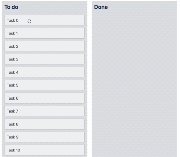
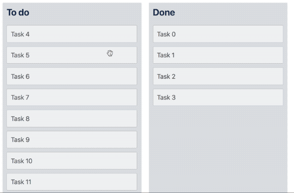
- Selection: The user selects one or more items.
- Dragging: The user drags one item as a representation of the whole group.
- Dropping: The user drops an item into a new location. We move all of the selected items into the new location
Keep in mind that internally react-beautiful-dnd is not aware of multi drag. Therefore it is advised that you use the ResponderProvided > Announce to announce meaningful screen reader messages for a multi drag. See our screen reader guide for details on how to control screen reader messaging.
Before a drag starts we need to allow the user to optionally select a number of <Draggable />s to drag. When an item is selected you should apply a style update to the <Draggable /> such as a background color change to indicate that the item is selected.
These interactions are based on the Mac OSX Finder (file browser) application.
If a user clicks on an item the selected state of the item should be toggled. Additionally, the selected state of the item should be updated when the user presses enter ⏎ key. The enter ⏎ key is quite nice because we do not use it for lifting or dropping - we use spacebar space for those.
- Attach an
onClickhandler to your drag handle or<Draggable /> - Only toggle selection if the user is using the
primaryButton(event.button === 0) - Prevent the default action on the
clickas you are using it for selection (it is only useful to callevent.preventDefault()to avoid selection clearing)
- When the user presses enter ⏎ toggle the selection of the item
- Option 1: Attach an
onKeyDownhandler to your drag handle or<Draggable /> - Option 2: Attach an
onKeyUphandler to your drag handle.keyupevents will not have their default action prevented so you will not be able to checkevent.defaultPreventedto see if the keypress was used for a drag. If you are only using the enter ⏎ key in your event handler then you should be fine as that is not used as a part of dragging. - Prevent the default action on the
keydown/keyupevent if you are toggling selection as you are using it for selection and you want to opt out of the standard browser behaviour - and also provide a clue that this event has been used.
- If the item was not previously selected - make it the only selected item
- If the item was previously selected and was not a part of a selection group: unselect the item
- If the item was previous selected and was a part of a selection group: make it the only selected item
This is providing the ability for a user to add or remove items to a selection group.
We perform this action if the user performs a click or presses the enter ⏎ key in addition to holding the appropriate modifier key to toggle item selection for their operating system.
Note: On Macintosh systems, this is the
⌘ Commandkey. On Windows systems, this is the⎈ Ctrlkey.
- If the item was not selected then add the item to the selected items
- If the item was previously selected then remove it from the selected items.
The ability to click on an item further down a list and select everything inbetween.
We perform this action if the user performs a click or presses the enter ⏎ key in addition to holding the the shift key.
With this action the user is able to select multiple items using a single command. This behaviour is the most complex. It deviates slightly from the MacOSX behaviour for simplicity.
If nothing is previously selected when the user triggers this action: simply set the selected item as the only selected item.
If the user is selecting to an item that is in a different list to the last selected item: clear all the selected items and select everything up to the index of the selected to item in the new list
- Select everything between the newly selected item and the last selected item.
MacOSX is a little more complicated than this, but for our purposes this seems like a good default
- If dropping on the same index as we started on - we do not need to do anything
Here is an example of composing the above event handling logic in a component
class Task extends Component<Props> {
  onKeyDown = (event: KeyboardEvent, snapshot: DraggableStateSnapshot) => {
    // already used
    if (event.defaultPrevented) {
      return;
    }

    if (snapshot.isDragging) {
      return;
    }

    if (event.keyCode !== keyCodes.enter) {
      return;
    }

    // we are using the event for selection
    event.preventDefault();

    this.performAction(event);
  };

  // Using onClick as it will be correctly
  // preventing if there was a drag
  onClick = (event: MouseEvent) => {
    if (event.defaultPrevented) {
      return;
    }

    if (event.button !== primaryButton) {
      return;
    }

    // marking the event as used
    event.preventDefault();

    this.performAction(event);
  };

  // Determines if the platform specific toggle selection in group key was used
  wasToggleInSelectionGroupKeyUsed = (event: MouseEvent | KeyboardEvent) => {
    const isUsingWindows = navigator.platform.indexOf('Win') >= 0;
    return isUsingWindows ? event.ctrlKey : event.metaKey;
  };

  // Determines if the multiSelect key was used
  wasMultiSelectKeyUsed = (event: MouseEvent | KeyboardEvent) => event.shiftKey;

  performAction = (event: MouseEvent | KeyboardEvent) => {
    const {
      task,
      toggleSelection,
      toggleSelectionInGroup,
      multiSelectTo,
    } = this.props;

    if (this.wasToggleInSelectionGroupKeyUsed(event)) {
      toggleSelectionInGroup(task.id);
      return;
    }

    if (this.wasMultiSelectKeyUsed(event)) {
      multiSelectTo(task.id);
      return;
    }

    toggleSelection(task.id);
  };

  render() {
    return (
      <Draggable draggableId={task.id} index={this.props.index}>
        {(provided: DraggableProvided, snapshot: DraggableStateSnapshot) => (
          <Container
            innerRef={provided.innerRef}
            {...provided.draggableProps}
            {...provided.dragHandleProps}
            onClick={this.onClick}
            onKeyDown={(event: KeyboardEvent) =>
              this.onKeyDown(event, snapshot)
            }
          >
            {task.content}
          </Container>
        )}
      </Draggable>
    );
  }
}We add a click handler to the window to detect for a click that is not on a <Draggable />. We call preventDefault in our selection onClick handler so click events used for selection will have the event.defaultPrevented property set to true. Additionally, if a drag occurred the default click action will be prevented. So if we receive a click event on the window that has not has event.defaultPrevented set to false we clear the current selection.
This event handler operates in a similar way to the window click handler described above. If a keydown event that is not prevented and is the escape key then we clear the current selection. The escape keydown event will be prevented if it is used to cancel a drag.
Rather than performing a 'toggle selection' action when the user presses an item using a touch input, the 'toggle selection in group' should be performed. On a touch device there is no way of adding extra input such as a metaKey or shiftKey.
You can use the onTouchEnd event on the element to trigger this action. As with the other handlers - only trigger a selection changed if the event.defaultPrevented property is false. When fire an action be sure to call event.preventDefault() to mark the event as used.
You will also want to add a window touchend handler which works in the same way as the click and keydown window handlers. This handler will be used to unselect everything when the user performs a touchend that is not a part of a drag or a selection.
We use touchend because that is part of the drag and drop lifecycle. We do not call preventDefault() on a touchstart as we do not know at that point if the event is a part of a drag or not. More information.
This is not implemented in our reference application
You are welcome to build a selection walking keyboard interaction pattern. You could use the arrow keys (↑ ↓ → ←) to move the selection around. Ideally these movements would also shift browser focus so that a user can press spacebar space to lift immediately.
This is not implemented in our reference application
You could build your own abstraction (or use some elses) to add the idea of a selection box. You could use this to allow a user to drag a box around the items they want to select. Example
We need to do one check in onDragStart. If the user is starting to drag something that is not selected then we need to clear the selection.
As the drag starts we need to add a few visual affordances:
- Add a count to the dragging item to indicate how many items this drag is representative of. If only a single item is dragging then do not show a count.
- Change the appearance of the selected items that are not dragging to a greyed out / disabled state. This can be a performance issue at scale.
We do not remove the selected items from the list. If we remove the items completely that can change the dimensions of the list which can lead to list collapsing and scroll jumps. If we leave them in the list and make them invisible then there are big blank sections in a list that have no meaning and can be confusing to interact with. Therefore we recommend leaving the items in the list and giving them a visual change.
As much as possible we want to preserve the selection that the user had before the drag started. That way they could continue to move the same items around after the drag.
This occurs when you cancel the drag, drop nowhere or drop in the same location. No reordering is required and you can keep the previous selection
When moving the items to the new list they should be inserted into the new list at the index in which the dragging item was dropped. We suggest the moved items be placed in the following order:
- Move the selected item to the first position
This is done to ensure that the item the user is dragging does not disappear suddenly on drop.
- Order by the items natural indexes regardless of list. For example if 'item alpha' started in column 1 of index 2 and 'item beta' started in column 2 of index 2 then 'item beta' should be placed before 'item alpha'
This gives priority to original index. However, you might want to give priority to list. So that items selected in previous lists go before items selected in subsequent lists.
- In the event of a tie then sort by the order in which the item was selected.
This strategy does change the order of items semantically: specifically step 1 which always moves the selected item to the top. If you do not want this you do not have to do it - however it is much nicer visually and helps to keep the user grounded on a drop.
The goal is to move the selected items to their new location. We want to insert all the items in at the index at which the dragging item was dropped. As with the strategy above we suggest the following order for the dropped items:
- Move the selected item to the first position
- Order the rest by their natural index
Doing a multi drag interaction in a performant way can be challenging. The core thing you want to do is to avoid calling render() on components that do not need to update. The current best practice for this is to use redux in combination with react-redux, reselect and memoize-one. We recommend you take a look at these resources:
In response to a selection change you want to call render on the minimum amount of <Draggable /> and <Droppable /> components as possible. In our example application whenever the selection changes we re-render the entire tree. This approach will not scale. Therefore we suggest using the optimisations listed above.
In the event of a 'unselect all' action you might need to render a lot of components at once to clear their selected styles. For most usages this will be fine. If you want to go further you will need to avoid calling render for selection style changes.
- You could look into using the dynamic shared styles pattern.
- You could apply a unique data attribute to each item and then apply the selected style to it using selectors dynamically in a parent component.
Additionally, when a drag starts we can also update the appearance of a lot of Draggables at once. Therefore you will need to solve this problem in the same was as the 'unselect all' action.
When dragging you need to display a count of the items that are dragging. In our example we provide this information down by re-rendering the tree. As with selection changes it would be good to only render the item that needs the change. You could publish this information down using redux and redux-select. For this particular problem you might be able to get away with unstated or the new React 16.3 Context api.