Create Shipment mockups #255
Comments
|
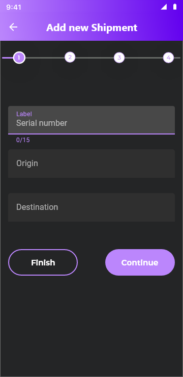
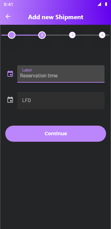
I like this phased approach as some of the fields are optional and likely not known at the time of creating the shipment details. This would simplify the user interaction. Do you think it would be a good idea to also give the user an option to finish creating the shipment early without having to go through all screens? |
|
Yes, the possibility of ending the form early is a good idea if you do not need to fill out all the fields. Optional fields can also be placed in the last step. You can also put a star icon next to the mandatory fields, so that the user has the clarity on what is required. |
|
Perfect. Thanks. |
|
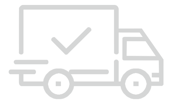
I love the concept, it'll make the app look professional. @harsimranmaan do you think it's possible to get this done over the weekend? @martareg can you attach the icon for the shipment truck from the first image or export the design as flutter code in XD? |
|
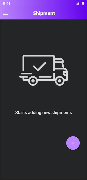
@schima do you have any feedback about this design. I think it'll simplify the user interaction for complex screens. As you have pointed out the current page is too cluttered, I think this would help. I am sorting the final bits of the address picker currently and plan to incorporate this in the next release of the app. |
|
Great screenshots.
But this workflow looks great. |
|
Thanks for your feedback. That's why I placed the 'Finish' button on the left side because it is the secondary button, and 'Conitue' is the primary button, and in mobile applications we mainly use the thumb and therefore the main actions should be within its reach. It is more difficult with the right thumb to reach the left side of the screen, so I put the secondary button there. When the primary action is on the left, it works against reading gravity. The user’s eyes want to move toward the bottom right, but the visual weight of the button keeps them fixated on the bottom left. After the fixation, they move to the bottom right only to revert to the left to tap the main button. As a result, the user’s eyes sweep back and forth sweep, increasing the user’s task time. When the primary action is on the right, the result is faster task completion because the button is where the reading gravity ends. Users don’t have to reverse their scanning flow or fixate on the primary action more than once. From my ux experience this way is better :) |
|
This is a link to this graphic from the Flaticon website. https://www.flaticon.com/free-icon/shipped_411763?term=delivery&page=1&position=10&related_id=411763&origin=search |
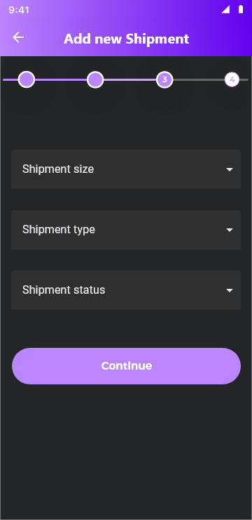
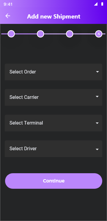
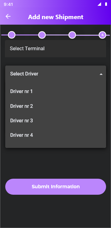
Split shipment form into four steps, to make more friendly for users. I grouped the steps by tematicaly and there are less items on the screen at any time, let me now what you thing :) It's best if you test this solution with someone who will use this form.


The text was updated successfully, but these errors were encountered: