
This repository provides the framework needed to create a BuildFire Plugin. Plugins are components that are added to a BuildFire app (http://buildfire.com) to add additional functionality to the platform.
Here is a playlist on how to develop on the plugins using buildfire.js https://www.youtube.com/playlist?list=PLnq_waykAGlgsERwxHmGNokE6WIeVeH0I
If you havent setup your environment just yet click here https://github.com/BuildFire/sdk/wiki/How-to-setup-your-development-environment to get started
See https://github.com/BuildFire/sdk/wiki/iOS-&-Android-Guidelines
Plugins are written in HTML and JavaScript with a few restrictions:
- Plugin files must be written within the required folder structure, so that the system can identify and import it correctly
- Plugin HTML files must be styled with bootstrap (http://getbootstrap.com) so that your pages will be styled with theme that the app owner has chosen
- Plugin HTML files must import buildfire.js in the header of the document in order to access the platform, context and device
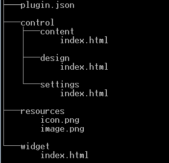
Plugins consists of three major components:
- the Config (plugin.json)
- the Control
- Context
- Design
- Settings
- the Widget
- The Resources
- Note :This folder is only meant for plugin configuration resource like default widget icon, widget hero image and media files.** You can replace those two files if you need by overriding the default hero image and default icon image and you can add extra images to showcase you plugin in the control panel market place and attract new users by filling the images paths and types in the
mediaproperty inplugin.json.
- Note :This folder is only meant for plugin configuration resource like default widget icon, widget hero image and media files.** You can replace those two files if you need by overriding the default hero image and default icon image and you can add extra images to showcase you plugin in the control panel market place and attract new users by filling the images paths and types in the
The configuration of each plugin is placed in a file on the root of the plugin called plugin.json. This JSON file consists of all the settings the plugin requires
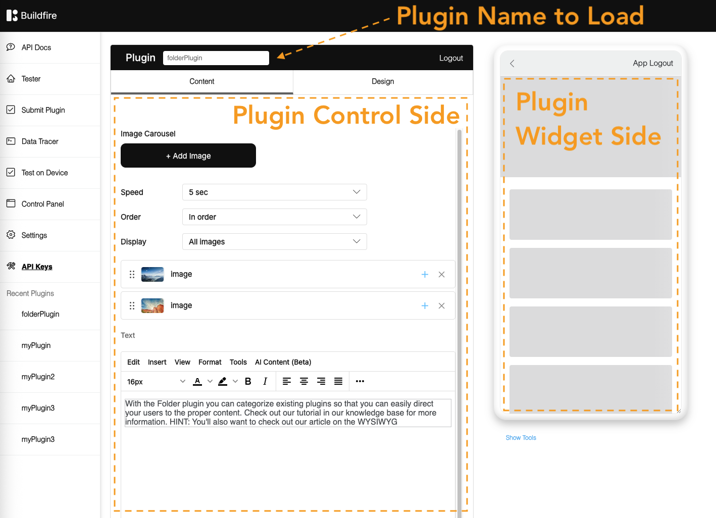
The Control is the part of the code that is added to the App Control Panel to help configure your plugin the control has 3 sections/sub folder each of which have their own index.html start page:
- content
- design
- settings
The Widget is the part that is rendered on the device. It consumes the configuration made from the control and displays the output.
The Resources is the default images which will be used for your widget .
-
image.png : this image file will be used as a default image for your widget which will appear when App Owners installed your plugin in their plugin Manager .
-
icon.png : this image file will be used as a default icon for your widget which will appear as an icon for the widget on the emulator and the actual device .
-
Note :This folder is only meant for plugin configuration resource like default widget icon, widget hero image and media files.** You can replace those two files if you need by overriding the default hero image and default icon image and you can add extra images to showcase you plugin in the control panel market place and attract new users by filling the images paths and types in the
mediaproperty inplugin.json.