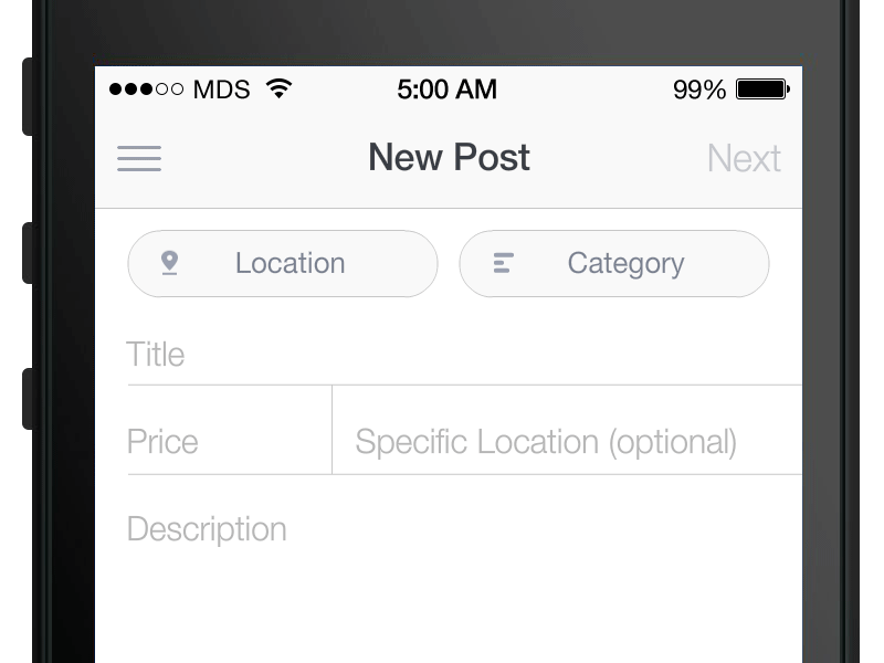
An AngularJS directive to improve input placeholders. Based on a concept found on Dribble:
http://dribbble.com/shots/1254439--GIF-Mobile-Form-Interaction?list=users
$ bower install angular-better-placeholdersSimple include the better-place-holder directive as a class on your input fields. (if it doesn't look right make sure that it's container element has position: relative set on it)
<input type="text" ng-model="user.firstName" class="form-control better-placeholder" placeholder="First Name" />Include the following CSS snipets:
.better-placeholder {
  -webkit-transition: all 0.5s ease;
  transition: all 0.5s ease;
}
.better-placeholder::-webkit-input-placeholder {
  display: none;
  opacity: 0;
  -ms-filter: "progid:DXImageTransform.Microsoft.Alpha(Opacity=0)";
  filter: alpha(opacity=0);
}
.better-placeholder::-moz-placeholder {
  display: none;
  opacity: 0;
  -ms-filter: "progid:DXImageTransform.Microsoft.Alpha(Opacity=0)";
  filter: alpha(opacity=0);
}
.better-placeholder:-ms-input-placeholder {
  display: none;
  opacity: 0;
  -ms-filter: "progid:DXImageTransform.Microsoft.Alpha(Opacity=0)";
  filter: alpha(opacity=0);
}
.better-placeholder::placeholder {
  display: none;
  opacity: 0;
  -ms-filter: "progid:DXImageTransform.Microsoft.Alpha(Opacity=0)";
  filter: alpha(opacity=0);
}
.better-placeholder.better-placeholder-active {
  padding: 18px 12px 6px 12px;
  height: auto;
}
.has-error .better-placeholder-text {
  color: #a94442;
}
.has-error .better-placeholder-text.active {
  color: #a94442;
}
.has-success .better-placeholder-text {
  color: #3c763d;
}
.has-success .better-placeholder-text.active {
  color: #3c763d;
}
.has-warning .better-placeholder-text {
  color: #8a6d3b;
}
.has-warning .better-placeholder-text.active {
  color: #8a6d3b;
}
.better-placeholder-text {
  -webkit-transition: all 0.5s ease;
  transition: all 0.5s ease;
  position: absolute;
  top: 2px;
  margin-left: 12px;
  line-height: 20px;
  height: 20px;
  color: #888;
  -webkit-transform-origin: 0 0;
  -ms-transform-origin: 0 0;
  transform-origin: 0 0;
  max-width: 85%;
/* You have to fiddle with this and it .active replacement depending on size of field */
  margin-right: 12px;
  white-space: nowrap;
  overflow: hidden;
  -o-text-overflow: ellipsis;
  text-overflow: ellipsis;
}
.better-placeholder-text.active {
  max-width: 110%;
  visibility: visible;
  -webkit-transform: scale(0.8);
  -ms-transform: scale(0.8);
  transform: scale(0.8);
  -webkit-transform-origin: 0 0;
  -ms-transform-origin: 0 0;
  transform-origin: 0 0;
  color: #428bca;
  top: -2px;
}