
flutter_expandable_fabは複数のアクションボタンをアニメーションで表示・非表示できるスピードダイアルFABです。
縦、横、扇形の表示を左右どちらにも配置できます。
細かなカスタマイズが可能になっています。
バージョン2.xから開く/閉じるボタンを自由にカスタマイズできるようにbuilderを設定するように変更しました。
ExpandableFab(
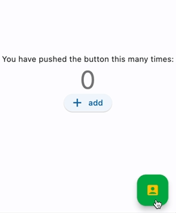
child: const Icon(Icons.account_box),
foregroundColor: Colors.amber,
backgroundColor: Colors.green,
closeButtonStyle: const ExpandableFabCloseButtonStyle(
child: Icon(Icons.abc),
foregroundColor: Colors.deepOrangeAccent,
backgroundColor: Colors.lightGreen,
)
expandedFabSize: ExpandedFabSize.small,
collapsedFabSize: ExpandableFabSize.regular,
expandedFabShape: const CircleBorder(),
collapsedFabShape: const CircleBorder(),
)ExpandableFab(
openButtonBuilder: RotateFloatingActionButtonBuilder(
child: const Icon(Icons.account_box),
fabSize: ExpandableFabSize.regular,
foregroundColor: Colors.amber,
backgroundColor: Colors.green,
shape: const CircleBorder(),
),
closeButtonBuilder: DefaultFloatingActionButtonBuilder(
child: const Icon(Icons.close),
fabSize: ExpandableFabSize.small,
foregroundColor: Colors.deepOrangeAccent,
backgroundColor: Colors.lightGreen,
shape: const CircleBorder(),
),
)

import 'package:flutter_expandable_fab/flutter_expandable_fab.dart';

Scaffold(
  floatingActionButtonLocation: ExpandableFab.location,
  floatingActionButton: ExpandableFab(
    children: [
      FloatingActionButton.small(
        heroTag: null,
        child: const Icon(Icons.edit),
        onPressed: () {},
      ),
      FloatingActionButton.small(
        heroTag: null,
        child: const Icon(Icons.search),
        onPressed: () {},
      ),
    ],
  ),
),
class _FirstPageState extends State<FirstPage> {
  final _key = GlobalKey<ExpandableFabState>();

  @override
  Widget build(BuildContext context) {
    return Scaffold(
      floatingActionButtonLocation: ExpandableFab.location,
      floatingActionButton: ExpandableFab(
        key: _key,
        children: [
          FloatingActionButton.small(
            child: const Icon(Icons.edit),
            onPressed: () {
              final state = _key.currentState;
              if (state != null) {
                debugPrint('isOpen:${state.isOpen}');
                state.toggle();
              }
            },
          ),
        ],
      ),
    );
  }
}FloatingActionButtonBuilderを使って開く/閉じるボタンを好きなWidgetでカスタマイズできます。
DefaultFloatingActionButtonBuilderを使えばFloatingActionButtonを簡単に設定できます。
RotateFloatingActionButtonBuilderは回転アニメーション付きのFloatingActionButtonです。
またchildrenに指定する各アイテムはFloatingActionButtonである必要はなく、自由なWidgetを設定できます。
ExpandableFab(
  openButtonBuilder: RotateFloatingActionButtonBuilder(
    child: const Icon(Icons.account_box),
    fabSize: ExpandableFabSize.regular,
    foregroundColor: Colors.amber,
    backgroundColor: Colors.green,
    shape: const CircleBorder(),
  ),
  closeButtonBuilder: FloatingActionButtonBuilder(
    size: 56,
    builder: (BuildContext context, void Function()? onPressed,
        Animation<double> progress) {
      return IconButton(
        onPressed: onPressed,
        icon: const Icon(
          Icons.check_circle_outline,
          size: 40,
        ),
      );
    },
  ),
  children: [
    FloatingActionButton.large(
      heroTag: null,
      child: const Icon(Icons.edit),
      onPressed: () {},
    ),
    IconButton(
      onPressed: () {
        final state = _key.currentState;
        if (state != null) {
          debugPrint('isOpen:${state.isOpen}');
          state.toggle();
        }
      },
      icon: const Icon(
        Icons.share,
        size: 30,
      ),
    ),
  ],
)| Property | Description | Default |
|---|---|---|
| distance | 子アイテムとの距離 | 100 |
| duration | アニメーション時間 | 250ms |
| fanAngle | 扇タイプでの角度 | 90 |
| initialOpen | 初期表示時に開く | false |
| type | このウィジェットの動作タイプ | fan |
| pos | 表示位置 | right |
| closeButtonBuilder | 閉じるボタンBuilder | |
| openButtonBuilder | 開くボタンBuilder | |
| childrenOffset | 子アイテムの位置調整 | 0 |
| children | 子アイテム | |
| onOpen | メニューを開く前に呼び出されます | |
| afterOpen | メニューを開いた後に呼び出されます | |
| onClose | メニューが閉じる前に呼び出されます | |
| afterClose | メニューが閉じた後に呼び出されます | |
| overlayStyle | オーバーレイのスタイル、nullで非表示 |
| Property | Description | Default |
|---|---|---|
| builder | Widgetを構築するコールバック | |
| size | Widgetの大きさ |
| Property | Description | Default |
|---|---|---|
| fabSize | ボタンの大きさ | regular |
| foregroundColor | ボタンの前景色 | |
| backgroundColor | ボタンの背景色 | |
| shape | 閉じるボタンの形 | |
| heroTag | ボタンの[Hero]ウィジェットに適用するタグ | |
| child | ボタンの子ウィジェット |
| Property | Description | Default |
|---|---|---|
| angle | 回転の角度(ラジアン) | math.pi / 2 |
| ... | DefaultFloatingActionButtonBuilderと同じ |
こちらの記事のコードを参考にいたしました。
https://docs.flutter.dev/cookbook/effects/expandable-fab