scatter/line chart representing integer distribution #37
Comments
|
Can you show an example of such a chart? Also map charts refer to the chart that shows the distribution by country - that's a map chart |
|
Yea, figured the map chart out. What do you mean by example - are you unaware of charts that show distribution? |
|
Not really - I've probably seen one but can't think of it on the top of my head right now |
|
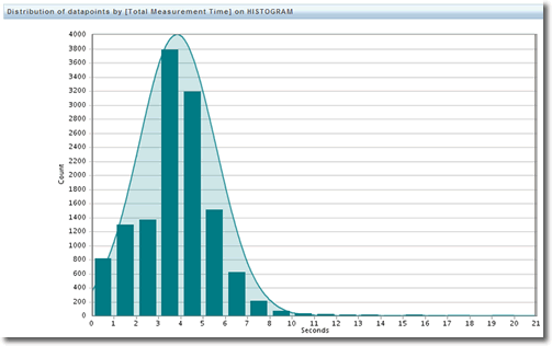
Something like this I guess (though the bars seem to be offset, there's no need for bars or a curve for average - a scatter plot would be sufficient and easy to implement). For an MC plugin config example, imagine a config option that accepts an integer for specifying how many days the owner of a plot can be inactive before deeming the plot inactive. The x-axis would be the range of integer values all servers have set for this value, and the y-axis is the number of servers who set that particular value. E.g. using the values in this graph, the range of values servers have set for this plugin is 0-21. Assuming we offset the bars to line up with the integer values to the left, we can see that the value "3" is being used by 3800 servers; the value "4" is being used by 3200 servers, etc. |
Not sure what you mean by Map chart, but I'd like to see a scatter/line chart that represents the distribution of integer values. Unless this is actually possible with the existing line chart - the page on the charts seem to suggest it's a cumulative "over-time" sort of deal though.
E.g. something akin to a bell curve showing the distribution of grades of students for a particular test.
The text was updated successfully, but these errors were encountered: