Property Bindings
-
Label modifier
- Label text
- Label position
-
Style modifier
- Star type
- Color
- Size
- Space
- Speed
- Direction
- Disabled
-
Control modifier
- Rating
- Step
- Number of stars
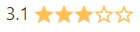
- Show half stars
- Read only
- Id
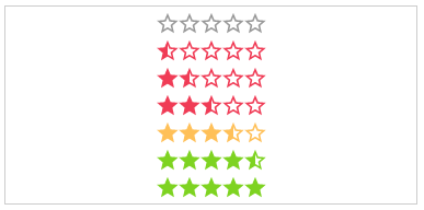
- getColor
- getHalfStarVisible
- hoverEnabled
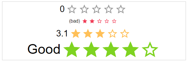
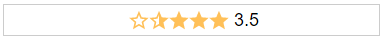
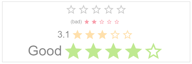
labelText: string (Optional)
The text next to the stars.
Default: undefined
<star-rating labelText="My text!"></star-rating>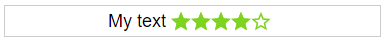
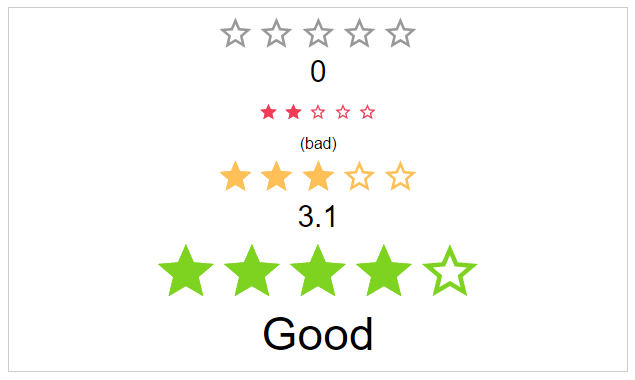
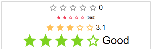
labelPosition: starRatingPosition (Optional)
The position of the label
Options: top, right, bottom, left
Default: left
<star-rating labelPosition="top"></star-rating>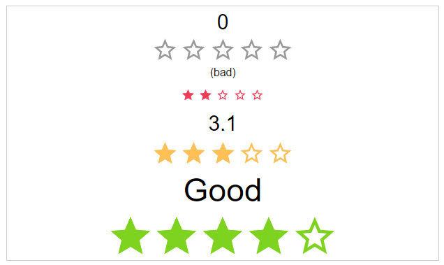
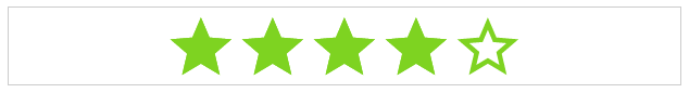
starType: starRatingStarTypes (Optional)
The type of start resource to use.
Options: svg, icon
Default: svg
<star-rating starType="icon"></star-rating>staticColor: starRatingColor (Optional)
Possible color names for the stars.
Options: default, negative, ok, positive
Default: undefined
<star-rating staticColor="positive"></star-rating>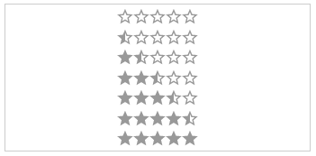
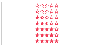
size: starRatingSizes (Optional)
The height and width of the stars.
Options: small, medium, large
Default: medium
<star-rating size="small"></star-rating>
space: starRatingStarSpace (Optional)
If the start use the whole space or not.
Options: no, between, around
Default: no
<star-rating space="around"></star-rating>

speed: starRatingSpeed (Optional)
The duration of the animation in ms.
Options: immediately, noticeable, slow
Default: noticeable
<star-rating speed="slow"></star-rating>


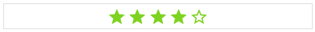
direction: string (Optional)
The direction of the stars and label.
Options: rtl, ltr
Default: rtl
<star-rating direction="ltr"></star-rating>
disabled: boolean (Optional)
The click callback is disabled, colors are transparent
Default: false
<star-rating [disabled]="true"></star-rating>
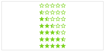
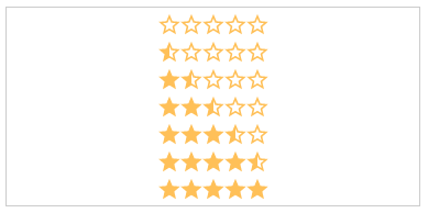
rating: number (Optional)
The actual star rating value
Default: no
<star-rating [rating]="3"></star-rating>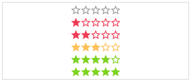
step: number (Optional)
The step interval of the control
Default: 1
<star-rating [step]="0.5"></star-rating>numOfStars: number (Optional)
The possible number of stars to choose from
Default: 5
<star-rating [numOfStars]="6"></star-rating>
showHalfStars: boolean (Optional)
To show half stars or not (This is only available in combination with starType svg)
Options: true, false
Default: false
<star-rating [showHalfStars]="true"></star-rating>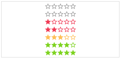
readOnly: boolean (Optional)
The click callback is disabled
Default: false
<star-rating [readOnly]="true"></star-rating>
id: string (Optional)
The html id attribute of the star rating
Default: undefined
<star-rating id="my-id"></star-rating>getColor: Function (Optional)
Calculation of the color by rating.
Params: rating, number,numOfStars and staticColor
Return: color name
<star-rating [getColor]="getColor"></star-rating>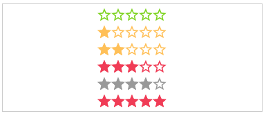
getHalfStarVisible: Function (Optional)
Calculation for adding the "half" class or not, depending on the rating value.
Params: rating
Return: boolean
<star-rating [getHalfStarClass]="getHalfStarClass" [rating]="3.2"></star-rating>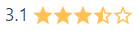
hoverEnabled: boolean (Optional)
An or disable hover interaction.
Default: false
Potions: true, false
<star-rating [hoverEnabled]="true"></star-rating>