Landscape mode and responsive framework #38
Comments
|
Great issue. Thanks for providing a good explanation. I think I understand what you're saying but if you could provide some images of layouts that don't look right in landscape mode, that'd be great. Thanks for using this library! |
Ok let me capture the issue |
|
@searchy2 Portrait vs Landscape Although it fits in landscape in my other 1280x720 mobile and other tablet but the 450x850 mobile doesn't fits it well. |

|
Thanks, I will take a look and add a landscape param most likely. For now, can you take a look at ResponsiveRowColumn to see if it suits your needs? |
This comment has been minimized.
This comment has been minimized.
|
Will create a fix for this issue soon. |
|
Good news! MediaQuery contains the landscape and portrait orientation property.
The ResponsiveFramework resolves the correct values to MediaQuery so you can confidently use that property. |
Can you elaborate more? |
|
If you use MediaQueryData's orientation property, you will get Orientation.landscape and Orientation.portrait which is what you wanted right? |
|
Hey @searchy2, Sorry for late reply, that's not what I wanted. If you read my problem again then it when I set the breakpoints of responsive framework then it treats like 450x850(widthxheight) in portrait but in landscape it will become 850x450 so the breakpoints will think its a Tablet and will not apply the responsive breakpoint formula (hence some of my objects will come out of the screen as I reported in start of this issue), Code reference below I hope you can understand the underlying issue, It is not doing what it should do i.e. become responsive on all form factors and orientations. Regards Prateek. |
|
My apologies, I thought I reopened this issue already. Thank you for the additional information. |
|
@searchy2 |
|
This'll be the next thing I look at. |
|
@searchy2 Any timeline for the fix? |
|
Not at the current time. This is an involved issue that needs quite a bit of thought to fix. Do you have any suggestions? |
|
@searchy2 Are you using MediaQuery.of(context).size.width to determine the width? If so, you could change that to MediaQuery.of(context).size.shortestSide which will ensure the width is never changing even if they switch to landscape. |
|
I am not. That's a good suggestion, thank you! |
|
Any timeline for a fix @searchy2 ? |
|
? @searchy2 |
|
Having the exactly the same issue
|

|
Seems to be related to #48 |
|
This is the temporary solution that seems to be working:
@searchy2 Can you make it so we can specify different breakpoints for different opientations please :> ? Although in this case the desktop app does not behave consistently when resizing window, since orientation seems to be calculated based on height and width. why is responsiveness so complicated... |
|
Thank you for the experiments and additional information. I can probably release a new version this week if everyone in this thread is willing to help me test. |
|
@searchy2 sure! eagerly awaiting the release! |
|
@searchy2 any luck? |
|
@searchy2 ?? |
|
@searchy2 If you don't have the time to fix this, could you please tell us what is the proper way to do it, so that we can submit a PR? |
|
@searchy2 my team and i are getting close to launch and this is one of the few missing pieces. please update when you can. |
|
My apologies, the solution here is to add a landscape breakpoints param and switch based on the media query returned orientation value. I don't have time today but I'll try this weekend. |
|
Good news, I've added support for landscape breakpoints with the v0.1.1 release! Landscape mode support was as extensive as I imagined and really needed a good think through. Please test and let me know your thoughts and suggestions. This is not full landscape support as it is missing minWidthLandscape, maxWidthLandscape, defaultScaleLandscape, defaultScaleFactorLandscape, etc. Any help adding support for those features is appreciated! |
|
i think the issue still exists? i entered the following landscapePlatforms: [ and it's still not working when i switch from portrait to landscape anyone else? |
|
@fdarsot I could be wrong here but wouldn't the width change when in landscape so I don't think it'd be the same breakpoint numbers as portrait. |
|
ohhh good point. i think you are correct @HasanMuslemani i was going based on the example in the repo. let me try new breakpoints |
|
tried with different breakpoints, it still isnt working |
|
is it working for anyone else? |
What are your new breakpoints? |
|
@prateekmedia i checked what my screen width was when it was in landscape mode and adjusted it to that. landscapePlatforms: [ |
|
Hmmm.. I'll find out the issue with some tests. For now, you need to test on a target device in order to have landscape apply. Landscape mode isn't enabled by default on Web or Desktop. |
|
@searchy2 im testing on a real device with targeted breakpoints im only developing for Android and IOS btw |
|
Well, that's unfortunate. I'll take a look tomorrow, the bulk of the work is done so it's probably a quick fix. And can add some tests! |
|
Thank you for all your work btw! i think we're close. this is one of the few last things needed before we launch and it would be great to have. |
|
I believe the problem is that flutter does not trigger |
|
@fdarsot @prateekmedia
I've verified through tests that landscape mode now works correctly. To test on desktop or web:
Please test and hopefully everyone's issues are resolved. |
|
In spite of the seemingly complex concepts here, landscape and portrait breakpoints switch seemlessly and it's a beauty to behold. |
Ok looks great, although I will test it when I'm free. If anyone has any query then I will reopen it. |
|
I can't get this to work. |
|
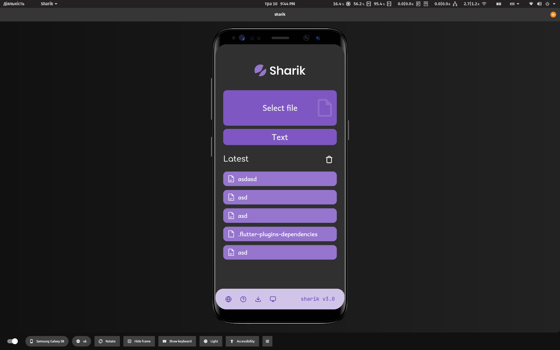
@elvosparsley You need to specify different breakpoints for both Here's how I am doing it in my app: https://github.com/marchellodev/sharik/blob/master/lib/main.dart#L63 |
|
Closing again as issue is answered. |
Many thanks for the example, I was missing the scaleFactor in the breakpoints, works great now! |
Intro
This framework works flawlessly for small screen devices, but when you turn your device into landscape mode the situation also becomes upside down.
The Problem
Although this is able to hand my approximately 450x850 mobile, but when I turn it in landscape mode then all the ui elements are too big and some are even overflowing cause of the less dpi in small screen but that's not the case in portrait mode.
You can also try this on the recreated flutter website, when you turn your phone with any resolution into landscape mode then everything becomes too big to handle event the bottomNavigationBar also doesnt respect the small screen.
It seems like it doesn't respect nor recognize small screens in landscape mode cause it thinks that the width is higher so that is true in landscape but it should also consider that the height is low in landscape mode cause the resolution becomes 850x450(in my small screen case)
Suggestion / Possible Solution
Give us the option to specify other properties for landscape mode or by default respect landscape mode cause even if the width is high in it but the height is very low in that mode, or it should understand landscape mode by itself by checking the aspect ratio which is my case is approx 2:1 in landscape mode.
Enough Talk, Show me your code
This is the code of my builder inside MaterialApp
The text was updated successfully, but these errors were encountered: