Added useShortestSide property #71
Conversation
|
I would add that this would be useful mainly for apps that want to avoid scrolling screens and distribute their content based on width/height regardless of orientation. |
|
Thank you for making this PR and contributing back to the repo! I'll take some time this weekend to review. Meanwhile, do you think you'll be able to add some tests? |
|
Yes I agree the approach that I take maybe is targeted to an specific mobile behaviour. Size units remain the same when the phone is in landscape mode or portrait mode, and only a few widgets change the hard coded size depending on the orientation, the rest of the widgets maintain their size but change the way they are displayed (ex: use listview in portrait and grid view on landscape, or use a side drawer on landscape and bottomappbar on portrait just to name a few) This is a behaviour that I think fits with the material design guidelines and I used a heavily modified fork of responsibe_builder with language and theming support as an internal library until a better alternative was found or made , the drawback was that it used inherditedwidget and context to get the size unit per device since flutter still doesn't allow to change devicepixelratio successfully So this library is just a better alternative but the expected behaviour is not there, as an example on a folded Galaxy fold the size unit change is really noticeable, the width is not proportional and an appbar takes almost half the screen on landscape and little to no space on portrait , but using the smallest size allows me to design my layout on landscape and just modify selective things to make it work on portrait. Really specific I know. But I guess one must take those things into account 😅 I will make tests in this week, since I don't know how this property will behave with normal and landscape breakpoints provided, maybe when enabled it should disable landscape breakpoints because it will calculate the breakpoints without taking orientation into account. If I have time I will also post some screenshots to showcase how this changes the way normal breakpoints are handled 😁 |
|
3 tests have been added, one to verify that useShortestSide doesn't break anything / is disabled by default, other to verify that the scaleFactor is the same on landscape or portrait using useShortestSide , and the third one to test a curious behaviour that i was expecting to implement by myself, it turns out that when both breakpointsLandscape and breakpoints are provided, useShortestSide will keep measuring based on the shortest side , so landscape breakpoints will trigger on the same way but using the shortest side instead of the width. This is useful if you want to shrink a little bit the scaleFactor on landscape to make better use of the available space. I will add images showing this behaviour |
|
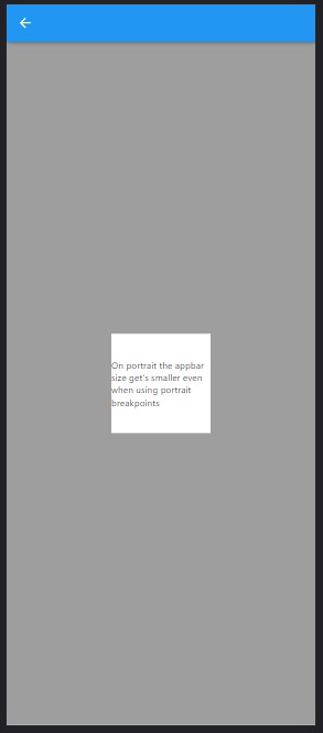
This was the initial behaviour, or the behaviour that happens when useShortestSide is false. Both landscape and portrait breakpoints are the same.
|

|
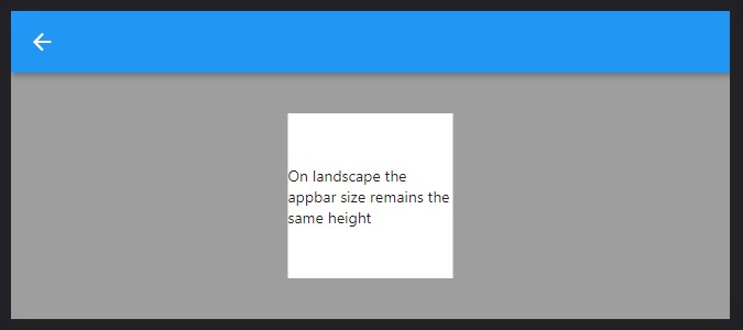
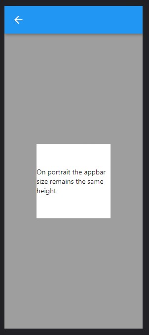
This is the new behaviour. useShortestSide is true, and ONLY normal breakpoints are set, but it should be the same when landscape and portrait breakpoints match exactly
|
|
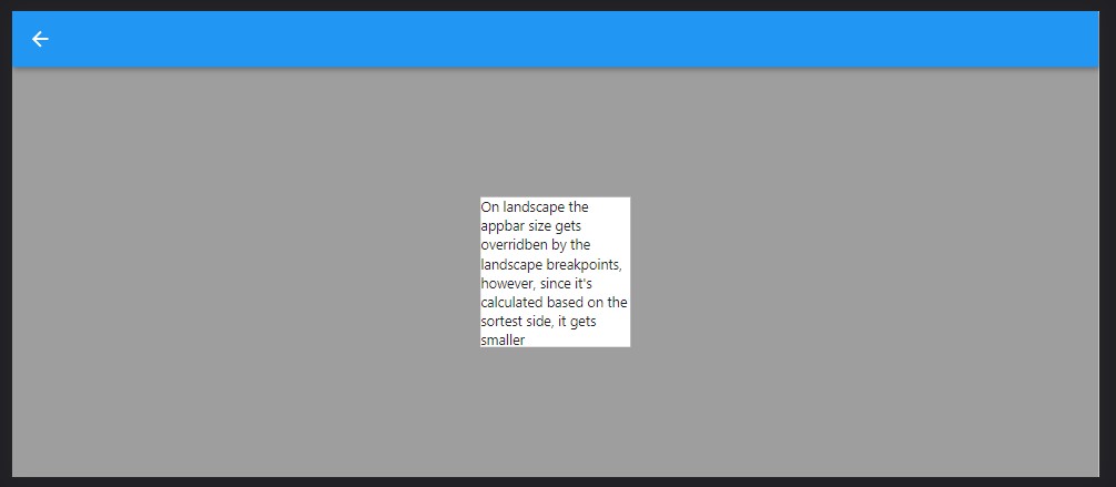
And this behaviour is triggered when useShortestSide is true but the portrait and landscape methods are different, on portrait it gets smaller, completely the opossite of the default behaviour, but, again, it was something that i needed that came for free since the space can be managed now based on the shortest screen size, and orientation, independently |

|
I should also add some code, the screen aspect ratio is the galaxy fold one since i found that one convenient to showcase the 3 behaviours And my screen |
|
Thank you for the great work here! |
|
Thank you for the thorough tests and the very illustrative examples around the interaction between shortest side and landscape breakpoints. They addressed my concerns and made merging very easy. I apologize again for the delay. Please email me at ray@codelessly.com with your name and email so I can add you as a contributor to this project, if you wish. |
I present my layouts in quite a personalized way, with overlays and popups using navigation and other tricks to avoid limitations of flutter and this library, so i use MediaQuery and max/min sizes to present a layout that uses heavily the shortest side of the screen in either landscape or portrait since i handle those cases internally.
The landscape breakpoints that this library provides are not fit for my use, and i would add a useShortestSide property that the user could try if they are in my position.
If you enable this property you don't need landscapeBreakpoints since all the breakpoints will be calculated on the normal breakpoints based on the shortest side, which might be the height or the width based on the rotation or screen size in the case of web.
It's optional for those who are comfortable with just letting this library do their job.