Home
Texture Fonts is a Godot plugin that allows for the creation of custom fonts from textures inside of Godot's editor.
Download the plugin from the Releases section, and enable it.
Alternatively, you can look at some examples from this repository. Press "Code 🠻", "Download Zip", extract the files, and open the .project file with Godot.
To create a new font, right click in Godot's "FileSystem" dock, and choose "New Resource...".
Then, search for "TextureFont" under Resource > Font > BitmapFont > TextureFont and press "Create".
You will need a texture containing some of the characters you wish to add as a font. Create one in any graphics application, or take one from the examples in the repository.
 |
|---|
| example font texture in Aseprite |
The characters on your texture need to be equally spaced horizontally and vertically. For this, I like to draw a grid before adding any characters. The grid can be removed before importing the texture into Godot, or kept, if there is a gap between the characters and the texture. If you have some characters which are much larger than others, use a separate texture. Only the characters on the same texture need to have the same size.
Don't worry if some characters like "p, y or q" are "floating" above the baseline. Their offset can be adjusted later on.
You do not need to add a empty space to your image for the "space" character. If you do not define a space character, one will be created for you. Also see: Increasing the Width for your Space Character.
To load your texture into the font, press "Add" in the files section, and choose your font from the file system.
 |
|---|
| new font after selecting and loading example texture |
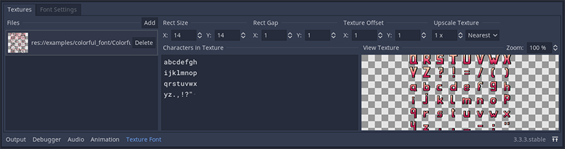
Now you will need to adjust some settings to load the font properly.
First, type out every character which appears on the texture into the "Characters in Texture" section. Add a line-break for every row in your texture. This way the texture font will know what character codes to add.
Then you will need to adjust the "Rect" settings. These settings dictate what character code will be mapped to which part of your texture.
- Rect Size - is the area your individual characters each fit into.
- Rect Gap - is the gap between your characters in the image. if you used a grid in your image, you can use this property to exclude it from the final font.
- Texture Offset - is the offset your first character has from the upper left corner of your image.
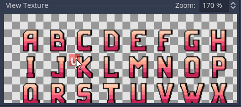
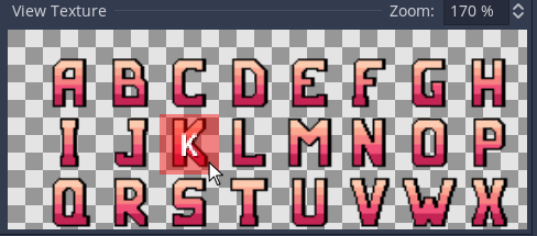
You can use the "View Texture" field, to check if you got the settings right. Hover over the characters in your texture, and check if each character fits into the red bounding box, and has the correct character associated with it.
 |
 |
|---|---|
| wrong texture settings | correct texture settings |
You can pan the preview by dragging it, and zoom in/out with your mouse wheel.
We will ignore the "Upscale Texture" option for now. If you are interested in upscaling your texture, see Upscaling Fonts for details.
Your font will need some global settings before it looks good. Open the "Font Settings" Tab, and have a look at the available options.
 |
|---|
| the font settings for the "Coloful Block Font" example |
You can test your font right away in the "Preview" section. Choose a background color which contrasts the color of your font, and type away.
Your font will most likely look strange in some places, and you will need to adjust some settings.
First, lets go over some general font-wide settings under the section "Font Settings".
- Height - the total height your font occupies in text. Usually this is your "Rect Size" y value, plus some spacing.
- Gap - the gap, or "advance", between each character.
- Horizontal Align - changes the align of every character in the x axis, moving it left or right.
- Vertical Align - changes the align of every character in the y axis.
- Ascent - only has a effect when combining multiple fonts. See Extending other Fonts for details.
- Monospaced - when this option is selected, all you characters will be treated as having the same width, which is that of your "Rect Size" width of your first texture.
Play around with these settings, and watch your font change in the Preview.
You might notice a delay between adjusting the settings and seeing changes in the editor. This delay is intentional. It avoids rebuilding the font too often, as this can become computationally expensive. Instead, the editor will wait for a short while after your last change, and then compile all changes at once, saving your font in the process.
 |
|---|
| example kerning pair |
Some of your characters might seem a bit too far away from each other. This often happens when large overhanging characters, like capital "T", are next to small charters.
Since this only happens between some pairings, this needs to be adjusted on a per-pairing basis. This is what "Kerning Pairs" are for.
Put a character into the "from" and "to" sections, and set a kerning. The kerning is how much the characters will be pressed together. Negative values will increase the gap between certain pairs.
You can put multiple characters into the "from" and "to" fields, and all possible pairs between these characters will be created with the set kerning value. This saves you from having to declare too many kerning pairs manually on large fonts.
Example:
from: ab to: dz kerning: 4 would produce following kerning pairs in the resulting font:
| from | to | kerning |
|---|---|---|
| a | d | 4 |
| a | z | 4 |
| b | d | 4 |
| b | z | 4 |
 |
|---|
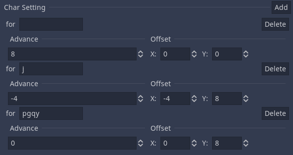
| Char settings from the default font, for the space character, j , p , g , q and y |
Some characters might have strange positioning, being too high, low, or wide. The letter "j" is often too wide, as it's tail could slip under most other characters, saving space.
You can adjust the positioning of individual characters by adding a "Char Setting" for it.
Following settings are available:
- Advance - additional width to add to your character. Can be negative, decreasing the width of a character.
- Offset - moves the alignment of the character in the font. Can be used together wit a negative advance, to overlap characters.
Like for Kerning Pairs, you can apply this setting to multiple characters at once, by putting multiple letters into the for field.
Your space is likely very small, as it only has the width of your gap (unless your font is monospaced). To increase it, ass a Char Setting, insert a blank space into for, and increase the advance value.
Congrats! You now know how to make your own fonts. Go be creative, or read on for more details and advanced features.
A list of image-files in this font. Fonts can have any amount of textures linked to them. Each texture has it's own settings.
The bounding box of a character in the currently selected file. It is recommended to set this as low as possible, without clipping any characters.
The gap from one character bounding box to the next, in the selected file. Can be used to hide a grid in the image texture, or to reduce the Rect Size.
Offset from the upper left corner of the texture in the selected file, to the Rect of the first character.
Upscales the input image-texture of the selected file, and saves the upscaled version in the font resource. Most useful for pixel-art fonts.
The scaled Texture retains the original textures input flags, regardless of up-sampling method used.
- Scale - default: 1x. Amount of scaling applied
- Interpolation - default: nearest. Up-sampling method/scaling algorithm to use.
What characters appear in the selected file.
The lines of this text-block need to match the lines in the image. Enter either letters, or use \U+XXXX; to add Unicode characters. (currently limited to max \U+FFFF;)
Also See: Using Unicode Characters
Preview the image and mappings of the selected file.
Drag to pan, scroll to zoom.
Also See: Loading a Texture
Note: When using texture scaling, the following values correspond to the scaled textures pixel values, not to the input texture, as they are font-wide.
Total height your font occupies in text. It will influence how controls expand to fit your font, as well as the spacing between lines, and the typing caret and selection markers.
The gap, or "advance", between each character. Can be negative.
Changes the x-alignment for all characters.
Changes the y-alignment for all characters.
The fonts built in "ascent" property. Only affects the font when using multiple fonts, via the "Fallback" property of the font.
Also see: Extending other Fonts
Turns off the cropping of characters, making each character as wide as the "Rect Size" x-value of its texture.
When using a Phantom Space Character, sets the width of the space char to that of the "Rect Size" x-value of the first texture.
- from - what character(s) form the first of the pair.
- to - what characters(s) form the other half of the pair.
- kerning - decreases the spacing between the characters. Can be negative, to increase the spacing.
Also See: Kerning Pairs
- for - what character(s) this setting applies to.
- advance - by how much to increase the characters with in the font.
- offset - how to align the character in the font.
Also See: Char Settings Tutorial
- scale - temporary zoom, to test how the font scales.
- color - background color to preview the font over.
- text field - type anything. Has the font applied, to see what it will look like in use.