Skip to content
New issue

Have a question about this project? Sign up for a free GitHub account to open an issue and contact its maintainers and the community.

By clicking “Sign up for GitHub”, you agree to our terms of service and privacy statement. We’ll occasionally send you account related emails.

Already on GitHub? Sign in to your account

Pagination UI Feedback #2035

Closed
Katharsas opened this issue Nov 13, 2020 · 4 comments
Closed

Pagination UI Feedback #2035

Katharsas opened this issue Nov 13, 2020 · 4 comments
Labels
beginner-friendly S5 mini severity 5 - mini - cosmetic problem like misspelled words or misaligned text

Comments

@Katharsas
Copy link
Collaborator

Katharsas commented Nov 13, 2020

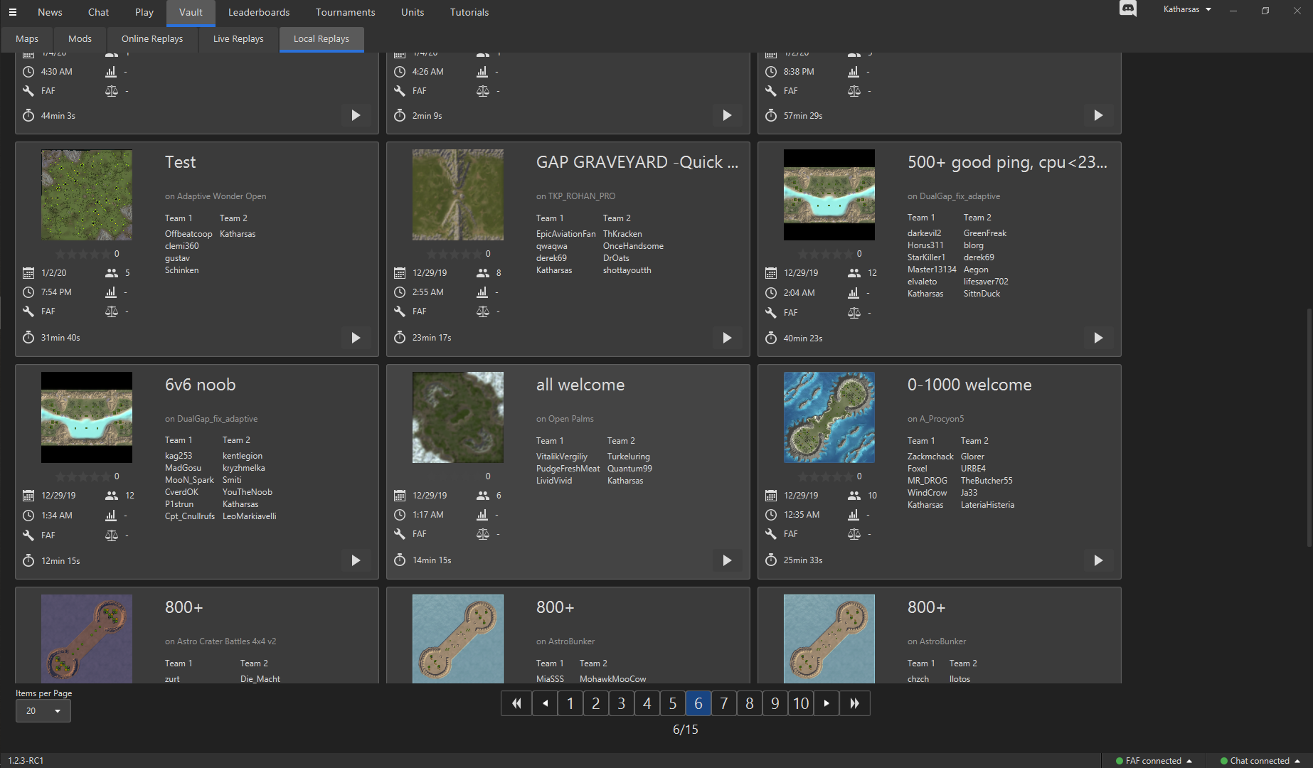
Looks like this currently:
grafik

Right now there is mostly just too much stuff.

Design:

  • Give the pagination area the same background color as the navigation tabs on the top to make clear the distinction between the part of the page that scrolls and the part that doesnt. Right now the tiles look cut off.
  • Remove "items per page" option and just choose a reasonable number for every page (the default should be different based on size of elements). No reason for this to clutter up the UI, it wont be used by 99% of people for 99,99% of time anyway. I suggest 50 for maps, 40 for mods, 30 for replays.
  • Remove the page counter "6/15", its in my opinion entirely redunant to the page buttons. Anyway it should move to the right or left of the other buttons if not removed because it takes up and way to much space for the little value it provides. Have a little bit of padding instead.
  • The "To first / to last page" buttons should imo be spaced apart from the much more important "to next / previous" buttons, and those should be bigger because of their importance, like double width maybe. If "items per page" and counter is removed, there could even be properly labeled, big "next" button on the far right and "previous" button on the far left instead of having the small arrows. Example:
    Screenshot 2020-11-13 231820
    Or maybe have those in between the jump to page and the first/last page buttons.

Bug:

  • Making the client window smaller resizes the number of pagination buttons shown, but making the client window larger doesnt, so you get stuck on smallest amount of buttons (feel free to split this into separate issue).
@Katharsas Katharsas added beginner-friendly S5 mini severity 5 - mini - cosmetic problem like misspelled words or misaligned text labels Nov 13, 2020
@Katharsas Katharsas changed the title Pagination Feedback Pagination UI Feedback Nov 13, 2020
@MrRowey
Copy link
Member

MrRowey commented Nov 15, 2020

Remove "items per page" option this feature i like as my pc can handle more on the screen at once. Is it not possible to have a Value that is changed in Setting that can be manualty set as i have to re select 200 everytime i visit the vault after ive closed the client

@Katharsas
Copy link
Collaborator Author

Should be possible. Could even be a multiplier instead of a fixed number, that way it would work with variable amount of items on various pages.

@Farmsletje
Copy link

  • The "To first / to last page" buttons should imo be spaced apart from the much more important "to next / previous" buttons, and those should be bigger because of their importance, like double width maybe. If "items per page" and counter is removed, there could even be properly labeled, big "next" button on the far right and "previous" button on the far left instead of having the small arrows. Example:
    Screenshot 2020-11-13 231820
    Or maybe have those in between the jump to page and the first/last page buttons.

Imo the way it currently looks is fine. If i look at a few other sites i use the next/previous buttons are allways right next to the page numbering
chrome_VvqR8xIhkC
chrome_u25LTny4qd
chrome_5qMtRmv8jd

@Sheikah45
Copy link
Member

I looked into these suggestions and it didn't seem like they reduced clutter or added value to me.

Sign up for free to join this conversation on GitHub. Already have an account? Sign in to comment
Labels
beginner-friendly S5 mini severity 5 - mini - cosmetic problem like misspelled words or misaligned text
Projects
None yet
Development

No branches or pull requests

4 participants