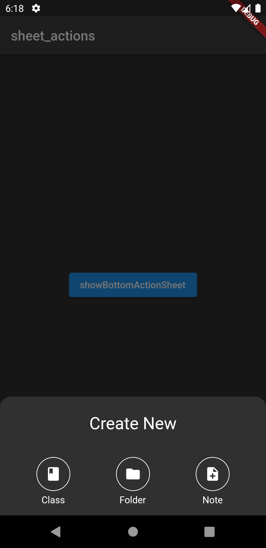
This package extends showModalBottomSheet() to provide a material bottom sheet with actions, replicating the one seen in Google Drive.
| Dark Theme | Light Theme |
|---|---|
 |
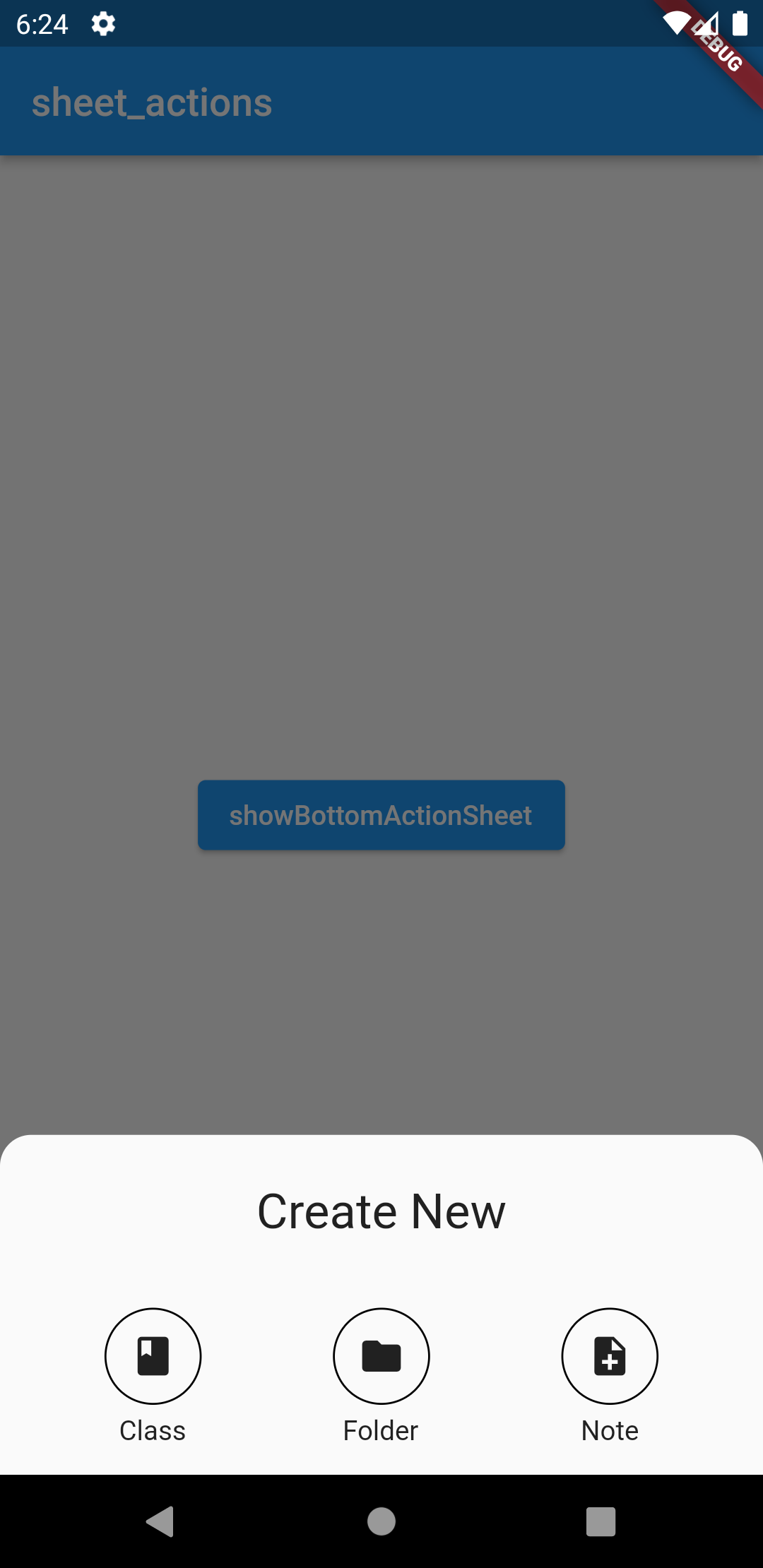 |
Unless given backgroundColor and widgetBorderColour adjust according to the Brightness defined in the current theme.
The color of Icons or other widgets have to be adjusted manually.
Add the package to your pubspec.yaml:
action_sheet: ^1.0.0Import the package in your dart file:
import 'package:sheet_actions_test/action_sheet.dart';Use showBottomActionSheet to return the bottom action sheet.
See Example.
Required Arguments:
- context: for building
- children: widgets to display as actions
- actions: function called on press
Widget build(BuildContext context) {
   return Center(
     child: ElevatedButton(
       child: Text("showBottomActionSheet"),
       onPressed: () {
         showBottomActionSheet(
           context: context,
           widgetPositioning: WidgetPositioning.mainAxis,
           children: [
             Icon(
               Icons.class_,
               color: Colors.white,
             ),
             Icon(
               Icons.folder,
               color: Colors.white,
             ),
             Icon(
               Icons.note_add,
               color: Colors.white,
             ),
           ],
           descriptions: [
             Text("Class"),
             Text("Folder"),
             Text("Note"),
           ],
           actions: [],
           titleText: Text(
             "Create New",
             style: TextStyle(fontSize: 25),
           ),
         );
       },
     ),
   );
}descriptions:Text()beneath actionsdescriptionsPaddingtitleTexttitlePaddingwidgetPositioning:WidgetPostioning.leftBound: positions widgets in a grid from left to rightWidgetPositioning.mainAxis: positions widgets in a grid depending onmainAxisAlignment
widgetBorderRadius: radius for all borders around widgetswidgetBorderColormaxPerRow: maximum amount of widgets/actions in each row, unless given adjusts to number of widgets givenwidgetBorderSize: size of all borders surrounding the widgetswidgetSplashRadiuswidgetBorderWidthwidgetPaddingrowGap: gap between each rowmainAxisAlignmentsheetPaddingconstraintsvisualDensitybackgroundColorelevationshape: defaults to a rectangle with rounded bordersclipBehaviour: clips everything outside of the specified shapebarrierColor: color of background when selectedisSrollControlleduseRootNavigatorisDimissibleenableDragrouteSettingstransitionAnimationController