
English | 简体中文
感觉还不错?请投出您的 Star 吧 🥰 !
-
支持打开、关闭的提示
-
支持为 Slider 设置装饰
-
支持灵活的配置可用状态
-
更具空间感的 阴影
-
良好的开关交互体验
| 参数 | 类型 | 必要 | 默认值 | 说明 |
|---|---|---|---|---|
| open | bool | 否 | false | 是否处于打开状态。默认 false。 |
| onChanged | ValueChanged | 是 | null | 当开关状态发生改变时,会回调该函数。 |
| width | double | 否 | 59.23 | 宽度。默认 59.23,符合美学 😃 |
| height | double | 否 | null | 高度。默认会根据 [width] 进行计算,符合美学 😃 |
| offset | double | 否 | null | 滑块与边缘的间距 |
| openChild | Widget | 否 | null | 打开状态的提示样式 |
| closeChild | Widget | 否 | null | 关闭状态的提示样式 |
| childOffset | double | 否 | null | 提示与边缘的间距 |
| color | Color | 否 | null | 关闭状态下的背景色 |
| openColor | Color | 否 | null | 打开状态下的背景色 |
| sliderColor | Color | 否 | null | 滑块颜色 |
| enable | bool | 否 | true | 是否可用 |
| sliderChild | Widget | 否 | null | 滑块中的组件。超过范围会被剪裁。 |
| shadowColor | Color | 否 | null | 设置组件阴影颜色 |
| shadowOffset | Offset | 否 | null | 设置组件阴影偏移 |
| shadowBlur | double | 否 | 0.0 | 设置组件高斯与阴影形状卷积的标准偏差 |

FSwitch(
  onChanged: (v) {},
)
FSwitch 需要始终设置 onChanged,以便根据开关状态作出响应。

FSwitch(
onChanged: (bool value) {
value_1 = value;
},
open: value_1,
enable: enable_1,
shadowColor: Colors.black.withOpacity(0.5),
shadowBlur: 3.0,
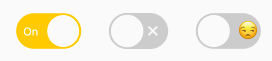
),通过 enable 可以改变 FSwitch 的可用状态。一旦 FSwitch 变为可用状态,将无法再改变开关状态。
此外,FSwitch 提供了灵活便捷的阴影配置支持。
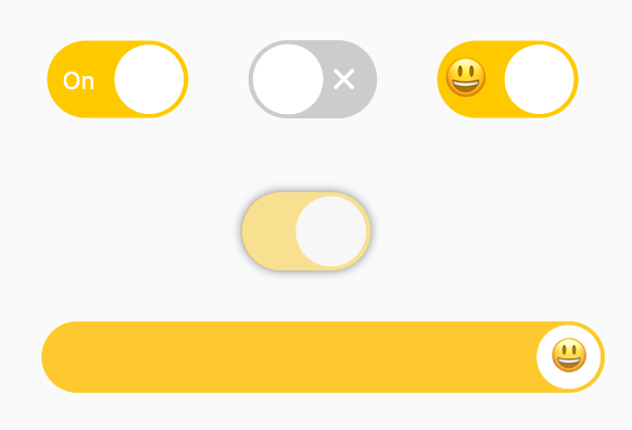
/// #1
FSwitch(
  width: 65.0,
  height: 35.538,
  onChanged: (v) {},
  closeChild: Text(
    "Off",
    style: TextStyle(
        color: Colors.white, fontSize: 11),
  ),
  openChild: Text(
    "On",
    style: TextStyle(
        color: Colors.white, fontSize: 11),
  ),
),

/// #2
FSwitch(
  open: true,
  onChanged: (v) {},
  closeChild: Icon(
    Icons.close,
    size: 16,
    color: Colors.white,
  ),
  openChild: Icon(
    Icons.check,
    size: 16,
    color: Colors.white,
  ),
),

/// #3
FSwitch(
  width: 65.0,
  height: 35.538,
  onChanged: (v) {},
  closeChild: Text(
    "😒",
    style: TextStyle(fontSize: 20),
  ),
  openChild: Text(
    "😃",
    style: TextStyle(fontSize: 20),
  ),
  childOffset: 3.0,
),
通过 openChild 和 closeChild 可以分别为 FSwitch 设置打开、关闭的状态指示。
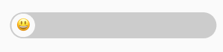
FSwitch(
  width: 300,
  height: 38,
  onChanged: (bool value) {},
  sliderChild: Text(
    "😃",
    style: TextStyle(fontSize: 20),
  ),
)
sliderChild 将允许开发者为 Slider 设置 child 装饰。
这很有趣!
在项目 pubspec.yaml 文件中添加依赖:
dependencies:
  fswitch: ^<版本号>
⚠️ 注意,请到 pub 获取 FSwitch 最新版本号
dependencies:
  fswitch:
    git:
      url: 'git@github.com:Fliggy-Mobile/fswitch.git'
      ref: '<分支号 或 tag>'
⚠️ 注意,分支号 或 tag 请以 FSwitch 官方项目为准。
Copyright 2020-present Fliggy Android Team <alitrip_android@list.alibaba-inc.com>.

Licensed under the Apache License, Version 2.0 (the "License");
you may not use this file except in compliance with the License.
You may obtain a copy of the License at following link.

    http://www.apache.org/licenses/LICENSE-2.0

Unless required by applicable law or agreed to in writing, software
distributed under the License is distributed on an "AS IS" BASIS,
WITHOUT WARRANTIES OR CONDITIONS OF ANY KIND, either express or implied.
See the License for the specific language governing permissions and
limitations under the License.