[Feature Request] Color Code for Account and Favorites Labels/Folders #526
Comments
|
+1 for that! customizing the left sidebar would be a big plus:
for example i get newsletters all day from my suppliers, but i have a gmail filter running that puts them to "news" and skips inbox to have a clear inbox and see really important mails. in the morning or after work i check the news folder and unread mails if there is something interesting. a intelligent folder option would be nice. for example: set a special folder with the option "only unread mails" and got it added to the sidebar. of course you can expand the accounts and see all labels. but they wont get checked for new emails till you click it. if you have 3 accounts with lots of labels there is a lot of scrolling needed. most labels you dont need on a daily base. |
|
Yes, +1 to both requests!
|
|
Having customizable account colors -- such that each email in the combined inbox has a little corresponding account color bar next to it, or similar -- is huge for those of us who deal with multiple email accounts! Please implement. |
|
+1 |
1 similar comment
|
+1 |
|
Just set Mailspring up and this was the first thing I noticed wasn't a thing. C'mon. |
|
I agree. This is a feature in SparkMail which is a wonderful helper. I would liek to see this added to MailSpring. |
|
+1 |
|
+1 favorite folders and colored accounts would be wonderful |
|
+1 |
|
+1 Color code for different accounts. |
|
+1 in color coding different accounts. That is a feature in Spark, a iOS and MacOS based client, and it works beautifully. |
|
+1 plus the ability to customize the color of labels. |
|
I will have some time at the beginning of next year and would like to try working on this feature. This is something which is most important for me with my mail clients, and I would love to give it a shot. I think the following two issues are bascially asking for similar functionality as well:
I am thinking about the following:
Are there any important things that I should keep in mind (in addition to https://github.com/Foundry376/Mailspring/blob/master/CONTRIBUTING.md)? Any pointers to the code that may be helpful are also totally welcome. |
|
I managed to get a first prototype working (https://github.com/Phylu/Mailspring/tree/feature/526-colorize-accounts). I am happy to receive some feedback on it.
|

|
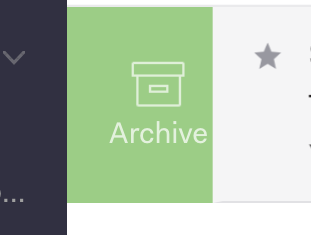
@Phylu Well done and thank you for working on this. The label design you have here is on the full left border, which means that from a design hierarchy, it is ambiguous whether the label is within the message box versus part of the parent component. This becomes an important distinction when we include the message list "swipe functions":
The swipe UI - the green archive - is not inside of the message box, but sort of underneath it. That star (in the same img above) is clearly inside the message box, so it is clear that it is tied to that message box (and when swiped to the archive, will go along with it).
With swipe actions, it becomes important to distinguish which UI elements are included inside the message box versus which aren't. The account label should be included with that specific message box (and when swiped, is swiped along with the rest). That is why it might be best to follow something similar to spark where it is a smaller color indication inside the message box:
Alternatively, since I like the way your mockup looks, you can add a strong left border, reduce the label height by a few pixels on both top/bottom, which will make the label appear to be part of the message... |


|
@ZachariahRosenberg Thanks for the design hint. I think having it similar to spark is looking better than adding a border left of the element (and easier to implement as well). have updated this accordingly:
|
Two features that exist in Spark:
Are there any related issues?
...
What operating system are you using?
...
What version of Mailspring are you using?
...
--
Bug?
Do you have any third-party plugins installed? If so, which ones?
...
Is the issue related to a specific email provider (Gmail, Exchange, etc.)?
...
Is the issue reproducible with a particular attachment, message, signature, etc?
...
--
Feature Request?
Does this feature exist in another mail client or tool you use?
...
The text was updated successfully, but these errors were encountered: