一个vite v2.0+插件,让你轻松实现基于less、sass的 web 应用在线动态主题切换。
特点:
- 使用成本很低
- 不限 ui 框架,Element-ui、iview、Ant-design 等等等(只要基于 less/sass)
- 不依赖 css3 vars
- 浏览器兼容性良好(IE9+ ?,待验证 ,但 vite 构建的产物最低 Polyfill 到 IE11,需更低的,你可以用 webpack 版本的插件@zougt/some-loader-utils,所以兼容性问题取决用的框架)
v1.4.0 + 支持
可用颜色板选择任意的主题色,这里以less为例,同样适用于scss。

安装与使用
# use pnpm (or npm)
pnpm install color @zougt/vite-plugin-theme-preprocessor @zougt/some-loader-utils -D
# use yarn
yarn add  color @zougt/vite-plugin-theme-preprocessor @zougt/some-loader-utils -D
vite.config.js
注意:以下的配置只适用于 动态主题模式 , 预设主题模式 请往文档下面对应的看。
import { defineConfig } from "vite";
import {
  themePreprocessorPlugin,
  themePreprocessorHmrPlugin,
} from "@zougt/vite-plugin-theme-preprocessor";
import path from "path";
export default defineConfig({
  plugins: [
    // 创建动态主题切换
    themePreprocessorPlugin({
      less: {
        // 启用任意主题色模式
        arbitraryMode: true,
        // 默认的主题色,用于对其他颜色值形成对比值,通常与 src/theme/theme-vars.less 中的一个主题色相同,也可以不相同,就看是不是你想要的效果
        defaultPrimaryColor: "#512da7",
        // 只需提供一组变量文件,变量文件内容不应该夹带样式代码,设定上只需存在变量
        multipleScopeVars: [
          {
            // 必需
            scopeName: "theme-default",
            // path 和 varsContent 必选一个
            path: path.resolve("src/theme/theme-vars.less"),
            // varsContent参数等效于 path文件的内容 ,可以让 defaultPrimaryColor 与 "@primary-color"值只写一遍, varsContent 与 path 选一个使用
            // varsContent:`@primary-color:${defaultPrimaryColor};`
          },
        ],
        // css中不是由主题色变量生成的颜色,也让它抽取到主题css内,可以提高权重
        includeStyleWithColors: [
            {
                    // color也可以是array,如 ["#ffffff","#000"]
                    color: '#ffffff',
                    // 排除属性,如 不提取背景色的#ffffff
                    // excludeCssProps:["background","background-color"]
                    // 排除选择器,如 不提取以下选择器的 #ffffff
                    // excludeSelectors: [
                    //   ".ant-btn-link:hover, .ant-btn-link:focus, .ant-btn-link:active",
                    // ],
                },
        ],
      },
      // scss:{

      // },
    }),
    // 主题热更新,不得已分开插件,因为需要vite插件顺序enforce
    themePreprocessorHmrPlugin(),
  ],
});
src/theme/theme-vars.less
/*说明:此文件不应该被其他@import,此文件的变量并不是来设置项目的主题(当然,你可以作为加载时的默认主题),主要作用是,这里的变量值只要与项目的原变量值有差别,编译后就会抽取跟随主题色梯度变化的css*/

/*注意(重要):此文件的内容一旦固定下来就不需要改,在线动态切换主题,调用setCustomTheme方法即可*/

/*注意(强调):变量值改动会影响 gradientReplacer 和 targetValueReplacer 的可用属性的变化,所以内容一旦固定下来就不需要改(强调)*/

/*主题色,通常与 themePreprocessorPlugin 的 defaultPrimaryColor 相同, 使用setCustomTheme({primaryColor})切换*/
@primary-color: #512da7;

/*与此颜色对应的样式,默认情况也会跟主色变化的,要切换它对应的梯度颜色,使用setCustomTheme({gradientReplacer:{"#F7D06B"}})切换 */
@alert-success-bg-color: #F7D06B;

/*圆角值,尽量与原值差别大一点,方便分析 targetValueReplacer 的可用属性,非颜色值的切换,可以使用 setCustomTheme({targetValueReplacer:{"6px"}}) 精准替换*/
@border-radius-base: 6px;
在线切换主题
动态主题切换必须使用的 "@setCustomTheme" 模块,会自动处理项目中包括组件库涉及的梯度颜色替换
import Color from "color";
// "@setCustomTheme" 是 themePreprocessorPlugin 提供的模块,setCustomTheme的参数必须提供Color模块,至于为什么不把 Color 直接依赖进去是有原因的
import setCustomTheme from "@setCustomTheme";
// 设置任意主题色既可
setCustomTheme({
  Color,
  primaryColor: "#FF005A",
  //gradientReplacer:{},
  //targetValueReplacer:{}
});
setCustomTheme 的可选参数 gradientReplacer 与 targetValueReplacer 的可用属性会跟随 .less 内容变化的,所以整个项目动态主题的模型应该最开始固化下来
# npm run dev 之后
# 可以在终端使用 z-theme 命令查看  gradientReplacer 与 targetValueReplacer 的可用属性
npx z-theme inspect
动态主题模式的原理
一言难尽
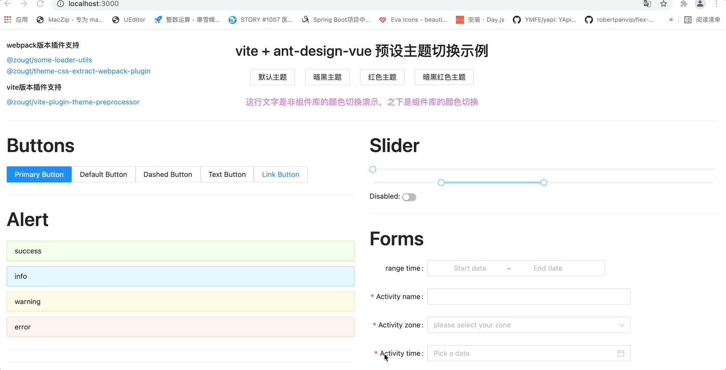
预设多种主题,其实也可以用动态主题模式来做,如需类似效果图中有暗黑主题的,可能使用此模式更加方便
# use npm
npm install @zougt/vite-plugin-theme-preprocessor -D
# use yarn
yarn add @zougt/vite-plugin-theme-preprocessor -D
vite.config.js
注意:以下的配置只适用于 预设主题模式。文档的参数值都是默认值。
import themePreprocessorPlugin from "@zougt/vite-plugin-theme-preprocessor";
export default {
  plugins: [
    themePreprocessorPlugin({
      scss: {
        // 是否启用任意主题色模式,这里不启用
        arbitraryMode: false,
        // 提供多组变量文件
        multipleScopeVars: [
          {
            scopeName: "theme-default",
            // 变量文件内容不应该夹带样式代码,设定上只需存在变量
            path: path.resolve("src/theme/default-vars.scss"),
          },
          {
            scopeName: "theme-mauve",
            path: path.resolve("src/theme/mauve-vars.scss"),
          },
        ],
        // css中不是由主题色变量生成的颜色,也让它抽取到主题css内,可以提高权重
        includeStyleWithColors: [
          {
            color: "#ffffff",
            // 此类颜色的是否跟随主题色梯度变化,默认false
            // inGradient: true,
          },
        ],
        // 默认取 multipleScopeVars[0].scopeName
        defaultScopeName: "",
        // 在生产模式是否抽取独立的主题css文件,extract为true以下属性有效
        extract: true,
        // 独立主题css文件的输出路径,默认取 viteConfig.build.assetsDir 相对于 (viteConfig.build.outDir)
        outputDir: "",
        // 会选取defaultScopeName对应的主题css文件在html添加link
        themeLinkTagId: "theme-link-tag",
        // "head"||"head-prepend" || "body" ||"body-prepend"
        themeLinkTagInjectTo: "head",
        // 是否对抽取的css文件内对应scopeName的权重类名移除
        removeCssScopeName: false,
        // 可以自定义css文件名称的函数
        customThemeCssFileName: (scopeName) => scopeName,
      },
      // less: {
      //   multipleScopeVars: [
      //     {
      //       scopeName: "theme-default",
      //       path: path.resolve("src/theme/default-vars.less"),
      //     },
      //     {
      //       scopeName: "theme-mauve",
      //       path: path.resolve("src/theme/mauve-vars.less"),
      //     },
      //   ],
      // },
    }),
  ],
};
在线切换主题
预设主题切换,需要做的事情
1、开发时只需,html标签的calss添加对应的scopeName,移除上个scopeName
2、打包后,如果开启extract: true,需要切换对应的link标签的href
可以选择使用如下封装好的方法,默认做好了这些事情。
import { toggleTheme } from "@zougt/vite-plugin-theme-preprocessor/dist/browser-utils";

toggleTheme({
  scopeName: "theme-default",
  // 可选,link的href处理,看情况用, 当启用 themePreprocessorPlugin 的 extract后才需要
  // customLinkHref: (href) => href,
  // 可选,默认对应 themePreprocessorPlugin 的 themeLinkTagId
  // themeLinkTagId: "theme-link-tag",
  // 可选 "head" || "body"
  // themeLinkTagInjectTo: "head",
  // 可选,对应 themePreprocessorPlugin 的 multipleScopeVars
  // multipleScopeVars
});
预设多主题编译原理示例(以 sass 为例)
变量文件内容不应该夹带样式代码,设定上只需存在变量
//src/theme/default-vars.scss
/**
*此scss变量文件作为multipleScopeVars去编译时,会自动移除!default以达到变量提升
*同时此scss变量文件作为默认主题变量文件,被其他.scss通过 @import 时,必需 !default
*/
$primary-color: #0081ff !default;//src/theme/mauve-vars.scss
$primary-color: #9c26b0;其他使用了变量的文件
//src/components/Button/style.scss
@import "../../theme/default-vars";
.un-btn {
  position: relative;
  display: inline-block;
  font-weight: 400;
  white-space: nowrap;
  text-align: center;
  border: 1px solid transparent;
  background-color: $primary-color;
  .anticon {
    line-height: 1;
  }
}
编译之后
src/components/Button/style.css
.un-btn {
  position: relative;
  display: inline-block;
  font-weight: 400;
  white-space: nowrap;
  text-align: center;
  border: 1px solid transparent;
}
.theme-default .un-btn {
  background-color: #0081ff;
}
.theme-mauve .un-btn {
  background-color: #9c26b0;
}
.un-btn .anticon {
  line-height: 1;
}对于*.module.scss,得到的 css 类似:
.src-components-Button-style_un-btn-1n85E {
  position: relative;
  display: inline-block;
  font-weight: 400;
  white-space: nowrap;
  text-align: center;
  border: 1px solid transparent;
}
.theme-default .src-components-Button-style_un-btn-1n85E {
  background-color: #0081ff;
}
.theme-mauve .src-components-Button-style_un-btn-1n85E {
  background-color: #9c26b0;
}
.src-components-Button-style_un-btn-1n85E
  .src-components-Button-style_anticon-1n85E {
  line-height: 1;
}使用了插件钩子:
- config
- configResolved
- buildStart
- generateBundle
- transformIndexHtml
核心功能是 @zougt/some-loader-utils提供的 getLess 和 getSass ,目前没有 stylus的需求
可以将某种不是由主题变量生成的颜色都抽取到主题 css 中,可能比 multipleScopeVars[].includeStyles 更加方便解决一些样式权重问题
v1.4.0+ , 动态主题模式和预设主题模式均可用
themePreprocessorPlugin({
  // css中不是由主题色变量生成的颜色,也让它抽取到主题css内,可以提高权重
  includeStyleWithColors: [
    {
      color: "#ffffff",
    },
  ],
});只能用在预设主题模式
Type: Object
当存在以下情况时,可以用这个属性处理
.theme-blue .el-button:focus,
.theme-blue .el-button:hover {
  /*这里的color值由 $primary-color 编译得来的,所以选择器前面加了 .theme-blue 提高了权重*/
  color: #0281ff;
  border-color: #b3d9ff;
  background-color: #e6f2ff;
}
.el-button--primary:focus,
.el-button--primary:hover {
  /*这里的color值不是由 变量 编译得来的,这时就会被上面那个 color 覆盖了, 实际上这里的color才是需要的效果*/
  color: #fff;
}
const includeStyles = {
".el-button--primary:hover, .el-button--primary:focus": {
color: "#FFFFFF",
},
};
const multipleScopeVars = [
{
scopeName: "theme-default",
path: path.resolve("src/theme/default-vars.less"),
includeStyles,
},
{
scopeName: "theme-mauve",
path: path.resolve("src/theme/mauve-vars.less"),
includeStyles,
},
];得到
.theme-blue .el-button:focus,
.theme-blue .el-button:hover {
  /*这里的color值由 $primary-color 编译得来的,所以选择器前面加了 .theme-blue 提高了权重*/
  color: #0281ff;
  border-color: #b3d9ff;
  background-color: #e6f2ff;
}
.theme-blue .el-button--primary:focus,
.theme-blue .el-button--primary:hover {
  /*这里的color值不是由 变量 编译得来的,通过includeStyles也提高了权重得到实际的效果*/
  color: #ffffff;
}
出现权重问题效果图

使用了 includeStyles 的效果图

webpack 版本的实现方案请查看@zougt/some-loader-utils
注:由于 vite 内置 css 插件未提供外接
less、sass的口子(类似webpack-contrib/less-loader的implementation),在@zougt/vite-plugin-theme-preprocessor的 buildStart 内替换了相对于根目录的 node_modules 里面的less或sass
所以想要复原less或sass包的位置,可以重新安装依赖,也可以调用 resetStylePreprocessor 方法
// resetLess.js
import { resetStylePreprocessor } from "@zougt/vite-plugin-theme-preprocessor";
resetStylePreprocessor({ langs: ["less"] });
node resetLess.js