FEAT: option for responsive design #3056
Comments
|
@micker You can see that on the demo page: https://grapesjs.com/demo.html You can change the device to mobile, change the width of something and go back to desktop. The change is only applied for the mobile device. You can click on the view code icon at the top, scroll down to the bottom and you will see the media queries. |
|
Ah cool |
|
@MartinPutz I have implemented the responsive feature as shown in the getting started guide but when I click on the mobile icon, the layout is only squished. (The two-column layout does not change to two-row. Only the width is reduced) Can you pls help me if you have worked on the responsive design? |
|
This Option is Not available in Grapesjs MJML right ? |
hello i am not sure its not already implement but i didn't find where
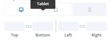
=> with grap we can change display for check responsive option but we can't change option for specific device ?
like change size of block on smartphone
exemple
what do you think about this ?
The text was updated successfully, but these errors were encountered: