some website elements don't meet recommended contrast standards #11448
Comments
|
This tool might be helpful in deciding whether/how to tweak contrast ratios https://contrast-ratio.com/?utm_campaign=chrome_series_contrastratio_050417&utm_source=chromedev&utm_medium=yt-desc It provides a quick and easy way to see the current ratio and to check the contrast ratio of proposed changes. Also note that the contrast recommendation for non-text UI elements (like the social links in the footer) is slightly lower than the recommendation for text contrast. https://www.w3.org/TR/WCAG21/#non-text-contrast |
|
I've updated the top post to add this note as a temporary work-around for anyone who may find it helpful: |
EDIT 2021-01-18: Anyone needing greater contrast may like to try @citrusella's Habitica WCAG AAA Contrast Stylus/Stylish theme.
In the Report a Bug guild, Donald Maness / @ddmaness (4d235d28-bd6f-4859-b222-e9a3f45ea212) has reported that the elements below don't meet recommended contrast minimum standards for text and non-text UI elements.
"All Items tested in Chrome on Oct. 16 2019 against WCAG's 2.1 AA standards"
Ref: 1.4.3 Contrast (Minimum)
I'll leave this as suggestion-discussion for a while and then if there's no objections to this approach I'll mark it as help wanted and suggest that a contributor could claim either all these items at once or just one/some of them. If the latter, I'll keep this post updated with the ones that are still open for claiming. @Tressley might want to provide comments or specific instructions before this is ready to be worked on.
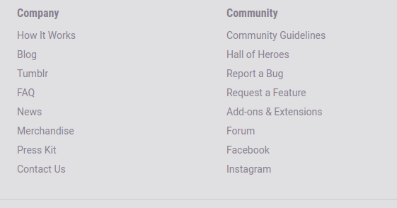
The grey text in the footer
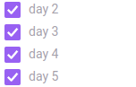
The grey text used for completed checklist items in the task menu
The white text used for the donate button in the footer

The yellow text used for the gold cost in the task section's reward column

The blue text used for the mana cost in the skills section

The grey text for each column in the task section explaining what the column is used for

The light blue text used for links in tasks

The social links in the footer

The white text used for the "daily" and "to do" column counter

The text was updated successfully, but these errors were encountered: