In this Code Pattern composite, we'll demonstrate how to analyze large datasets with Python data science packages. We'll provide an example use case of analyzing hourly air quality data provided by the EPA.
When the reader has completed this Code Pattern, they will understand how to:
- Create a Juypter notebook in Watson Studio
- Extract patterns from datasets using pandas
- Visualize data trends via matplotlib graphs
-
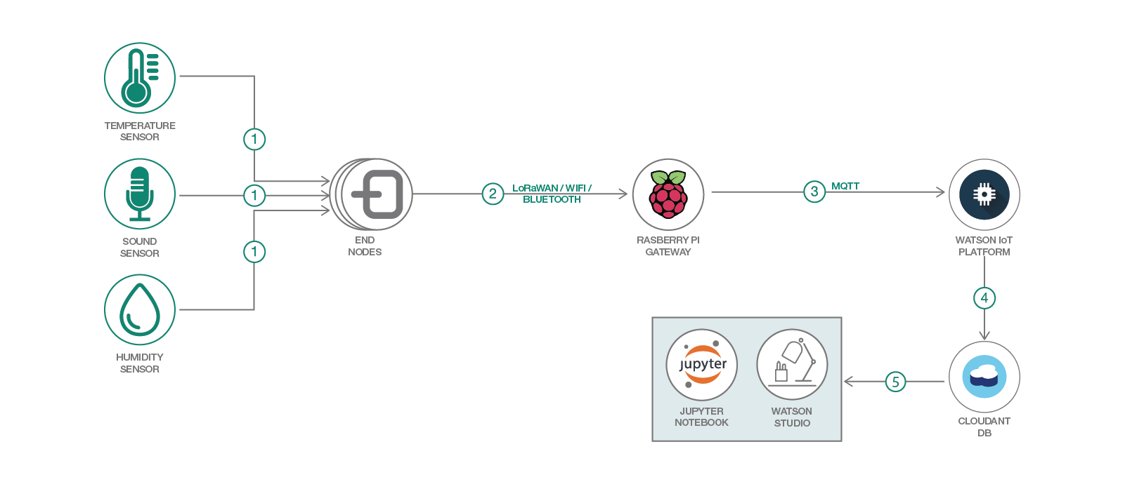
"End Node" device captures sensor data in the field
-
Captured data is sent through through a wireless protocol to a gateway
-
Gateway forwards data to IoT platform
-
Data packets received by IoT Platform are archived in Cloudant
-
Watson Studio imports archived data and processes data via Juypter notebooks
If expecting to run this application locally, please install python and pip, and then run the following pip command to install relevant python packages. This step can be bypassed if running in Watson Studio, as these packages should be included already.
pip install matplotlib pandas numpy
First, we'll need to deploy a "Watson Studio" service instance. This service offers multiple tools to analyze and format data
Navigate to the IBM Cloud dashboard at https://cloud.ibm.com/ and click the "Catalog" button in the upper right

Type in the name of the service "Watson Studio" and select the resulting icon

Select the pricing plan and click "Create". If deploying on an IBM Lite account, be sure to select the free "Lite" plan

Once the service has been provisioned, select the "Get Started" button to enter the Watson studio console

Once the Watson Studio dashboard has loaded, scroll to the "Projects" section and click "New Projects" to create a project.

Select a "Empty Project" as the project type

Enter a project name, and then click "Create"

Once the project has been created, a dashboard showing all the project assets will be displayed. We'll continue by adding a Juypter notebook to our project. This can be done by clicking the "Add to project" button and then clicking "New Notebook"

To import the notebook from this repository, select the "From URL" option and enter the name and URL

Now we'll go through the Jupyter notebook step by step. In this project, we're looking to explore trends in air pollutant levels throughout the US.
The first step here will import the various Python libraries. In this case, we'll be using pandas, numpy, and matplotlib. Pandas is generally used to Makes it easy to select portions of a dataset based on defined conditions, and enables map and reduce commands to be executed efficiently.

Next, we'll need to secure a useful dataset. After doing some initial searches, we found a public dataset released by the EPA containing hourly pollution data at various points throughout the US. We can download the dataset from an EPA database with wget like so. Since this is a .zip file, it'll also need to be extracted using the unzip command.

Now, we can import the csv file as a pandas dataframe. This will allow us to easily organize and execute conditional queries on the data.

To inspect the newly created dataframe, we'll start by running the .head() method. This allows us to view a subset of the dataframe (5 rows by default).

We can see from the values defined in the "Parameter Name" and "Units of Measure" that the pollutant being monitored is defined as "Nitrogen dioxide", and that the number reported is "Sample Measurement"
Using the .describe() command on the "Sample Measurement" column shows a basic statistical summary of all measurements in the dataset, such as the total number of elements, mean, spread, standard deviation, etc.

We can filter down to only select air quality sites in a specific state by using the .loc method. This method allow us to select a subset of rows that meet certain conditions. In this case, the conditional is essentially saying Select rows where 'State Name' is 'California'

We can drill down even further to only select sites within the Los Angeles area. We'll do this by providing a set of Longitude / Latitude boundaries, and utilizing multiple '&' conditional statements.

Combining the .unique() method and .shape on the "Site Num" column from the result shows that the dataframe has been reduced to show data for 12 sites.

To visualize where each monitoring station is located, we'll export the result to a csv file with the command
los_angeles_site_data.to_csv('/Users/kkbankol@us.ibm.com/Documents/los_angeles_site_data.csv', index=False)
And load the CSV export into our previous "Smart City Mapping" composite application using the "Import CSV File" button and selecting the relevant titles.

Next we'll trim the dataframe down to a subset of the following columns.
- Site Number
- Location (Longitude, Latitude)
- Time
- Date
- State
- Sample Measurement
This can be done by providing a list of columns within double brackets like so

We'll also merge the "Date Local" and "Time Local" columns into an "Timestamp" column. This process converts each pair of time / date strings into a unix timestamp. This makes it easier to order the time values on an x-axis plot.

And now we can plot the air quality trends throughout the year. There are a few ways to do this, and the first that comes to mind is to separate the data by monitoring station. We can extract the data associated with a single monitoring site by again using the .loc command like aq_data_trimmed.loc[ aq_data_trimmed['Site Num'] == site ]
To plot these datasets on a chart, we can loop through the array of sites like so, and call the plt.plot() method during each iteration. We'll be passing two arguments to this method, a list for the x axis (time) and y axis (measurement value). So here we're able to view the air quality in chronological order throughout the year.

Since plotting so many different points on the same chart creates a result that can be difficult to interpret, we'll split into separate charts for each station by using the subplot() method of matplotlib.

Another way to explore the data can be to plot the hourly air quality by weekday. In this case, we'll do so by using the strptime package to extract the weekday name based on the data, and placing the result into a "Weekday" column.
After this conversion, we can then loop through an array of Weekdays (Monday - Sunday) and an inner loop of hours (0-24), and take the total of each selection using the .sum() method. So for example, each plotted point will represent the total measurement collected at a given time and weekday.

We can also see that each chart here follows a specific trend, where the air pollution peaks in the morning (between 6:00 and 10:00 am) and in the afternoon (between 4:00 to 8:00 pm), which suggests that rush hour traffic is a strong contributor to this particular pollutant. However, there are other possible contributors as well, such as shipping ports, flights, factory emissions, etc.
In conclusion, this notebook offers a few different examples of ways that developers may take advantage of open source software packages to analyze datasets.
This code pattern is licensed under the Apache Software License, Version 2. Separate third party code objects invoked within this code pattern are licensed by their respective providers pursuant to their own separate licenses. Contributions are subject to the Developer Certificate of Origin, Version 1.1 (DCO) and the Apache Software License, Version 2.