
 Catppuccin for daisyUI
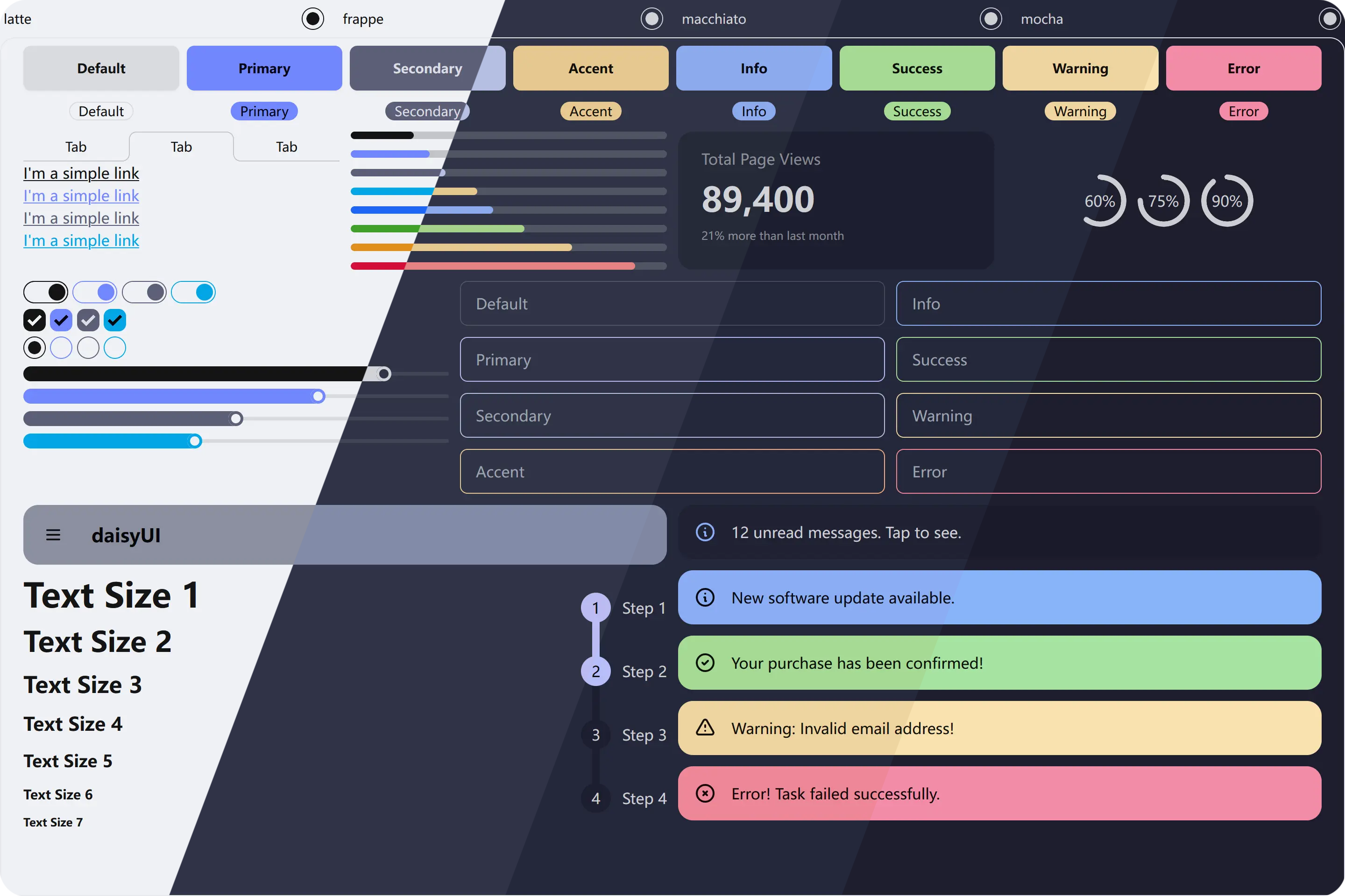
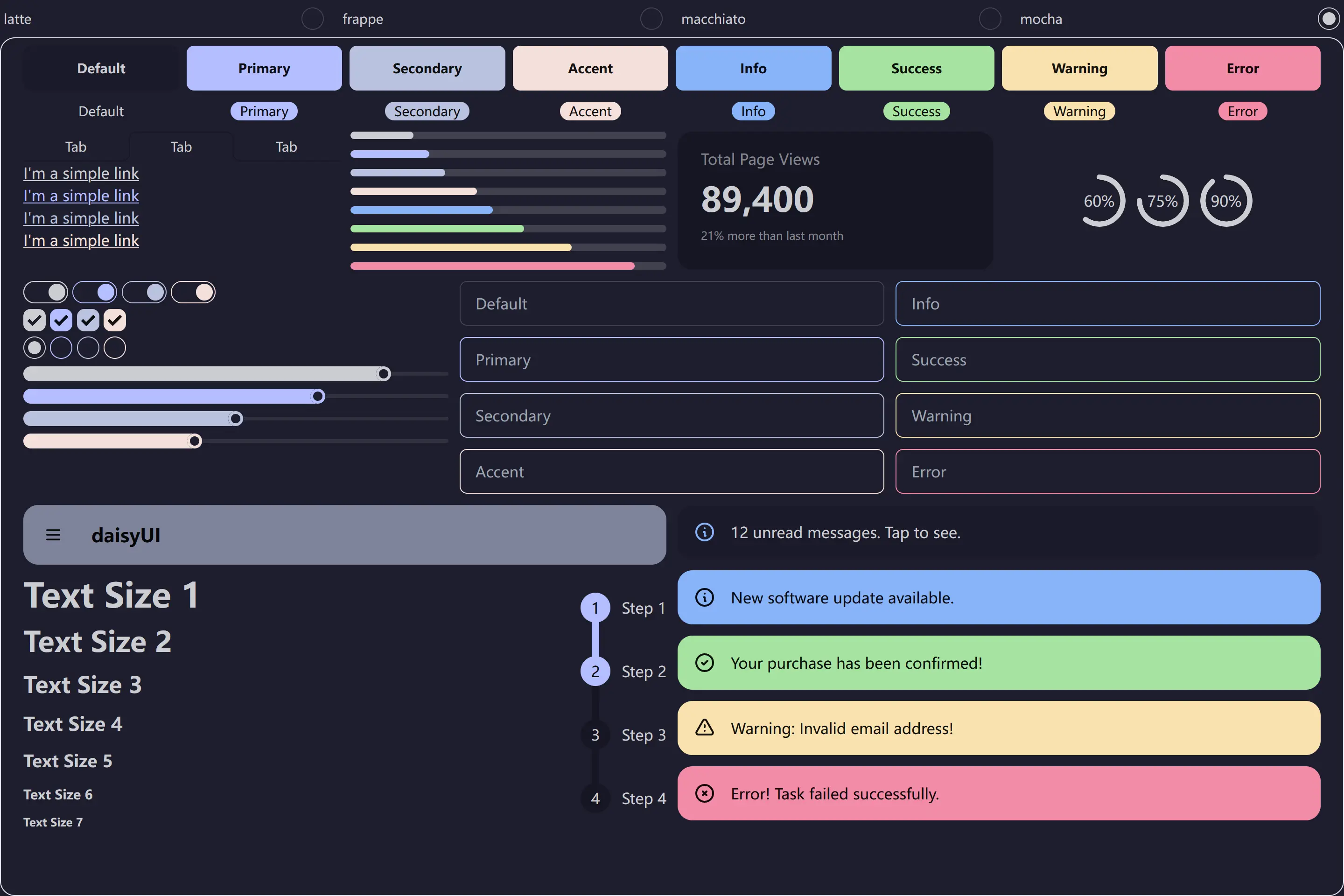
🌻 Latte
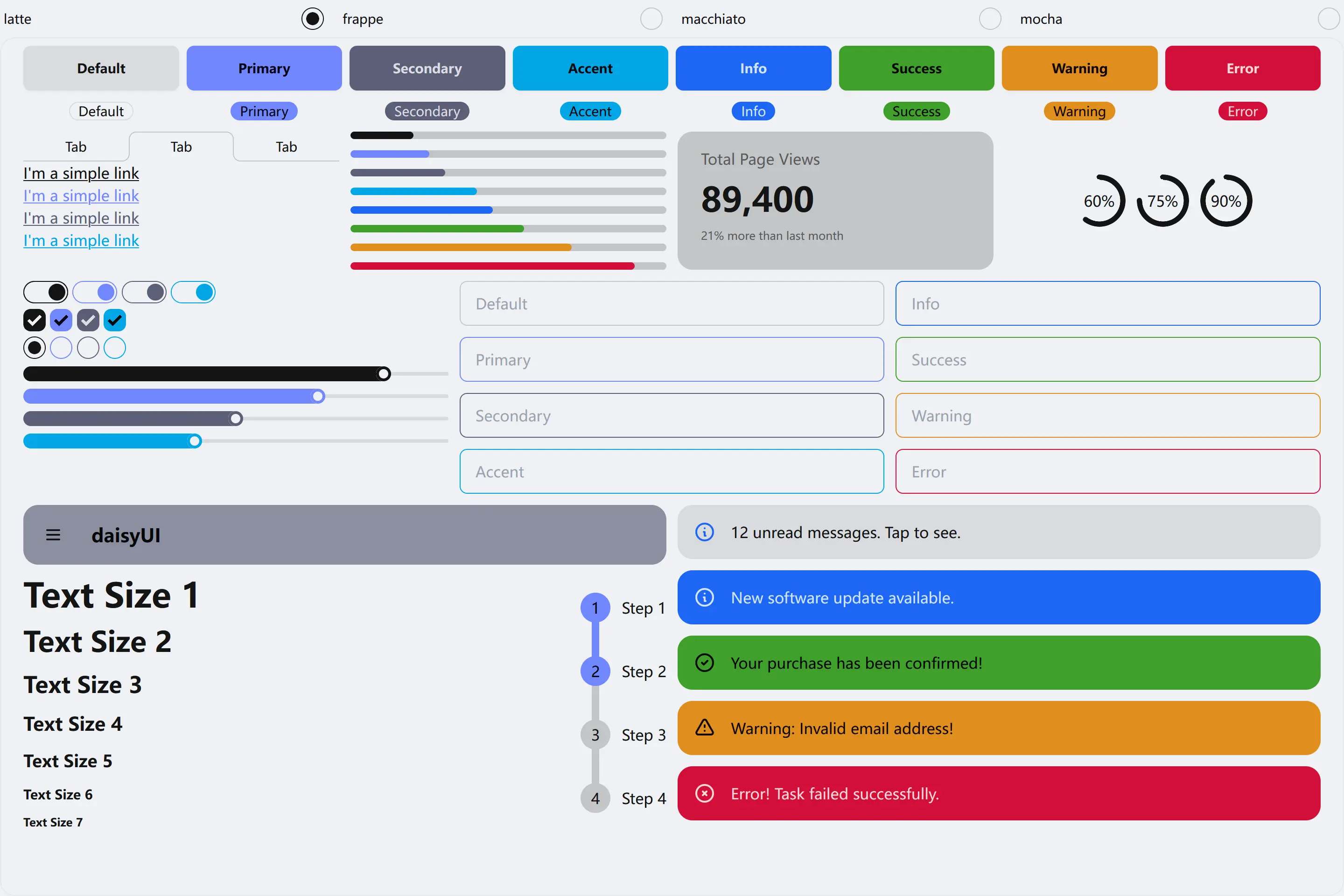
🪴 Frappé
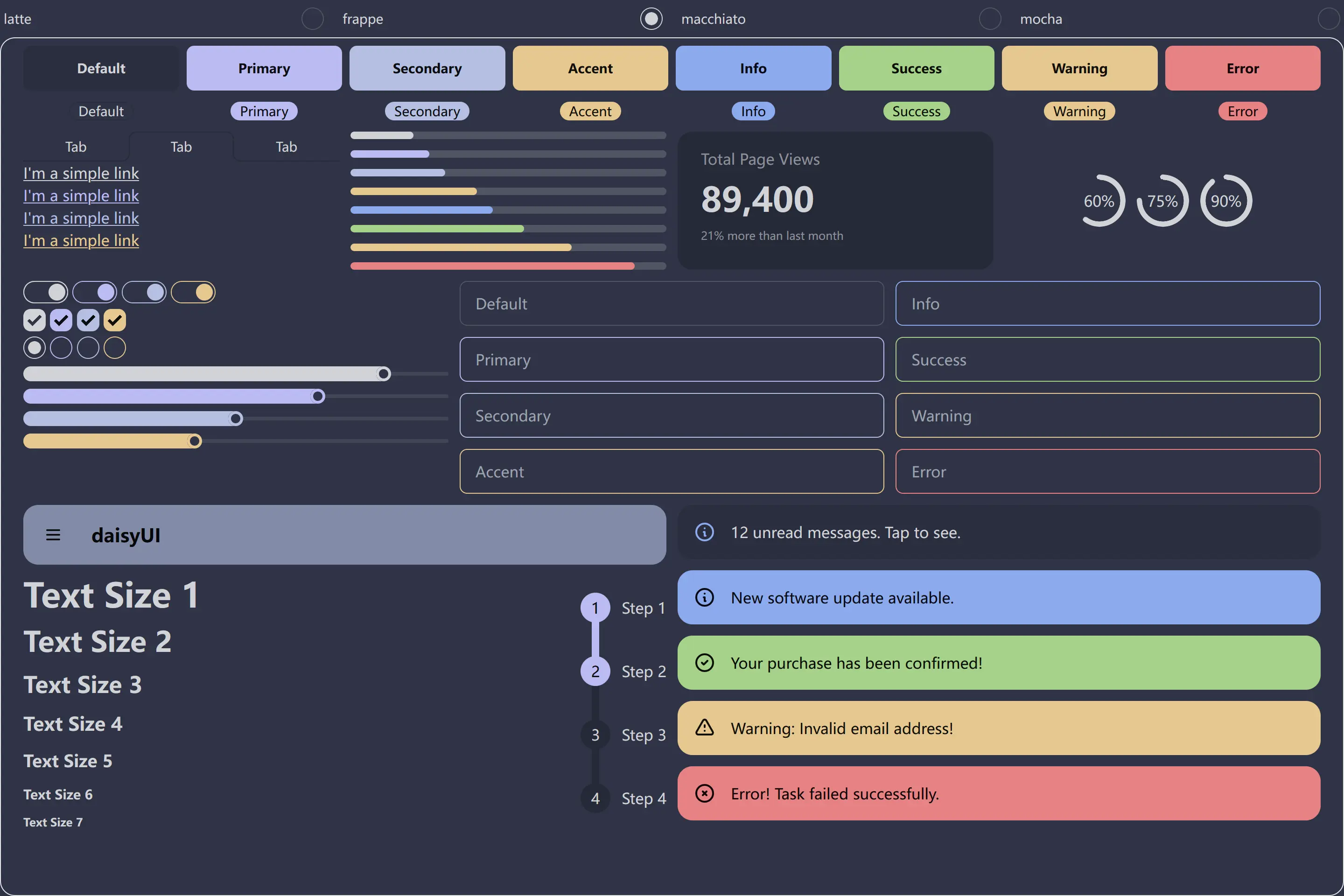
🌺 Macchiato
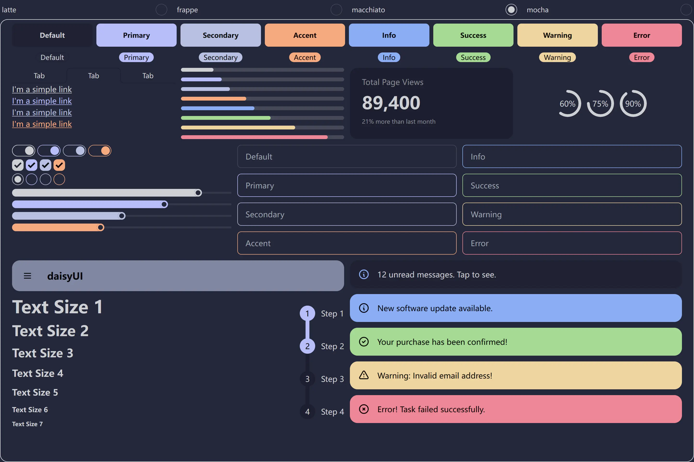
🌿 Mocha
| npm | pnpm | yarn |
|---|---|---|
| npm install -D @catppuccin/daisyui | pnpm install -D @catppuccin/daisyui | yarn install -D @catppuccin/daisyui |
// tailwind.config.js
import catppuccin from '@catppuccin/daisyui'

module.exports = {
  content: ['./src/**/*.{js,ts}', 'index.html'],
  plugins: [require('daisyui')],
  daisyui: {
    themes: [
      'light',
      // You can simply select a catppuccin flavor with sane default colors
      catppuccin('latte'),
      // Or you can optionally specify accent colors
      catppuccin('frappe', 'pink'),
      // Or you can optionally customize more semantic colors
      catppuccin('macchiato', { primary: 'maroon' }),
      // Values not explicitly defined will use default values
      catppuccin("mocha", { primary: 'sky', secondary: 'rosewater' }),
    ],
  },
};- Latte, Frappe, Macchiato, Mocha
- Optional fields: primary, secondary, accent, neutral, info
Note: We do not recommend changing any colors other than the primary and accent, although we provide a way to do so
- Accent Colors: rosewater, flamingo, pink, mauve, red, maroon, peach, yellow, green, teal, sky, sapphire, blue, lavender
- Can be assigned to
primary,secondary,accentandinfosemantic color values
- Can be assigned to
- Monochromatic Colors: text, subtext1, subtext0, overlay2, overlay1, overlay0, surface2, surface1, surface0, base, mantle, crust
- Can be assigned to
secondaryandneutralsemantic colors values
- Can be assigned to
<div class="grid grid-cols-2 gap-2 md:grid-cols-4 lg:grid-cols-8">
  <button class="btn">Default</button>
  <button class="btn btn-primary">Primary</button>
  <button class="btn btn-secondary">Secondary</button>
  <button class="btn btn-accent">Accent</button>
  <button class="btn btn-info">Info</button>
  <button class="btn btn-success">Success</button>
  <button class="btn btn-warning">Warning</button>
  <button class="btn btn-error">Error</button>
</div>
You can find the example in the example floder.

Copyright © 2021-present Catppuccin Org
