Morabaa Provider is a versatile library for creating and managing customizable popups in your React applications. It offers a simple API and various configuration options to make your popups look and behave just the way you want.
You can easily install Morabaa Provider via npm or yarn:
npm install morabaa-provider
# or
yarn add morabaa-provider
Set up the ProviderContainer component in your main application file (e.g., App.js or App.tsx):
import "./App.css"
import { ProviderContainer } from 'morabaa-provider';

const App = () => {
  return (
    <>
      {/* Your app code... */}
      <ProviderContainer />
    </>
  );
};

export default App;
Now you can use the PopupMe function to create popups anywhere in your application:
The PopupMe function takes two arguments: the first argument is the component that you want to render inside the popup it can be a React component or a function that returns a React component, and the second argument is an object containing the popup's options. You can find more information about the available options in the Popup Options section.
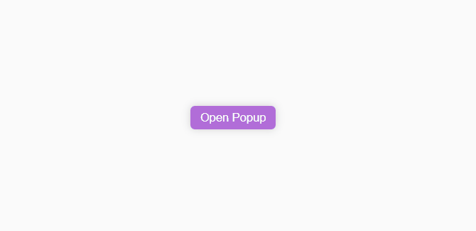
Create PopupExample.js or PopupExample.tsx and add this code to it:
import { PopupMe } from 'morabaa-provider';

const PopupExample = () => {
  return (
    <div className="test-container">
      <p className="test-button" onClick={() => PopupMe(<PopupChild />)}>
        Open Popup
      </p>
    </div>
  );
};

export default PopupExample;

const PopupChild = () => {
  return (
    <div className="test-col">
      <p className="test-label-red"> Hello World </p>
    </div>
  );
};
Include the PopupExample component in your main application file to see the result:
import "./App.css"
import React from "react";
import { ProviderContainer } from 'morabaa-provider';
import PopupExample from "./PopupExample";

const App = () => {
  return (
    <>
      {/* Your app code... */}
      <PopupExample />
      <ProviderContainer />
    </>
  );
};

export default App;
The result should look like this:
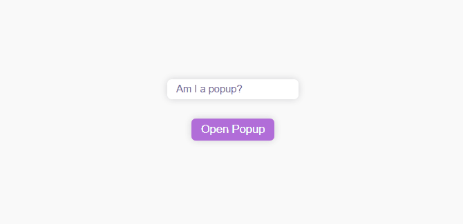
import { PopupMe } from 'morabaa-provider';

const PopupExample = () => {
  const [title, setTitle] = React.useState("Am I a popup?");
  return (
    <div className="test-container">
      <input className="test-input" value={title} onChange={(e) => setTitle(e.target.value)} />
      <p className="test-button" onClick={() => PopupMe(<PopupChild title={title} />)}>
        Open Popup
      </p>
    </div>
  );
};

export default PopupExample;

const PopupChild = ({ title }: PopupChildProps) => {
  return (
    <div className="test-col">
      <p className="test-label-red"> {title} </p>
    </div>
  );
};

interface PopupChildProps {
  title: string;
}
The result should look like this:
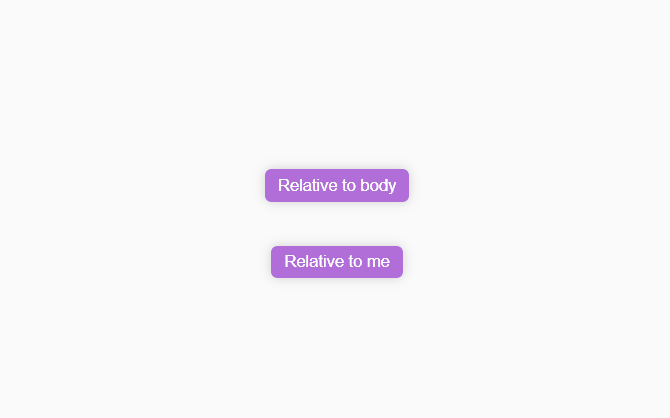
import { PopupMe } from 'morabaa-provider';

const PopupExample = () => {
  return (
    <div className="test-container">
      <p className="test-button" onClick={(e) => PopupMe(<PopupChild title="Am Relative to body " />)}>
        Relative to body
      </p>
      <p
        className="test-button"
        onClick={(e) =>
          PopupMe(<PopupChild title={"Am Relative to target"} />, {
            target: e.target as any,
          })
        }>
        Relative to me
      </p>
    </div>
  );
};

export default PopupExample;

const PopupChild = ({ title }: PopupChildProps) => {
  return (
    <div className="test-col min-w-max">
      <p className="test-label-red"> {title} </p>
    </div>
  );
};

interface PopupChildProps {
  title: string;
}
The result should look like this:
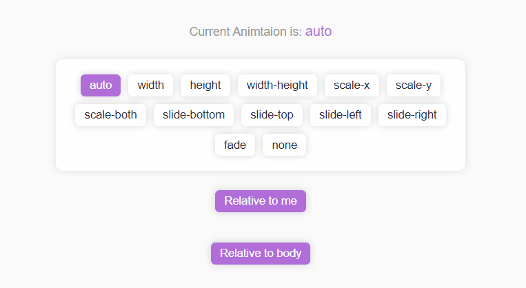
import { PopupMe } from 'morabaa-provider';

const animations = [
  "auto",
  "width",
  "height",
  "width-height",
  "scale-x",
  "scale-y",
  "scale-both",
  "slide-bottom",
  "slide-top",
  "slide-left",
  "slide-right",
  "fade",
  "none",
];

const PopupExample = () => {
  const [animation, setAnimation] = React.useState<any>("auto");

  return (
    <div className="test-container">
      <p className="test-label-gray">
        Current Animtaion is: <span className="test-label-red"> {animation} </span>
      </p>

      <div className="test-wrap">
        {animations.map((anim) => (
          <div className={`test-button ${animation === anim ? "" : "bg-white"}`} key={anim} onClick={() => setAnimation(anim)}>
            {anim}
          </div>
        ))}
      </div>

      <p className="test-button" onClick={(e) => PopupMe(<PopupChild animation={animation} />, { target: e.target as any, animation })}>
        Relative to me
      </p>

      <p className="test-button" onClick={() => PopupMe(<PopupChild animation={animation} />, { animation })}>
        Relative to body
      </p>
    </div>
  );
};

export default PopupExample;

const PopupChild = ({ animation }: PopupChildProps) => {
  return (
    <div className="test-col min-w-max">
      <p className="test-label-red">
        <span className="test-label-gray">animation: </span>
        {animation}
      </p>
    </div>
  );
};

interface PopupChildProps {
  animation: string;
}
The result should look like this:
import { PopupMe } from 'morabaa-provider';

const placementsWithBody = ["auto", "center", "top", "top-left", "top-right", "bottom", "bottom-left", "bottom-right", "left", "right", "none"];

const PopupExample = () => {
  const [placement, setPlacement] = React.useState<any>("auto");
  return (
    <div className="test-container">
      <h1 className="test-label-gray">Placements with target</h1>
      <div className="test-wrap gap">
        {placementsWithBody.map((plac: any) => (
          <div
            className={`test-button ${placement === plac ? "" : "bg-white"}`}
            key={plac}
            onClick={() => {
              setPlacement(plac);
              PopupMe(<PopupChild placement={plac} />, { placement: plac });
            }}>
            {plac}
          </div>
        ))}
      </div>
    </div>
  );
};

export default PopupExample;

const PopupChild = ({ placement }: PopupChildProps) => {
  return (
    <div className="test-col min-w-max">
      <p className="test-label-red" style={{ textAlign: "center" }}>
        <span className="test-label-gray"> placement: </span>
        {placement}
      </p>
    </div>
  );
};

interface PopupChildProps {
  placement: string;
}
The result should look like this:
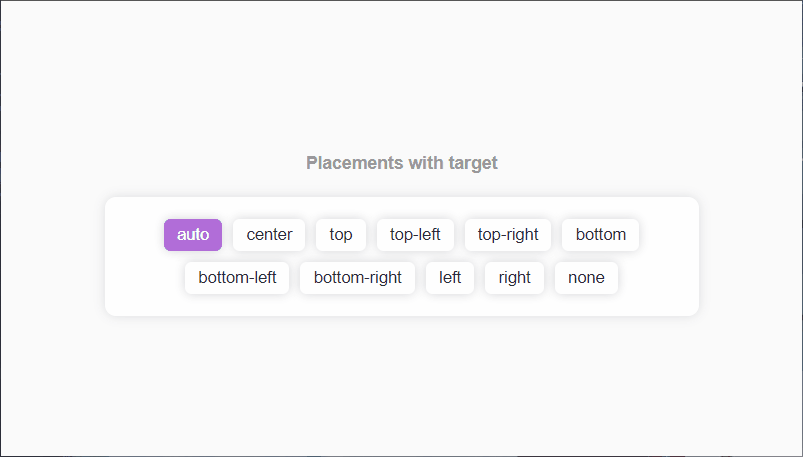
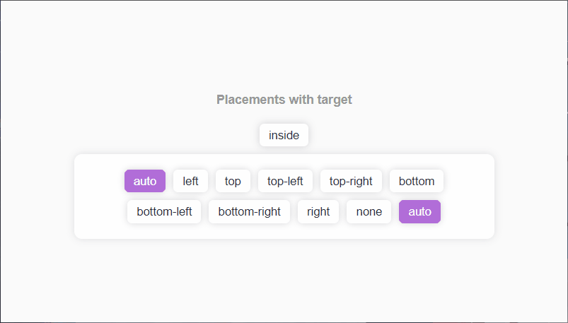
import { PopupMe } from 'morabaa-provider';

const placementsWithTarget = ["auto", "left", "top", "top-left", "top-right", "bottom", "bottom-left", "bottom-right", "right", "none", "auto"];

const PopupExample = () => {
  const [placement, setPlacement] = React.useState<any>("auto");
  return (
    <div className="test-container">
      <h1 className="test-label-gray">Placements with target</h1>
      <div
        className={`test-button ${placement === "inside" ? "" : "bg-white"}`}
        key={"inside"}
        onClick={(e) => {
          setPlacement("inside");
          PopupMe(<PopupChild placement={"inside"} />, { target: e.target as any, placement: "inside" });
        }}>
        {"inside"}
      </div>
      <div className="test-wrap gap">
        {placementsWithTarget.map((plac: any) => (
          <div
            className={`test-button ${placement === plac ? "" : "bg-white"}`}
            key={plac}
            onClick={(e) => {
              setPlacement(plac);
              PopupMe(<PopupChild placement={plac} />, { target: e.target as any, placement: plac });
            }}>
            {plac}
          </div>
        ))}
      </div>
    </div>
  );
};

export default PopupExample;

const PopupChild = ({ placement }: PopupChildProps) => {
  return (
    <div className="test-col min-w-max">
      <p className="test-label-red">
        <span className="test-label-gray"> placement: </span>
        {placement}
      </p>
    </div>
  );
};

interface PopupChildProps {
  placement: string;
}
The result should look like this:
You can configure the ProviderContainer component by passing the following props to it:
| Name | Type | Default | Description |
|---|---|---|---|
| containerClass | string |
"" | The class name of the popup container. |
| childClass | string |
"" | The class name of the popup's child. |
| overlayClass | string |
"" | The class name of the popup's overlay. |
| offset | object |
{x:0,y:0} | The offset of the popup. |
| animationTime | number |
300 | The animation time of the popup. |
| clearOnNavigation | boolean |
true | Whether to clear all popups when the user navigates to another page. |
You can configure each popup by passing the following options to the PopupMe function:
| Name | Type | Default | Description |
|---|---|---|---|
| id | string |
global | The id of the popup. If not provided, a random id will be generated. |
| placement | string |
auto | The placement of the popup. It can be one of the following: auto, inside, center, top, bottom, left, right, top-left, top-right, bottom-left, bottom-right, none. |
| target | Element |
body | The target element of the popup. If not provided, the popup will be rendered relative to the body. |
| overlay | boolean |
true | Whether to render an overlay behind the popup. |
| componentProps | any |
null | The props to be passed to the component. |
| removeOnOutClick | boolean |
true | Whether to remove the popup when the user clicks outside of it. |
| offset | object |
{x:0,y:0} | The offset of the popup. |
| viewPort | object |
window | The viewport of the popup. |
| childClass | string |
"" | The class name of the popup's child. |
| onRemoved | function |
null | A function to be called when the popup is removed. |
| containerClass | string |
"" | The class name of the popup's container. |
| animation | string |
auto | The animation of the popup. It can be one of the following: auto, width, height, width-height, scale-x, scale-y, scale-both, slide-bottom, slide-top, slide-left, slide-right, fade, none. |
Morabaa Provider comes with a set of predefined animations that you can use to animate your popups. You can also create your own animations by adding new CSS classes to the library's CSS file.
| Name | Description |
|---|---|
| auto | The default animation. It is the same as width-height. |
| width | The popup's width will be animated. |
| height | The popup's height will be animated. |
| width-height | The popup's width and height will be animated. |
| scale-x | The popup's width will be animated. |
| scale-y | The popup's height will be animated. |
| scale-both | The popup's width and height will be animated. |
| slide-bottom | The popup will slide from the bottom. |
| slide-top | The popup will slide from the top. |
| slide-left | The popup will slide from the left. |
| slide-right | The popup will slide from the right. |
| fade | The popup will fade in and out. |
PopupMe(Component: PopupComponentType, options: PopupOptions = {})PopupMe is the main function of the library. It takes a React component and renders it as a popup. It returns a function that can be used to remove the popup.
Popup: PopupControllerPopup is the main controller of the library. It has the following properties:
| Name | Type | Default | Description |
|---|---|---|---|
| create | function |
null | A function to create a popup. |
| remove | function |
null | A function to remove a popup. |
| removeAll | function |
null | A function to remove all popups. |
| getPopup | function |
null | A function to get a popup by its id. |
| getPopups | function |
null | A function to get all popups. |
| getPopupIds | function |
null | A function to get all popup ids. |
PrintMe(props: PrintProps)PrintMe is a function that prints a component. It takes the following props:
| Name | Type | Default | Description |
|---|---|---|---|
| Component | React.ReactNode |
null | The component to be printed. |
| componentProps | any |
null | The props to be passed to the component. |
| afterPrint | function |
null | A function to be called after the component is printed. |
What dose it do?
It create the component in a hidden div and wait for all images to be loaded then disable every child in the body except the provided component and print the component and enable all children again.
So you don't need to worry about the images and other elements in the body and you can print the component without any problem.
You don't need to build a print page and you can print the component in the same page.
If you have any questions or need assistance, please reach out to Owl or open an issue on GitHub.