Chart Types
Some hints and tips about the graphs produced by benchee_html
This part compares the different benchmarking jobs against each other so you can see which performs better. They also try to give you a feel for how much results vary.
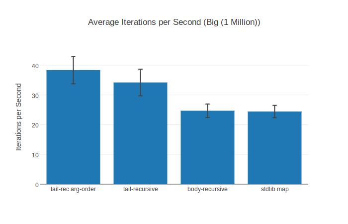
Plots the average iterations per second of the defined benchmarking jobs to see which perform better. This is augmented with the "black whiskers" that denote the standard deviation i.e. how much the results vary in one direction or the other.
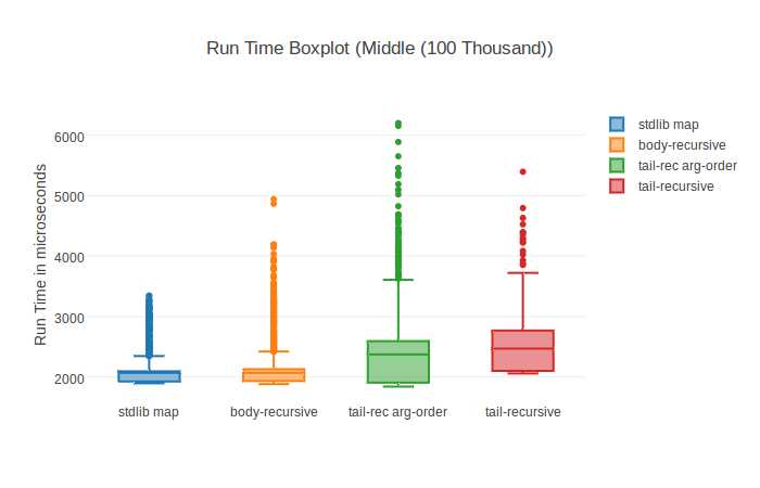
The Box Plot (Wikipedia) aims to help you understand the distribution of values better. It plots to run time - so lower is better. The middle line shows you the median of the distribution (sort all values, get the middle value aka a "typical" value) and then it is divided into further quartiles to show how many data points lie in which range. A more thorough explanation can be found at the plotly.js website - the graphing library benchee_html uses.
These graphs take a closer look at the run times of individual jobs.
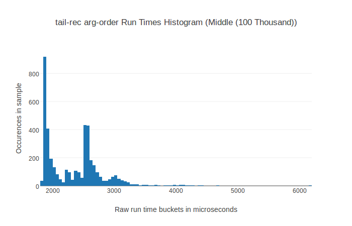
In a histogram the run times are sorted into bins of a specific size with the run time bins being on the x-axis while the y-access shows the number of occurrences of run times in this bin. This is made so that the visual distribution is apparent, it is good to see and check out which values occur often and are therefore typical and which values occur less often.
You will mostly notice that there are a lot of data points at the lower end of the graph and a few, almost invisible, at the right end of the graph. This due to outliers (non typical values) produced through garbage collection or other means.
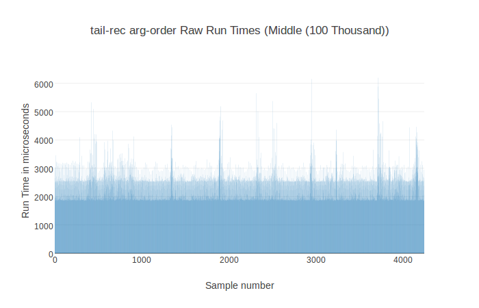
This chart simply plots the recorded run times in the order in which they were recorded. This can be quite nice to spot trends and anomalies. Do the run times get faster or slower over time? Is there any trend to them? Are there occasional spikes (could be garbage collection) or longer spikes (maybe something else needed computing)? Is there some pattern to it e.g fast/slow, fast/slow?
This chart helps answering these questions.