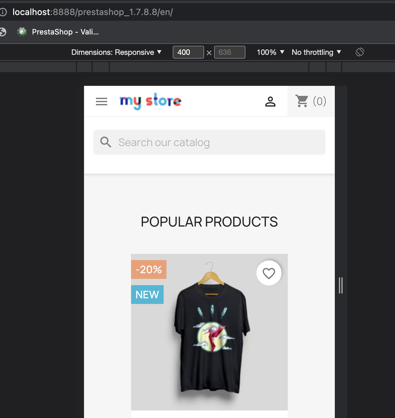
2 product columns on mobile changed to 1 column since 1.7.8.8 #30706
Comments
|
Hello @naprba I was able to reproduce the issue with PrestaShop version 1.7.8.8 and 8.0.0. It's a regression! 1.7.8.7 ✅
1.7.8.8 ❌
8.0.0 ❌
I’ll add this to the debug backlog so that it’s fixed. Please be aware that due to the high number of reported issues, some bugs might take a very long time to be resolved. If this issue is important to you and you cannot wait for it to be fixed on the project’s own time, we strongly suggest you consider hiring a specialist to help you. If you manage to get the problem fixed, then please contribute the fix back to the project as a Pull Request. Remember that the more people contribute, the better PrestaShop becomes for everyone. Thank you |


 hibatallahAouadni
added
Minor
hibatallahAouadni
changed the title
hibatallahAouadni
added
Minor
hibatallahAouadni
changed the title
|
That's because when product has several labels they cover most of the image at 2 items per row, especially on some languages. IMO it's an improvement, not a bug 😉 Otherwise labels would have to be moved out of the image or made much smaller. The only problem now is 250x250 images are too small.
|

|
If the issue comes from the label, the label should be smaller. |
|
On 400px width and with labels improvements maybe it could be squeezed to 2 per row, but mobile starts at 320px so it still would be too small for classic theme. New default theme for PS 8.x will have better configuration and shop admin will be able to set default size for the product grid item for mobile and desktop (work in progress). |
|
for completing the information about mobile screen resolutions:
320px is used by very old phones nowadays as show in the graph and tabel before. Anyway lables must depends on caracter size of the device to accomodate the scaling in better way. There are many tricks to use Viewport size that works also with desktop using a mix like:
|


|
I agree for the two columns, it's much better. |
Prerequisites
Describe the bug and add attachments
Hi Guys,
I noticed that after upgrading from 1.7.8.7 to 1.7.8.8 there is no more 2 product columns on mobile.
1.7.8.7 and a few previous versions already had 2 product columns implemented on mobile by default, but after the upgrade it is back to 1 column.
I am using the standard PrestaShop theme.
Expected behavior
2 product columns to remain on mobile after the upgrade.
Steps to reproduce
PrestaShop version(s) where the bug happened
1.7.8.8 & 8.0.0
PHP version(s) where the bug happened
No response
If your bug is related to a module, specify its name and its version
No response
The text was updated successfully, but these errors were encountered: