You signed in with another tab or window. Reload to refresh your session.You signed out in another tab or window. Reload to refresh your session.You switched accounts on another tab or window. Reload to refresh your session.Dismiss alert
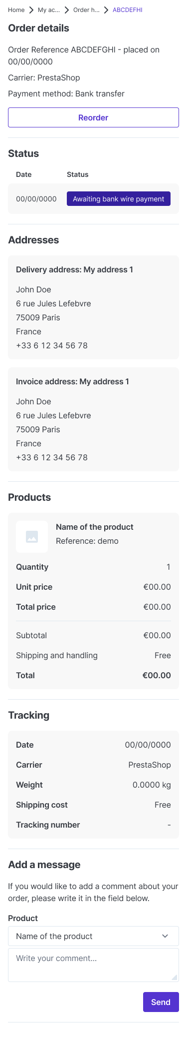
Ellipsis is used for breadcrumb, which means that some words have been shortened to fit the breadcrumb in a single line
Alignement
The header text in the first column is differentiated from the second column text by a heavier weight. It makes the header easy to read with its contrast.
The numeric alignment is applied for data related to size (e.g. the currency). The font used for numeric alignment is "Monospace", also known as "Tabular" font. This means that a wide letter such as "W" that is bigger than "I" will have the same width. It allows users to scan numerical data easier.
First column of data is aligned to the left and the second one is aligned to the right
Order details
Sections are better defined and identifiable by dividers and section titles (e.g. Addresses, Products, Tracking, etc)
In terms of alignment, the same rules apply
Image of the purchased product has been added so customers can remember the look of the product
Total price is differentiated from the rest by a heavier weight to create a contrast so it can easily be identified
Affordance has been improved by transforming the "Reorder" link into a button
Mockups
Order history and details
Order details
The text was updated successfully, but these errors were encountered:
Epic: #2
Desktop's issue: #22
Link to Figma prototype
UX and design explanations
Breadcrumbs
Alignement
Order details
Mockups
Order history and details

Order details
The text was updated successfully, but these errors were encountered: