Revise the alignment and placement of the opening line shadow text #254
Comments
|
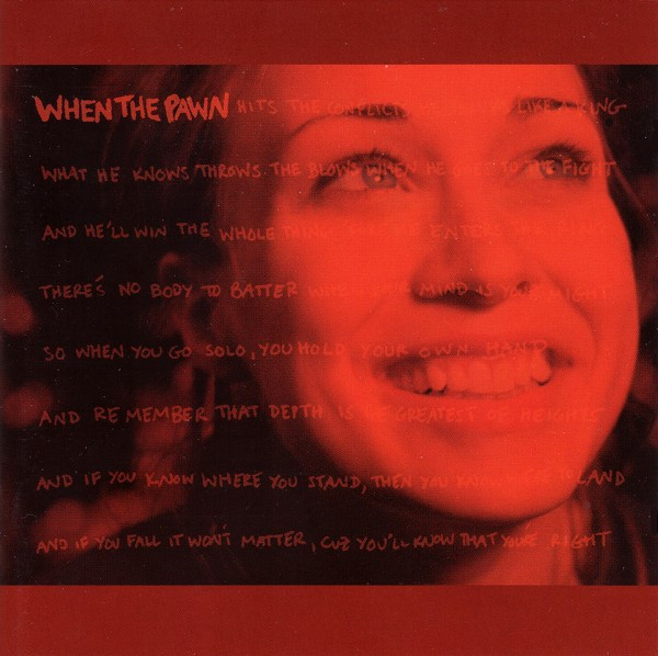
@rlskoeser @gwijthoff I have proposed a variety of text shadows. Please take a look and tell me if you have suggestions on which ones to omit or pursue. here they are on Figma, There are labels explaining what's different about each. I'll scale and place on mobile once we eliminate some, having a hard time deciding. |
|
@gissoo exciting! I think the overlapping layers with same size and opacity are impossible to read and end up looking jumbled, I would eliminate those. I like the different size and opacity a lot. The gradient versions are interesting, but I'm not sure if I like them are not; they would be more difficult to implement, which worries me at this point. I don't think I can apply a gradient to a text shadow, which was how I was planning to implement the secondary version of the background text. |
|
I was initially drawn the most to option 4: same size, different opacities, linear gradient, because the shadow text draws back / recedes as the eye approaches the main text, allowing it to stand out more. Looks cool. But if @rlskoeser thinks it will be difficult to implement, it's certainly not necessary. Option 2 isn't my favorite from an aesthetic perspective, but I don't really have a justification for that feeling. It reminds me of some 1990s album covers, but I guess the 90s are back now, right? Maybe a new option "3.5" could be a happy medium? Same size, different opacities, no gradient? |
|
@rlskoeser @gwijthoff thanks for writing, all makes sense. here is version 3.5 (same size, different opacities, no gradient). Grant, the reason I didn't offer the 3.5 is that without the gradient you can see the lighter shadow starts in the middle of the page and to me that looks a bit horrible, I don't think we should display that. Could we go with 3.6? It won't be overlapping with the main content though, kind of boring but I prefer it to 3.5. (don't like it as much as 2 and 3 though, but it's ok.) |
|
@gissoo thanks for sketching these extra options -- it's much easier to visualize their pros and cons now! If you think option 3 would work without a gradient, let's go that direction since you're more excited about it. I can see how having shadow text behind the main body text would make things more immersive and interesting, definitely. As long as it doesn't interfere with readability, I see where you're coming from. |
|
@gwijthoff Option 3 without the gradient is 3.5 – I think it won't work without the gradient, it's the "a bit horrible" case I mentioned :D |
|
@gissoo 🤦 sorry, I meant option 2. Despite my 90s comment. If you think it's the most interesting among the options we haven't eliminated for readability reasons, then let's go for it. |
|
@rlskoeser @gwijthoff thanks for your comments. I've picked option 2 and applied it on mobile as well – please read the text for implementation on the left of the designs and let me know if they don't make sense for implementation I can resolve or reframe. |
|
@gissoo looks great to me, thanks for the detailed notes. @gwijthoff approve? ok to start implementing when I'm ready? |
|
Looks awesome, thanks @gissoo! Can't wait to see it on the site. |
No description provided.
The text was updated successfully, but these errors were encountered: