feat(styles): introduce message popover component [ci visual] #3937
Conversation
✅ Deploy Preview for fundamental-styles ready!
To edit notification comments on pull requests, go to your Netlify site settings. |
There was a problem hiding this comment.
Popover should a bit overlap its trigger in Fiori 3
Curr:
Specs:
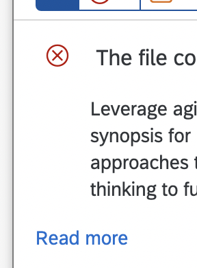
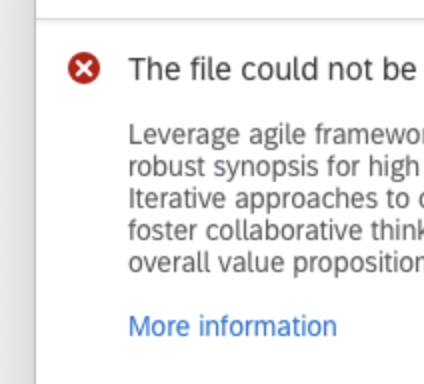
Read more should be under the next, not under the icon
Curr:
Specs:
In details mode we should see back button in header
Let's add example of message popover in details mode so we can track its visuals in chromatic
Specs:
Header elements sticked to the border in HC themes
Icons should be filled in Fiori themes, not outlined
Curr:
Specs:
src/styles/message-popover.scss
Outdated
| .#{$block} { | ||
| &__trigger { | ||
| @include fd-focus() { | ||
| outline-color: var(--sapContent_ContrastFocusColor); | ||
| } | ||
|
|
||
| @each $state, $colors in $fd-trigger-states { | ||
| &--#{$state} { | ||
| --fdButtonColor: #{map-get(map-get($colors, "regular"), "color")}; | ||
| --fdButtonBackgroundColor: #{map-get(map-get($colors, "regular"), "backgroundColor")}; | ||
| --fdButtonBorderColor: #{map-get(map-get($colors, "regular"), "borderColor")}; | ||
|
|
||
| @include fd-hover() { | ||
| --fdButtonColor: #{map-get(map-get($colors, "hover"), "color")}; | ||
| --fdButtonBackgroundColor: #{map-get(map-get($colors, "hover"), "backgroundColor")}; | ||
| --fdButtonBorderColor: #{map-get(map-get($colors, "hover"), "borderColor")}; | ||
| } | ||
|
|
||
| @include fd-active() { | ||
| --fdButtonColor: #{map-get(map-get($colors, "active"), "color")}; | ||
| --fdButtonBackgroundColor: #{map-get(map-get($colors, "active"), "backgroundColor")}; | ||
| --fdButtonBorderColor: #{map-get(map-get($colors, "active"), "borderColor")}; | ||
| } | ||
| } | ||
| } | ||
| } |
Hey Platon. Thank you for your review. Couple of notes from my side:
|
|
Netlify for some reason doesn't update it's pipeline status, even though second deploy was successful, so ignore the error please. |
| $block: #{$fd-namespace}-message-view; | ||
|
|
||
| .#{$block} { | ||
| @include fd-reset(); |
There was a problem hiding this comment.
since you are using message view with the fd-scrollbar (fd-message-view fd-scrollbar) aren't there risks for overwriting the scrollbar rules with the reset? Also, the scrollbar itself comes with a reset
There was a problem hiding this comment.
Scrollbar aren't overwriting necessary parts of the message view. Technically, message view can be also used without fd-scrollbar, thus it also should contain own reset
| ); | ||
|
|
||
| .fd-button__icon { |
There was a problem hiding this comment.
you need to use #{$fd-namespace} instead of fd
| ); | ||
|
|
||
| box-shadow: $toggledActiveShadow; | ||
|
|
||
| .fd-button__icon { |
| @include fd-flex(column); | ||
| @include fd-list-ie11-active-state-fix(); | ||
|
|
||
| flex: 1 1 auto; |
There was a problem hiding this comment.
this should go in the block of @include fd-flex(column)
|
not really a big deal but designers might catch the 1px discrepancy with the design specs. The height of a single line is 2rem and the height of a byline is 3.25rem. |
|
Missing truncation rules for the title and subtitle. UI5: |


 N1XUS
force-pushed
the
feat/8329-message-popover
branch
from
N1XUS
force-pushed
the
feat/8329-message-popover
branch
from
5805c44
to
beb3be2
Compare
|
Great job, Denis! |
N1XUS
force-pushed
the
feat/8329-message-popover
branch
from
beb3be2
to
9d3c41a
Compare
Related Issue
Relates SAP/fundamental-ngx#8329
Description
Added new components:
Screenshots
Please check whether the PR fulfills the following requirements
remfd-*class is used in the filefd-rtl,fd-ellipsis,fd-flex,fd-selected,fd-focus, ect.)fd-reset()mixin is applied to all elementsnormalizeoptionunnormalizeoption[ci visual]so it can trigger chromatic visual regression (e.g.test: run chromatic visual regression [ci visual])