An interactive 'Gantt-like' chart for visualising project and portfolio information.
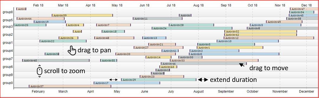
Time based activity attributes are grouped on the y-axis and the layout is optimised to reduce the overall chart size. The aim in most cases is to create a project or portfolio 'view on a page' Further insight can be gained by using any attribute to group /categorise the data.
Zoom exposes /hides text that doesn't fit inside the timeline bars and allows exploration of the plan in combination with the chart drag function. Bars can be individually re-sized or moved and the optimised layout is refreshed automatically. Later versions: • Combination with a grid to enable text editing • Drag and drop of multiple bars by group or all bars • An npm version with only the required d3 modules • User guide and examples. (d3 v3 Example)
The axes for the chart are from Vasco Asturiano Timelines Chart
const myChart = pegChart();
myChart
    .data(<myData>)
    (<myDOMElement>);
| Method | Description |
|---|---|
| data([array]) | Getter/setter for chart data (see below for syntax details). |
| category([string]) | Getter/setter for categories on the y-axis. |
| width([number]) | Getter/setter for the chart width in px. |
| maxHeight([number]) | Getter/setter for the chart's maximum height in px. |
| maxLineHeight([number]) | Getter/setter for the maximum height of each line, in px. |
| leftMargin([number]) | Getter/setter for the chart's left margin, which contains the left-side group axis labels. |
| rightMargin([number]) | Getter/setter for the chart's right margin, which contains the right-side series axis labels. |
| topMargin([number]) | Getter/setter for the chart's top margin, which contains the color legend. |
| bottomMargin([number]) | Getter/setter for the chart's bottom margin, which contains the time axis labels. |
[
  {
    group: "group name",
    label: "label name",  //colour attribute
    description: "bar text",
    start: "2019-01-01",  //yyyy-mm-dd
    finish: "2020-01-01" //yyyy-mm-dd
    description: "your text"
  }
]