
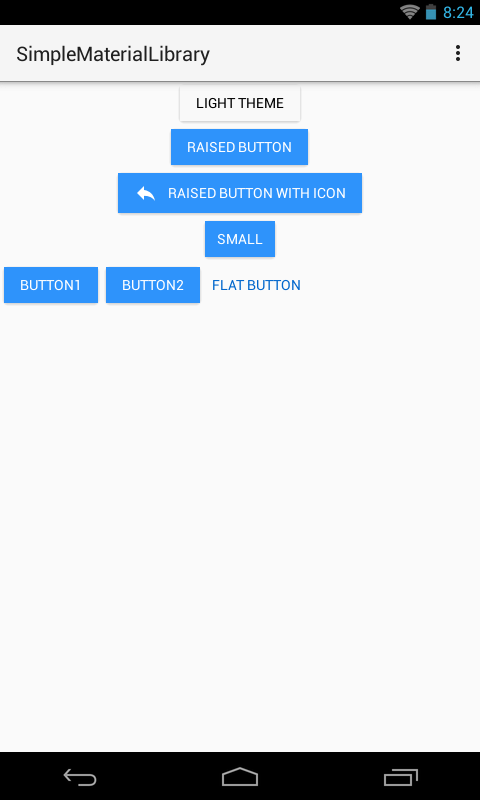
As the names says, it is a simple library which follows Google's Material Design. Lollipop specific effects (such as ripples) won't be ported-back to older versions of Android.
Simple Material Library is deprecated in favour of Google's Material dependency. For learning more about integrating that dependency, please refer to its getting started page.
##Gradle Dependency
Add following to your build.gradle file:
dependencies {
  compile 'com.github.sufianbabri:simple-material-library:0.1.7'
}
<com.simple.material.RaisedButton
        xmlns:raised_button="http://schemas.android.com/apk/res-auto"
        android:layout_width="wrap_content"
        android:layout_height="wrap_content"
        raised_button:text="Raised Button" />

<com.simple.material.RaisedButton
        xmlns:raised_button="http://schemas.android.com/apk/res-auto"
        android:layout_width="wrap_content"
        android:layout_height="wrap_content"
        raised_button:smallButton="true"
        raised_button:text="Small" />
<com.simple.material.FlatButton
		android:layout_width="wrap_content"
		android:layout_height="wrap_content"
		android:text="Flat Button"/>
| Attribute | Type | Description |
|---|---|---|
| iconStart | drawable | icon to show at left |
| iconLeft | drawable | icon to show at start |
| buttonColor | color | color of the button, if not provided, colorAccent is used |
| smallButton | boolean | true if you want this to be the smaller version of the button |
| minWidth | integer | Useful if custom width is desired for a small button. Default is 70dp |
| minHeight | integer | Useful if custom height is desired for a small button. Default is 36dp |
| text | String | text of the button |
| Attribute | Type | Description |
|---|---|---|
| textColor | color | the color of the text |
- fixed padding issue (#8),
- added
FlatButton, - colorAccent is now picked if no color is provided,
- other improvements to library,
- small
RaisedButtonis at least 70dp x 36dp - updated demo app,
- uploaded demo app to PlayStore.
- now supports icon (#7),
- height increased to 35dp of small
RaisedButton(previously it was 28dp), - changes to demo app.