/
session2.Rmd
413 lines (275 loc) · 17 KB
/
session2.Rmd
1
2
3
4
5
6
7
8
9
10
11
12
13
14
15
16
17
18
19
20
21
22
23
24
25
26
27
28
29
30
31
32
33
34
35
36
37
38
39
40
41
42
43
44
45
46
47
48
49
50
51
52
53
54
55
56
57
58
59
60
61
62
63
64
65
66
67
68
69
70
71
72
73
74
75
76
77
78
79
80
81
82
83
84
85
86
87
88
89
90
91
92
93
94
95
96
97
98
99
100
101
102
103
104
105
106
107
108
109
110
111
112
113
114
115
116
117
118
119
120
121
122
123
124
125
126
127
128
129
130
131
132
133
134
135
136
137
138
139
140
141
142
143
144
145
146
147
148
149
150
151
152
153
154
155
156
157
158
159
160
161
162
163
164
165
166
167
168
169
170
171
172
173
174
175
176
177
178
179
180
181
182
183
184
185
186
187
188
189
190
191
192
193
194
195
196
197
198
199
200
201
202
203
204
205
206
207
208
209
210
211
212
213
214
215
216
217
218
219
220
221
222
223
224
225
226
227
228
229
230
231
232
233
234
235
236
237
238
239
240
241
242
243
244
245
246
247
248
249
250
251
252
253
254
255
256
257
258
259
260
261
262
263
264
265
266
267
268
269
270
271
272
273
274
275
276
277
278
279
280
281
282
283
284
285
286
287
288
289
290
291
292
293
294
295
296
297
298
299
300
301
302
303
304
305
306
307
308
309
310
311
312
313
314
315
316
317
318
319
320
321
322
323
324
325
326
327
328
329
330
331
332
333
334
335
336
337
338
339
340
341
342
343
344
345
346
347
348
349
350
351
352
353
354
355
356
357
358
359
360
361
362
363
364
365
366
367
368
369
370
371
372
373
374
375
376
377
378
379
380
381
382
383
384
385
386
387
388
389
390
391
392
393
394
395
396
397
398
399
400
401
402
403
404
405
406
407
408
409
410
411
412
413
---
title: "Session 2"
author: "Kevin Wang and Garth Tarr"
date: "2 Dec 2019"
output:
html_document:
fig_height: 8
fig_width: 8
toc: yes
number_sections: true
toc_depth: 3
toc_float: yes
---
```{r setup, include=FALSE}
knitr::opts_chunk$set(results = "hide", fig.show = "hide", warning = FALSE, message = FALSE)
```
# Learning outcomes of this session
+ Join two data together using the `left_join` function
+ Making basic plots using `ggplot2`: boxplots, histograms and scatter plots
+ Use `pivot_longer` and `pivot_wider` to reshape data for visualisation purposes
+ Saving cleaned data for next stage of analysis
# Loading packages
```{r}
library(tidyverse)
```
# Loading cleaned sample data
Let's begin today by reading in the csv file that we created in session 1.
```{r}
session1_data = read_csv(file = "data/clean_sample_data.csv")
```
# Reading in gene expression data (top 6 rows) {#reading_ge}
Remember our aim for this workshop is to join the mice sample data with a mice gene expression data. `session1_data` is the sample data we have already cleaned yesterday, so we should now read in the gene expression data now.
This gene expression data was downloaded straight from the Gene Expression Omnibus and it was saved as a `txt` file. This `txt` file is more or less like a rectangular Excel sheet, with each row separated by a new line and each column is separated by a a single press of the "tab" button on the eyboard. Thus, we call this tab as the "delimiter" of this file. `R` understands this "tab" as `\t`.
The whole data has 54 rows, but for the sake of brevity, we will only read in the first 6 rows. We will also get rid of the first column of this raw data (the column of manufacturer's ID).
```{r}
raw_ge_data = read_delim(file = "data/GSE43251_NanoString_non-normalized.txt", delim = "\t", n_max = 6)
## Alternatively:
## raw_ge_data = read_tsv(file = "data/GSE43251_NanoString_non-normalized.txt", n_max = 6)
clean_ge_data = raw_ge_data %>%
dplyr::select(-1)
clean_ge_data
```
Let's try to understand this data before we proceed to the next section. The first column of this data contains the gene symbols that was measured by the gene expression machine. From the second column onwards, each column records the gene expression measurement for one mouse and the sample ID of the mouse is the column name (i.e. HW1, HW2, etc.).
So how should we join these two data? If we just stack the two data together, there are no guarantees to say that we will have the right ordering of sample ID. In fact, if you try to just bind the two sample IDs together, `R` will complain about this.
```{r, error = TRUE}
length(colnames(clean_ge_data)[-1]) ## Not counting the gene symbol column
length(session1_data$sample)
cbind(
colnames(clean_ge_data)[-1],
session1_data$sample)
```
This is where the `left_join` function from the `dplyr` package can help us.
# `left_join` sample data
Let's begin by looking at the samples that have gene expression data available. We will make a `data.frame` documenting the sample IDs and another column that indicates the availability of the gene expression data (which always have a value of `"yes`, since we extracted the ID from the gene expression data itself).
```{r}
ge_sample_data = data.frame(
sample = colnames(clean_ge_data)[-1],
ge_data_available = "yes"
)
head(ge_sample_data)
```
Now we will apply the `left_join` function between the `session1_data`, the full sample data, and the `ge_sample_data`, which only contains the samples with gene expression information available. The `sample` column in both data serves as an "identifier" to match each mice in the `session1_data` to each mice in `ge_sample_data`. See below.
```{r}
joined_sample_data = left_join(session1_data, ge_sample_data, by = "sample")
joined_sample_data
```
The resulted data has the same number of rows as `session1_data`, and this is no surprise because it is the first input into the function and hence the name. The `by` input specify which column should be used as the identifier.
Looking at this data seems to suggest that nothing has gone wrong in the first 10 rows. But if we apply a small sampling on the number of rows, we can see that there are indeed sample mismatching between the sample and the gene expression data. This makes our task of combining data more difficult. Because we only know how to combine two datasets through a identifier column. This is not an issue with the `session1_data`, but the challenge here is the gene expression data, which has all identifiers as the column names.
If only there is a way that we can grab the column names of the gene expression data into a column while preserving the gene expression values. That'd make things so much easier! Let's learn about the `pivot_longer` function first before returning to this problem.
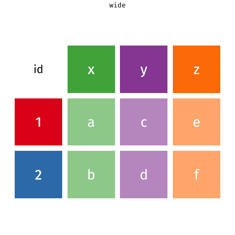
# `tidyr::pivot_longer` the gene expression data
The `pivot_longer` function takes a "wide" data into a "long" data. We simply tell the function which column we want to preserve, in this case, it will be the gene symbols, because we still want to distinguish each genes for each of the samples after the pivot operation.
```{r}
clean_ge_data %>%
tidyr::pivot_longer(
cols = -GENE_SYMBOL)
```
Of course, it is be better to give the new columns some informative names.
```{r}
ge_data_long = clean_ge_data %>%
tidyr::pivot_longer(
cols = -GENE_SYMBOL,
names_to = "sample",
values_to = "gene_expression")
ge_data_long
```
Pay attention to how this data still maintains its tidy structure but it is now in a better format to be `left_join` with the `session1_data`. This may look simple, but you should appreciate the thinking behind this process as it will be ever more important as your data gets more complex.
```{r}
long_sample_ge_data = session1_data %>%
left_join(ge_data_long, by = "sample") %>%
dplyr::filter(!is.na(GENE_SYMBOL)) %>%
janitor::clean_names()
long_sample_ge_data
```
Now that we have a very nice and cleaned data, we are now in a good position to learn about visualisation.
# `ggplot2` visualisation
There are many plotting systems and packages out there, so why should we use this `ggplot2` system?
The `gg` in `ggplot2` stands for "grammar of graphics". That means in order to produce a ggplot, a very strict set of coding structure must be followed. These restrictions are designed in such a way that you can always look at a ggplot and know exactly which characteristic of the plot comes from which column of the data. This is extremely important for the purpose of reproducibility.
The `ggplot2` plotting system is based on a layered structure, which means the final plot can always be decompose into several layers. We will illustrate what this means now step-by-step.
Let's say we want to draw a scatter plot of the strains and the gene expression. We will first begin with a data and pipe that into the `ggplot()` function. This will give us a blank canvas for plotting.
```{r}
long_sample_ge_data
long_sample_ge_data %>%
ggplot()
```
Now is a good time to think about what are the components of a scatter plot?
+ x-coordinates of points
+ y-coordinates of points
+ Actually placement of points
The first two components are referred to as "mapping" in ggplot. Because the x-coordinates should be stored as a column in the `data.frame`, so we will "map" this column to be a characteristic on our ggplot. Similary, the y-coordinates should also be a mapping. This is why we write our code in the following manner. Note, we are using the `aes()` function to wrap everything.
```{r}
long_sample_ge_data %>%
ggplot(mapping = aes(x = strain, y = gene_expression))
```
Even though we still have a blank canvas, but notice how the x and y axes are now labelled with the variables/columns in the `data.frame`. So what are we missing for a scatter plot?
Actually putting the points on the canvas!
In `ggplot2`, a plot is always a combination of layers. We have now a layer of blank canvas with axes, we will want to draw on this canvas using `geom_point()` which places the actual points on the canvas based on the mappings we have already specified. In `ggplot2`, geometries are functions that actually draws on the canvas based on the aesthetic mappings given. These are referred to as "geometries".
```{r}
long_sample_ge_data %>%
ggplot(aes(x = strain,
y = gene_expression)) +
geom_point()
```
This is your first ggplot! Let's give it a title!
```{r}
long_sample_ge_data %>%
ggplot(aes(x = strain,
y = gene_expression)) +
geom_point() +
labs(title = "My first ggplot!")
```
We see that the scale of data points can be very different. This is due to some genes always tend to have a higher expression than others (due to biology). So it will be a good idea to make a plot for each gene instead. This means that we need to make this plot for each value in the `gene_symbol` column in our data. This can be done using the `facet_wrap` function, which will produce a plot that we have already made, but split by all unique values in the given variable, in this case `gene_symbol`.
```{r}
long_sample_ge_data %>%
ggplot(aes(x = strain,
y = gene_expression)) +
geom_point() +
facet_wrap(~gene_symbol) +
labs(title = "My first ggplot!")
```
This plot shows that "Aldh3a1" is the main culprit for having a very different scale compared all other five genes.
One way to deal with this scaling is to use the logarithm scale. `ggplot2` has a very convenient way to doing this. The `scale_y_log10` function will scale the y-axis to log10 scale and this is a very convenient function because it retains the labelling of the original data but the points are on a log10-scale.
```{r}
long_sample_ge_data %>%
ggplot(aes(x = strain,
y = gene_expression)) +
geom_point() +
facet_wrap(~gene_symbol) +
scale_y_log10() +
labs(title = "My first ggplot!")
```
We now have the scatter plots on a good scale, and we can already see some interesting features from these plots. For example, the "Aldh3a1" gene seems to show off some differences between the two strains, and the "Bbs2" gene seems to have a different variance between the two strains.
So, how can we improve on this plot further?
We can layer plots of other features onto this! For example, boxplots.
```{r}
long_sample_ge_data %>%
ggplot(aes(x = strain,
y = gene_expression)) +
geom_point() +
geom_boxplot() +
facet_wrap(~gene_symbol) +
scale_y_log10() +
labs(title = "My first ggplot!")
```
Now it is a good time to stop and think about what we did.
We started off with a `data.frame` and a blank canvas with the aim to make a scatter plot. We added aesthetic mappings onto our ggplot and evaluated the quality of our plot as we go along. Every time we identify deficiencies in our plot, we simply add more layers to the plot. This detective-work is what makes `ggplot2` is so popular, because it is very flexible in handling new ideas and plotting aesthetics. But at the same time, every aesthetic of this plot can be traced back to a particular column in the `data.frame`.
There are so many functions and tricks that we can't really go through in details. Here is a very helpful [cheatsheet](https://rstudio.com/wp-content/uploads/2016/11/ggplot2-cheatsheet-2.1.pdf). And in general, the best way is to Google the plot that you want and copy the code that someone else already made.
Have a play with the following code. Try deleting components of the code to understand which aspect of the plot it was controlling
```{r}
long_sample_ge_data %>%
ggplot(aes(x = strain,
y = gene_expression,
colour = strain)) +
geom_point() +
geom_boxplot() +
facet_wrap(~ gene_symbol, scales = "free_y") +
scale_y_log10(labels = scales::comma) +
scale_color_manual(values = c("red", "blue")) +
labs(x = "Strain",
y = "Gene Expression",
title = "Boxplot of genes across strains") +
theme_bw() +
theme(legend.position = "bottom")
```
## Histogram
We will now try to make a histogram of each gene.
Let's begin with the question: what are the aesthetic mappings of a histogram?
+ x-axis should be numerical values of gene expression
Let's try this out. For making a histogram, we need to use the `geom_histogram()` geometry.
```{r}
long_sample_ge_data %>%
ggplot(aes(x = gene_expression)) +
geom_histogram()
```
You might be wondering, how is it possible that we didn't specify what should be on the y-axis but still got a plot out? This is because by the very definition of a histogram, only counts or density of the give x-variable should be plotted. Here, the default of `ggplot2` is to use counts.
Again, we see the same scaling issue as the above boxplots. Hence, we will try to apply the same functions to manipulate the plots, namely:
+ `facet_wrap` which creates a plot for each gene in small panels,
+ `scale_x_log10` which plots the x-axis on the log10 scale
```{r}
long_sample_ge_data %>%
ggplot(aes(x = gene_expression)) +
geom_histogram() +
facet_wrap(~gene_symbol) +
scale_x_log10(labels = scales::comma)
```
This plot looks pretty good! We can see that some genes are unimodal while others are bimodal. This is an new characteristic of the data that we didn't observe from the boxplots above.
We can make the modality more obvious by imposing the density of each gene onto the histogram. Let's try out the `geom_density` function then!
```{r}
long_sample_ge_data %>%
ggplot(aes(x = gene_expression)) +
geom_histogram() +
geom_density() +
facet_wrap(~gene_symbol) +
scale_x_log10(labels = scales::comma)
```
This doesn't look quite right, so what happened?
If we pay attention to the y-axis of our ggplot so far, we see that it is `count`, which means that each of bin in the histograms is showing the number of observations in that interval. However, when we talk about density, it is on a very different scale to the number of counts.
So how can we make a density-based histogram?
Let's think this logically: right now, the count of observation is being mapped to the y-axis (default of `geom_histogram`), and we need to overwrite this by making density to be mapped to the y-axis. So the answer would be adding an extra input of `y = ..density..` into the `aes()` function. The `..` is just a technical way that `ggplot` handles such problem which you don't have to worry too much on the details about. (The reason that we can't use `y = density` is because in that case ggplot will interpret this line of code as mapping a column named `density` from the `data.frame` to the plot - but such column does not exist.)
```{r}
long_sample_ge_data %>%
ggplot(aes(x = gene_expression, y = ..density..)) +
geom_histogram() +
geom_density() +
facet_wrap(~gene_symbol, scales = "free") +
scale_x_log10(labels = scales::comma)
```
# Plotting two genes against each other
Now, let's consider how we could make a scatter plot of two genes, say the "Ahrrr" and the "Cxcr7" gene. So, let's answer the question, what are the components of a scatter plot in this case?
+ Ahrrr gene expression values on the x-axis
+ Cxcr7 gene expression values on the y-axis
But if we look at the `data.frame` we are using for plotting, `long_sample_ge_data`, it has all the gene expression values mixed in that `gene_symbol` column. So we can't effectively map the expression of only "Ahrrr" and "Cxcr7" to the x and y axes respectively.
```{r}
long_sample_ge_data
```
So we need to think about how to separate out the gene expression values into distinct columns. You may realise this as to be exactly the opposite of the operation of `pivot_longer`. In the `tidyr` package, the `tidyr::pivot_wider` allows for this operation.
```{r}
wide_sample_ge_data = long_sample_ge_data %>%
tidyr::pivot_wider(names_from = "gene_symbol",
values_from = "gene_expression")
wide_sample_ge_data
```
Now that we have each gene as a column, we can perform our familiar ggplot operations. Have a play with each of the layers below. Notice that we also added the colour of the strain as well as a new geometry, `geom_smooth` that allows for adding linear regression lines.
```{r}
wide_sample_ge_data %>%
ggplot(aes(x = Ahrr,
y = Cxcr7,
colour = strain)) +
geom_point() +
geom_smooth(method = "lm") +
scale_x_log10(labels = scales::comma) +
scale_y_log10(labels = scales::comma)
```
# Saving data
```{r, eval = FALSE}
write_csv(long_sample_ge_data, path = "data/long_sample_ge_data.csv")
write_csv(wide_sample_ge_data, path = "data/wide_sample_ge_data.csv")
```
# Making gene expression boxplots with p-values
```{r, results="show", fig.show = "show"}
library(ggpubr)
ggpubr::ggboxplot(
data = long_sample_ge_data,
x = "strain",
y = "gene_expression",
facet.by = "gene_symbol",
scales = "free") +
ggpubr::stat_compare_means()
```
# References
Wickham et al., (2019). Welcome to the tidyverse. Journal of Open Source Software, 4(43), 1686, https://doi.org/10.21105/joss.01686
# Session Info
```{r, results = "show"}
sessionInfo()
```