-
How to naming artboard/symbols (Name convention)
2.1 Artboard name
2.2 Symbol name
-
3.3 Text styles
-
7.1 Naming ID
[Project Folder]
  ├─ <feature_1>.sketch
  ├─ <feature_2>.sketch
  ├─ ...
  └─ <project_name> Library.sketch ✱✱
Platform/Feature/Feature — State
[Example]
Mobile/Register/Register — Ideal
Desktop/Register/Cancel dialog
| State | Description |
|---|---|
| Ideal | All fields filled state |
| Empty | All fields empty state |
| Loading | Components loading state |
| Error | All fields error state |
Group of symbol name is always plural and capital name.
[Example]
Icons/…Assets/…Icons/Black/…
Symbol names are written in snake_case.
type_subtype_state
[Example]
Icons/Black/ic_email
Buttons/Default/btn_default_enabled
Buttons/Outline/btn_outline_pressed
Naming conventions for symbol type:
| Asset Type | Prefix | Example |
|---|---|---|
| Toolbar | tb_ | tb_default |
| Button | btn_ | btn_send_password |
| Dialog | tb_ | tb_default |
| Divider | divider_ | divider_horizontal |
| Icon | ic_ | ic_star |
| Menu | menu_ | menu_submenu_bg |
| Notification | noti_ | noti_bg |
| Tabs | tab_ | tab_pressed |
Naming conventions for icons:
| Asset Type | Prefix | Example |
|---|---|---|
| Icons | ic_ | Icons/_Icons/ic_star |
| Launcher icons | ic_launcher | Icons/_Icons/ic_launcher_calendar |
| Menu icons and action bar icons | ic_menu | Icons/_Icons/ic_menu_archive |
| Status bar icons | ic_stat_notify | Icons/_Icons/ic_stat_notify_msg |
| Tab icons | ic_tab | Icons/_Icons/ic_tab_recent |
| Dialog icons | ic_dialog | Icons/_Icons/ic_dialog_info |
Naming conventions for selector states:
| Asset Type | Prefix | Example |
|---|---|---|
| Normal | _normal | Buttons/Default/btn_order_normal |
| Pressed | _pressed | Buttons/Default/btn_order_pressed |
| Focused | _focused | Buttons/Default/btn_order_focused |
| Disabled | _disabled | Buttons/Default/btn_order_disabled |
| Selected | _selected | Buttons/Default/btn_order_selected |
For example:

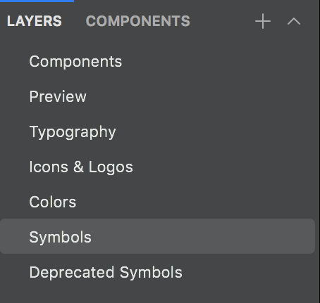
[Library.sketch]
├─ Components ➡ Overview of Colors/Typepography/All components
├─ Preview ➡ Google search result/Preview link
├─ Typography
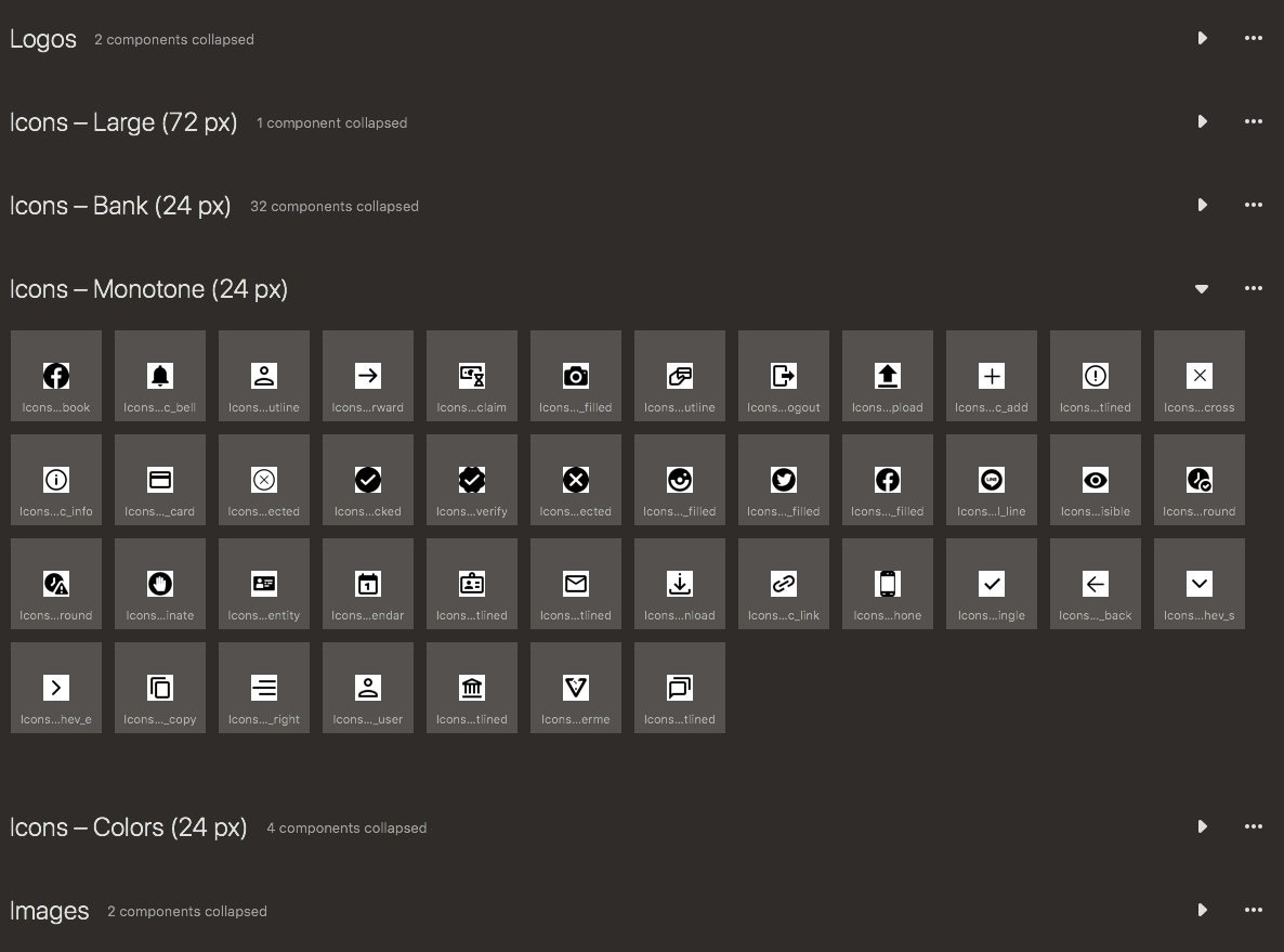
├─ Icons & Logos ➡ Including Launcher/fav.ico
├─ Colors
├─ Symbols
└─ Deprecated Symbols
Reuse components concept is very important to us because:
- Team can control components in same direction. ✱✱
- Easy to use with a few click.
- Having a shared database of components is easy to control design systems with developers.
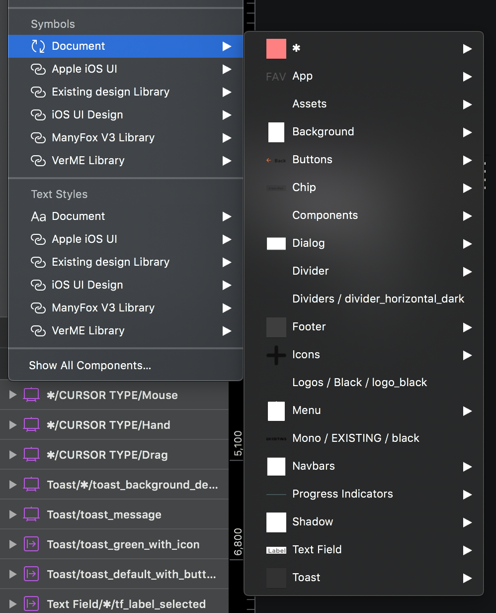
[Symbols]
 ├─ ✱ ➡ config of project
 │  ├─ Colors
 │  ├─ CURSOR
 │  ├─ STATE OVERLAY
 │  └─ ...
 ├─ App
 ├─ Assets
 ├─ Background
 ├─ Buttons
 ├─ Dialog
 ├─ Divider
 ├─ Footer
 ├─ Icons
 ├─ Logos
 ├─ Text Field
 ├─  ...
EN/TH/CN/...
├─ Primary
│  └─ ...
│     ├─ Center
│     ├─ Left
│     └─ Right
│  ...
└─ Secondary
   └─ ...
      ├─ Center
      ├─ Left
      └─ Right

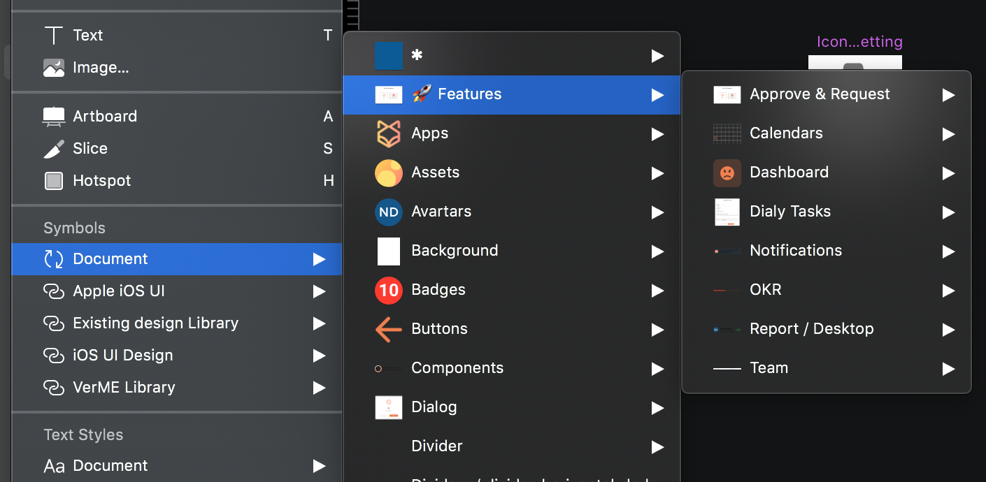
We split component into common components and feature components for big project.
For example:
🚀 Features/...
When you want to update the new version of components, you have to move your old components to:
[Library.sketch]
 ├─ ...
 └─ Deprecated Symbols
and change the name to _Deprecated/...
[Example]
Text Field/Outline/… → _Deprecated/Text Field/Outline/…
Don’t forget to create all error states from every user-generated content by linking with i18N sheet.
For example:
- Type form
- Upload files / images
- Q&A
- Feedback / Review
- and more…

- Common wording (for reuse ID)
| ID | EN | TH |
|---|---|---|
| ok | OK | ตกลง |
| cancel | Cancel | ยกเลิก |
| error_empty | This field cannot be empty. | กรุณากรอกข้อมูล |
| error_empty_select | Please select information. | กรุณาเลือกข้อมูล |
| error_format | Incorrect format. | รูปแบบข้อมูลไม่ถูกต้อง |
- Fix wording → feature_wording
| ID | EN | TH |
|---|---|---|
| home_how_to_use | How to use? | วิธีการใช้งาน |
- Error wording → feature_error_component_case
| ID | Common ID | EN | TH |
|---|---|---|---|
| register_error_emai_empty | error_empty | This field cannot be empty. | กรุณากรอกข้อมูล |
| register_error_emai_format | error_format | Incorrect format. | กรุณากรอกข้อมูล |
-
Upload screens and categorize into features

-
Upload all assets (icons, logos, images)

-
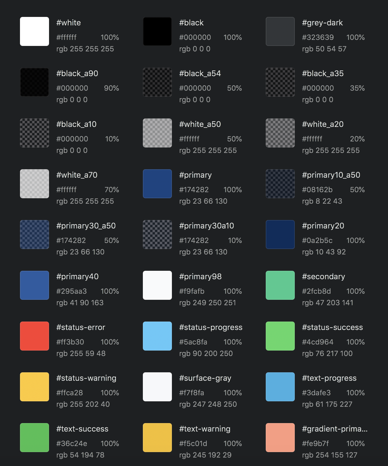
Update style guides (colors, text styles)

-
Upload project documentation (optional)
-
Define states and features into tags (optional)

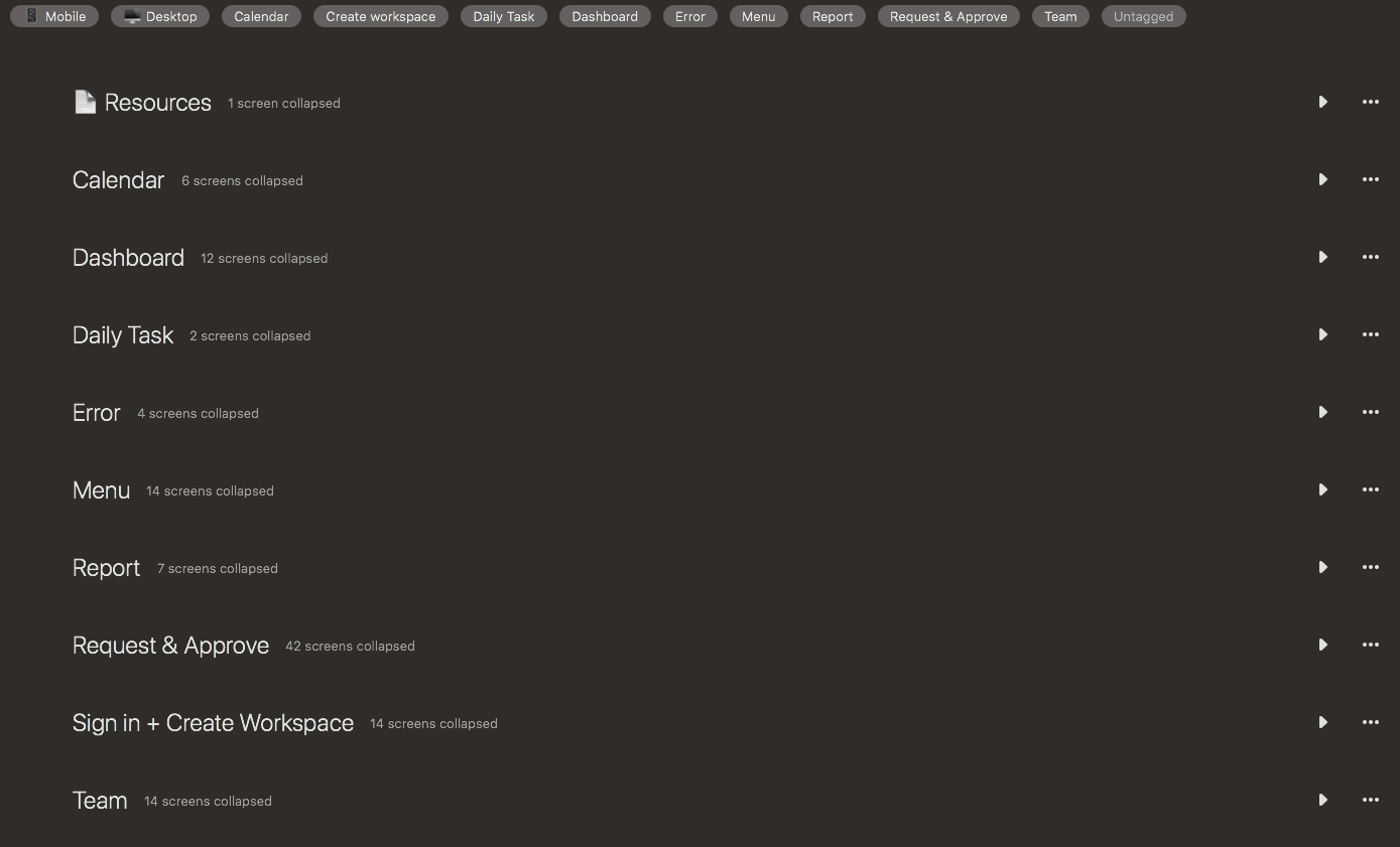

Using tags is easy for screen types, states, and features sorting.
2. Link flow with Overflow.io
You can also support this project by becoming a sponsor. Your logo will show up here with a link to your website.

Thank you to all our backers! 🙏


To ask questions, please use 👇🏻 or Follow our Facebook page. 🇹🇭

To report bugs, please use the GitHub project.
- Reporting Bugs: https://github.com/THE-EXISTING/GUI/issues