ExComponents
These Components Are For WPF / XAML Only!
xmlns:ex="clr-namespace:ExtraFunctions.ExComponents;assembly=ExtraFunctions"A Text Box For Numbers.
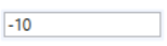
<ex:DigitBox Margin="5" Text="-10" Width="120" Height="20"/>An Advanced Model Of The DigitBox With Increase And Decrease Buttons.
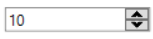
<ex:NumericUpDown Margin="5" Width="120" Value="10" MaxValue="20"/>A Markup Of A Button Including An Image.

<ex:ImageButton Source="visual-studio-logo.png" ImageAlignment="Left" Text="Image Button" Click="ImageButton_Click"/>private void ImageButton_Click(object sender, RoutedEventArgs e) {}An Alternative CheckBox That Fits Newer Applications.

<ex:Switch isChecked="true"/>A Better Looking And Working DatePicker That The Build In One.
Uses Your Systems Format.
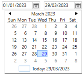
<ex:DatePicker Margin="5" Value="2023/01/01"/>Pick A Time Any Time And Its There.
hh:mm:ss Format
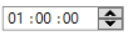
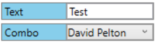
<ex:TimePicker Margin="5" Value="01:00:00"/>Property Viewer For All Your Property Needs.

<ex:PropertyView Margin="5" Width="200" Height="250" Header="Properties">
    <ex:PropertyViewItem Header="Text">
        <TextBox Text="Test"/>
    </ex:PropertyViewItem>
    <ex:PropertyViewItem Header="Combo">
        <ComboBox ItemsSource="{Binding strings.Values, Source={StaticResource Data}}" Padding="1" SelectedIndex="2"/>
    </ex:PropertyViewItem>
</ex:PropertyView>The Item To Use In The PropertyView.
<ex:PropertyViewItem Header="Text">
    <TextBox Text="Test"/>
</ex:PropertyViewItem>
<ex:PropertyViewItem Header="Combo">
    <ComboBox ItemsSource="{Binding strings.Values, Source={StaticResource Data}}" Padding="1" SelectedIndex="2"/>
</ex:PropertyViewItem>A TreeViewItem With Check Boxes.

<TreeView Margin="0,2" ItemsSource="{Binding SetData, Source={StaticResource Data}}">
    <TreeView.ItemContainerStyle>
        <Style TargetType="{x:Type TreeViewItem}">
            <Setter Property="Focusable" Value="False"/>
            <Setter Property="Template">
                <Setter.Value>
                    <ControlTemplate TargetType="TreeViewItem">
                        <local:CheckBoxTreeViewItem
                            Header="{Binding}"
                            ItemsSource="{Binding Children}"
                            IsChecked="{Binding IsChecked, Mode=TwoWay, FallbackValue=True}"/>
                    </ControlTemplate>
                </Setter.Value>
            </Setter>
        </Style>
    </TreeView.ItemContainerStyle>
</TreeView>public class obj
{
public obj() { }
public obj(string Value, bool? Checked = false)
{
this.Value = Value;
IsChecked = Checked;
}
public string Value { get; set; } = "";
public bool? IsChecked { get; set; } = false;
public List<obj> Children { get; set; } = new();
public override string ToString() => Value;
}
public List<obj> SetData { get; set; } = new()
{
new("Item 2") { Children = new List<obj>() { new("Child 2.1"), new("Child 2.2"), new("Child 2.3"), } },
new("Item 3") { Children = new List<obj>() {
new("Child 3.1") { Children = new(){ new("Content 3.1.1"), } },
new("Child 3.2") { Children = new(){ new("Content 3.2.1"), } },
} },
new("Item 1") { Children = new List<obj>() { new("Child 1.1"), new("Child 1.2"), } },
};A Collection Of CheckBoxes.
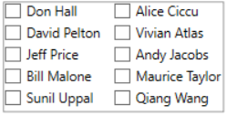
<ex:CheckBoxGroup Margin="5" Width="200" Height="100" ItemsSource="{Binding strings.Values, Source={StaticResource Data}}"
                  ColumnCount="2" SelectionChanged="CheckBoxGroup_SelectionChanged"/>
private void CheckBoxGroup_SelectionChanged(object sender, RoutedEventArgs e) {}A Collection Of Radio Buttons.

<ex:RadioGroupBox Margin="5" Width="200" Height="100" ItemsSource="{Binding strings.Values, Source={StaticResource Data}}"
                  ColumnCount="2" SelectionChanged="RadioGroupBox_SelectionChanged"/>
private void RadioGroupBox_SelectionChanged(object sender, RoutedEventArgs e) {}A Button To Help Filter A Tree Of Items
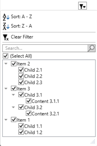
<ex:FilterButton Margin="200" Height="20" ItemsSource="{Binding SetData, Source={StaticResource Data}}"/>Shows A Search/Find Box In Its Targeted Control.
Value Is The Text Value Of The Text Box And ItemsSource Is The Items For The Category Combo Box.
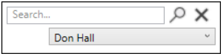
<ex:FindBox Name="FindBox" ItemsSource="{Binding strings.Values, Source={StaticResource Data}}"
TargetControl="{Binding ElementName=Main_Window}"/>FindBox.Show();A Text Box That Looks Like A Search Bar.
Pressing Enter Or The Search Icon Will Trigger The OnSearch Event.

<ex:SearchBox Width="120" Margin="5" OnSearch="SearchBox_OnSearch"/>private void SearchBox_OnSearch(object sender, RoutedEventArgs e) {}A Fully Working ResizeGrip. Nothing Like The Half Done (Build In) ResizeGrip.
ResizeGripMode Determents The Axes That Can Be Resized.

<local:ResizeGrip Target="{Binding ElementName=Main_Window}" ResizeGripMode="Vertical"/>These Components Are For WinForms Only!
Its A ToolStripMenuItem With Bindable Properties.