Now it's time to style our app.
We can edit styles manually but we can also use ready made components that have already been styled and shared in the community.
In this chapter we will do both.
First, we would also use Material-UI - a library with a set of React components that implements Google's Material Design. What's good about it is that the design is already implemented right out of the box. Not only that, but it also includes a set of icons which are free to use.
There are many things that Material-UI can offer, and it's not easy to follow it up, especially with the constantly evolving and improving API. The best way to go with it is to identify a component you need, and then look for it in the official website. And when it comes to searching for icons, they can be found on the material.io website through the search bar.
As we move further in this tutorial you should have a better grasp of Material and how to use it.

We will start off by installing some of the needed material libraries and its Typescript types library:
$ yarn add @material-ui/core @material-ui/icons
@material-ui/core includes core component of Material-UI such as Input, Popover, Modal, etc, and @material-ui/icons includes a set of icons.
Material is very generic and has a built in theming system which can be controlled by simply setting few variables,
which is exactly what we're gonna need in our app.
In our app we're mainly gonna use 2 colors:
- Primary #306759
- Secondary #79e352
The easiest way to reference colors without repeating yourself is through Themes. Theme definition can easily be done in Material using the MuiThemeProvider component:
@@ -1,12 +1,22 @@
+┊  ┊ 1┊import { MuiThemeProvider, createMuiTheme } from '@material-ui/core/styles';
 ┊ 1┊ 2┊import React from 'react';
 ┊ 2┊ 3┊import ReactDOM from 'react-dom';
 ┊ 3┊ 4┊import './index.css';
 ┊ 4┊ 5┊import App from './App';
 ┊ 5┊ 6┊import * as serviceWorker from './serviceWorker';
 ┊ 6┊ 7┊
+┊  ┊ 8┊const theme = createMuiTheme({
+┊  ┊ 9┊  palette: {
+┊  ┊10┊    primary: { main: '#2c6157' },
+┊  ┊11┊    secondary: { main: '#6fd056' },
+┊  ┊12┊  },
+┊  ┊13┊});
+┊  ┊14┊
 ┊ 7┊15┊ReactDOM.render(
 ┊ 8┊16┊  <React.StrictMode>
-┊ 9┊  ┊    <App />
+┊  ┊17┊    <MuiThemeProvider theme={theme}>
+┊  ┊18┊      <App />
+┊  ┊19┊    </MuiThemeProvider>
 ┊10┊20┊  </React.StrictMode>,
 ┊11┊21┊  document.getElementById('root')
 ┊12┊22┊);
We create a palette of the themes together with any other definitions for the theme, and then we wrap our app with a React component
from the material-ui library to provide those definitions to all of our App's components when they need them.
Once we have it set, the colors should be available to use in our application by simply providing the "color" prop to the component instance whose color we would like to change:
<Button color="primary">Primary</Button>
<Button color="secondary">Secondary</Button>
In our app, we're also gonna use CSS directly to change its colors, therefore it would be handy to have these theme variables available to us through CSS.
To do so, we will have a second definition of these variables in index.css, at the :root level of our application.
That feels like a small duplication but this will help us use them in styled components directly. Also that means you can view the variables in chrome-dev-tools.
@@ -1,3 +1,10 @@
+┊  ┊ 1┊:root {
+┊  ┊ 2┊  --primary-bg: #2c6157;
+┊  ┊ 3┊  --secondary-bg: #6fd056;
+┊  ┊ 4┊  --primary-text: white;
+┊  ┊ 5┊  --secondary-text: white;
+┊  ┊ 6┊}
+┊  ┊ 7┊
 ┊ 1┊ 8┊body {
 ┊ 2┊ 9┊  margin: 0;
 ┊ 3┊10┊  font-family: -apple-system, BlinkMacSystemFont, 'Segoe UI', 'Roboto', 'Oxygen',
:root is a pseudo element that simply represents the root node, which will make the colors available in all elements.
Normally, it works like JavaScript's scoping system and it will make variables available only to the current node and to its children, NOT its parents.
CSS vars can be used like so:
  color: var(--primary-text);
  background-color: var(--primary-bg);
More information about CSS variables can be found in the official MDN docs.
So getting back to the ChatsListScreen, we will wrap the ChatsNavbar with Material's component:
@@ -1,5 +1,6 @@
 ┊1┊1┊import React from 'react';
+┊ ┊2┊import { Toolbar } from '@material-ui/core';
 ┊2┊3┊
-┊3┊ ┊const ChatsNavbar: React.FC = () => <div>Whatsapp Clone</div>;
+┊ ┊4┊const ChatsNavbar: React.FC = () => <Toolbar>Whatsapp Clone</Toolbar>;
 ┊4┊5┊
 ┊5┊6┊export default ChatsNavbar;
And we will replace the <ul /> and <li /> elements with Material's <List /> and <ListItem /> in ChatsList:
@@ -1,12 +1,13 @@
 ┊ 1┊ 1┊import React from 'react';
 ┊ 2┊ 2┊import { chats } from '../../db';
 ┊ 3┊ 3┊import moment from 'moment';
+┊  ┊ 4┊import { List, ListItem } from '@material-ui/core';
 ┊ 4┊ 5┊
 ┊ 5┊ 6┊const ChatsList: React.FC = () => (
 ┊ 6┊ 7┊  <div>
-┊ 7┊  ┊    <ul>
+┊  ┊ 8┊    <List>
 ┊ 8┊ 9┊      {chats.map((chat) => (
-┊ 9┊  ┊        <li key={chat.id}>
+┊  ┊10┊        <ListItem key={chat.id} button>
 ┊10┊11┊          <img src={chat.picture} alt="Profile" />
 ┊11┊12┊          <div>{chat.name}</div>
 ┊12┊13┊          {chat.lastMessage && (
@@ -15,9 +16,9 @@
┊15┊16┊ <div>{moment(chat.lastMessage.createdAt).format('HH:mm')}</div>
┊16┊17┊ </React.Fragment>
┊17┊18┊ )}
-┊18┊ ┊ </li>
+┊ ┊19┊ </ListItem>
┊19┊20┊ ))}
-┊20┊ ┊ </ul>
+┊ ┊21┊ </List>
┊21┊22┊ </div>
┊22┊23┊);
┊23┊24┊Thanks to the button attribute, the Material component can give our list a more vibrant feeling and that will display a nice ripple effect once an item is clicked,
something that could have taken a long time to implement manually.
Now that we are using existing styled components, it's time to customize them to look exactly like we want them to look. When we write styles, we usually use CSS.
One of the important concepts that React brought us was the fact we could use just Javascript to describe our components and another was the fact that we could encapsulate our UI into a set of separated components.
But when it comes to CSS, we are still using it like before, having no encapsulation between different definitions and files.
Styled-components is a relatively new library that will transpile a given string into a CSS string and will encapsulate it under a React.Component.
Bringing the same concepts from React into the way we write styles, so we can define our styles programmatically.
With JavaScript in-hand you naturally have more control over our styles and its encapsulation, which makes it a very powerful tool.
Here's one way to style a button using styled-components:
import styled, { css } from 'styled-components';

const Button = styled.button`
  background: transparent;
  border-radius: 3px;
  border: 2px solid palevioletred;
  color: palevioletred;
  margin: 0.5em 1em;
  padding: 0.25em 1em;

  ${props => props.primary && css`
    background: palevioletred;
    color: white;
  `}
`;styledis coming from thestyled-componentslibrary. When we callstyled.buttonthat means we are extending a button component from styled.Buttonwill become a full React component with the extended styled we specified- Like a React component, we can send props into our component. And like a React function, we can write Javascript code that interact and respond to those props.
In our case, just like a check we've done before in TSX to render something only if it exists, here only if we have a
primaryproperty, we will add extra styles to our component. The created Button is actually a React.Component, so an instance of it can be created with ease like any other component: cssis telling Styled components that the string literal that comes after describes CSS styles.
<Button primary />But as this is just like a component, we should type it just like we type component, defining what properties it should get in:
import styled, { css } from 'styled-components';

interface ButtonProps {
  readonly primary: any;
};

const Button = styled.button<ButtonProps>`
  background: transparent;
  border-radius: 3px;
  border: 2px solid palevioletred;
  color: palevioletred;
  margin: 0.5em 1em;
  padding: 0.25em 1em;

  ${props => props.primary && css`
    background: palevioletred;
    color: white;
  `}
`;
More information about styled-components can be found in the official docs page.
Now, we will use styled-components to create new React.Components which are bound into a style-sheet.
This way when we create new instances of them, the components will be styled right out of the box. Example:
const Button = styled.button `
  border-radius: 999px;
`

const RedButton = styled(Button) `
  color: red;
`

const GreenButton = styled(Button) `
  color: green;
`

const BlueButton = styled(Button) `
  color: blue;
`

const Dashboard = (
  <div>
    <RedButton />
    <GreenButton />
    <BlueButton />
  </div>
)
The clear advantage of such working strategy is that all the styles are encapsulated, unlike traditional CSS where style rules can easily collide and be merged unintentionally.
Remember that styled-components operates per component, not globally.
We will start off by installing styled-components and its Typescript types library:
$ yarn add styled-components @types/styled-components
Now, let's use styled-components our ChatsListScreen:
@@ -1,12 +1,17 @@
 ┊ 1┊ 1┊import React from 'react';
 ┊ 2┊ 2┊import ChatsNavbar from './ChatsNavbar';
 ┊ 3┊ 3┊import ChatsList from './ChatsList';
+┊  ┊ 4┊import styled from 'styled-components';
+┊  ┊ 5┊
+┊  ┊ 6┊const Container = styled.div`
+┊  ┊ 7┊  height: 100vh;
+┊  ┊ 8┊`;
 ┊ 4┊ 9┊
 ┊ 5┊10┊const ChatsListScreen: React.FC = () => (
-┊ 6┊  ┊  <div>
+┊  ┊11┊  <Container>
 ┊ 7┊12┊    <ChatsNavbar />
 ┊ 8┊13┊    <ChatsList />
-┊ 9┊  ┊  </div>
+┊  ┊14┊  </Container>
 ┊10┊15┊);
 ┊11┊16┊
 ┊12┊17┊export default ChatsListScreen;
Here you can see that we've created a new component called Container.
That component is extending div and adds some styles into it.
Then we've replaced the div element with the new, enhanced div called Container.
With this we know for sure that the styles we applied for Container won't affect any other component in our app.
@@ -1,6 +1,14 @@
 ┊ 1┊ 1┊import React from 'react';
 ┊ 2┊ 2┊import { Toolbar } from '@material-ui/core';
+┊  ┊ 3┊import styled from 'styled-components';
 ┊ 3┊ 4┊
-┊ 4┊  ┊const ChatsNavbar: React.FC = () => <Toolbar>Whatsapp Clone</Toolbar>;
+┊  ┊ 5┊const Container = styled(Toolbar)`
+┊  ┊ 6┊  background-color: var(--primary-bg);
+┊  ┊ 7┊  color: var(--primary-text);
+┊  ┊ 8┊  font-size: 20px;
+┊  ┊ 9┊  line-height: 40px;
+┊  ┊10┊`;
+┊  ┊11┊
+┊  ┊12┊const ChatsNavbar: React.FC = () => <Container>Whatsapp Clone</Container>;
 ┊ 5┊13┊
 ┊ 6┊14┊export default ChatsNavbar;
Here you can see we've done the same, but instead of extending a built-in component from styled-component,
we enhanced the Toolbar component from `material-ui.
Notice that we also called the wrapper Container but again it has no affect on any component outside of our specific component.
Let's finish this off by doing the same in our last component:
@@ -2,24 +2,81 @@
 ┊ 2┊ 2┊import { chats } from '../../db';
 ┊ 3┊ 3┊import moment from 'moment';
 ┊ 4┊ 4┊import { List, ListItem } from '@material-ui/core';
+┊  ┊ 5┊import styled from 'styled-components';
 ┊ 5┊ 6┊
-┊ 6┊  ┊const ChatsList: React.FC = () => (
-┊ 7┊  ┊  <div>
-┊ 8┊  ┊    <List>
+┊  ┊ 7┊const Container = styled.div`
+┊  ┊ 8┊  height: calc(100% - 56px);
+┊  ┊ 9┊  overflow-y: overlay;
+┊  ┊10┊`;
+┊  ┊11┊
+┊  ┊12┊const StyledList = styled(List)`
+┊  ┊13┊  padding: 0 !important;
+┊  ┊14┊`;
+┊  ┊15┊
+┊  ┊16┊const StyledListItem = styled(ListItem)`
+┊  ┊17┊  height: 76px;
+┊  ┊18┊  padding: 0 15px;
+┊  ┊19┊  display: flex;
+┊  ┊20┊`;
+┊  ┊21┊
+┊  ┊22┊const ChatPicture = styled.img`
+┊  ┊23┊  height: 50px;
+┊  ┊24┊  width: 50px;
+┊  ┊25┊  object-fit: cover;
+┊  ┊26┊  border-radius: 50%;
+┊  ┊27┊`;
+┊  ┊28┊
+┊  ┊29┊const ChatInfo = styled.div`
+┊  ┊30┊  width: calc(100% - 60px);
+┊  ┊31┊  height: 46px;
+┊  ┊32┊  padding: 15px 0;
+┊  ┊33┊  margin-left: 10px;
+┊  ┊34┊  border-bottom: 0.5px solid silver;
+┊  ┊35┊  position: relative;
+┊  ┊36┊`;
+┊  ┊37┊
+┊  ┊38┊const ChatName = styled.div`
+┊  ┊39┊  margin-top: 5px;
+┊  ┊40┊`;
+┊  ┊41┊
+┊  ┊42┊const MessageContent = styled.div`
+┊  ┊43┊  color: gray;
+┊  ┊44┊  font-size: 15px;
+┊  ┊45┊  margin-top: 5px;
+┊  ┊46┊  text-overflow: ellipsis;
+┊  ┊47┊  overflow: hidden;
+┊  ┊48┊  white-space: nowrap;
+┊  ┊49┊`;
+┊  ┊50┊
+┊  ┊51┊const MessageDate = styled.div`
+┊  ┊52┊  position: absolute;
+┊  ┊53┊  color: gray;
+┊  ┊54┊  top: 20px;
+┊  ┊55┊  right: 0;
+┊  ┊56┊  font-size: 13px;
+┊  ┊57┊`;
+┊  ┊58┊
+┊  ┊59┊const ChatsList = () => (
+┊  ┊60┊  <Container>
+┊  ┊61┊    <StyledList>
 ┊ 9┊62┊      {chats.map((chat) => (
-┊10┊  ┊        <ListItem key={chat.id} button>
-┊11┊  ┊          <img src={chat.picture} alt="Profile" />
-┊12┊  ┊          <div>{chat.name}</div>
-┊13┊  ┊          {chat.lastMessage && (
-┊14┊  ┊            <React.Fragment>
-┊15┊  ┊              <div>{chat.lastMessage.content}</div>
-┊16┊  ┊              <div>{moment(chat.lastMessage.createdAt).format('HH:mm')}</div>
-┊17┊  ┊            </React.Fragment>
-┊18┊  ┊          )}
-┊19┊  ┊        </ListItem>
+┊  ┊63┊        <StyledListItem key={chat.id} button>
+┊  ┊64┊          <ChatPicture src={chat.picture} alt="Profile" />
+┊  ┊65┊          <ChatInfo>
+┊  ┊66┊            <ChatName>{chat.name}</ChatName>
+┊  ┊67┊            {chat.lastMessage && (
+┊  ┊68┊              <React.Fragment>
+┊  ┊69┊                <MessageContent>{chat.lastMessage.content}</MessageContent>
+┊  ┊70┊                <MessageDate>
+┊  ┊71┊                  {moment(chat.lastMessage.createdAt).format('HH:mm')}
+┊  ┊72┊                </MessageDate>
+┊  ┊73┊              </React.Fragment>
+┊  ┊74┊            )}
+┊  ┊75┊          </ChatInfo>
+┊  ┊76┊        </StyledListItem>
 ┊20┊77┊      ))}
-┊21┊  ┊    </List>
-┊22┊  ┊  </div>
+┊  ┊78┊    </StyledList>
+┊  ┊79┊  </Container>
 ┊23┊80┊);
 ┊24┊81┊
 ┊25┊82┊export default ChatsList;
Notice that we've changed the structure of the HTML of the ChatsList component.
We've added the ChatInfo to allow better alignment of the elements.
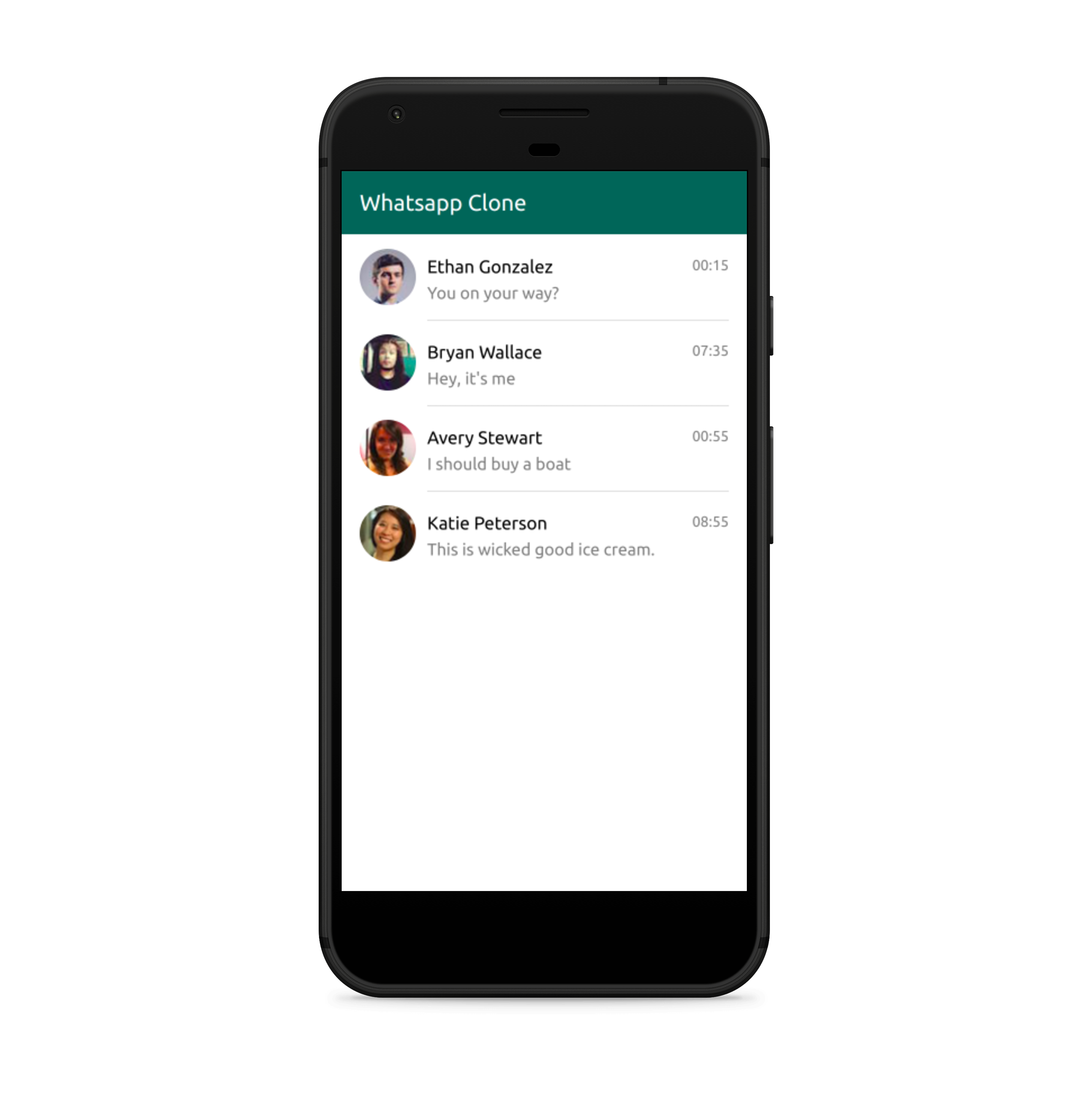
We're done styling ChatsListScreen. We will keep using the same principles to style the rest of the components in our application. The final result should look like so:
TODO: What do people think about https://www.styled-components.com/docs/tooling#babel-plugin, should we use it here?
| < Previous Step | Next Step > |
|---|