Charge your spring-hack project with Vivid’s unified UI, pre-configured a11y standards & industry best practices. oh and, get REWARDED for it! 🏆
"Be the best version of your-app"
Projects will be scored by the following criteria:
- Quality & semantics
- use components that clearly fit a purpose or role (e.g. Menu to offer a list of actionable choices to the user), thus result in high quality UX
- Build with accessibility in mind (use tools like accessibility insights or WAVE)
- Variety - use as many vivid components as you can stomache
- Interface only - avoid the use of CSS and other practices to reshape UI elements. sticking to the public API is a best practice
- Use alpha components - help shaping the future of new components by "field testing" & feedback
Getting to know our awesome design system can help you with your day-to-day work, easily creating product UI’s with Vonage unified look & feel... And you can get a special tech prize!!!
Familiarize yourself with some concepts that you will to encounter when working with Vivid.
Colors have assigned meanings and are used consistently throughout Vivid components to set expectations of meaning for users. Color is used sparingly and intentionally to reinforce hierarchies and to create clear modes of communication.

Here are a few tips to get you up and running:
Follow the #ask-vivid Slack channel for more weekly tips
TKO.-.Vivid.in.50.seconds.1080p.mov
External validation is very important to us, hence, we try to make developer experience as efficient, safe, fast and smooth as possible.


To help you start your journey
- Vivid storybook
- Icon gallery
- #ask-vivid Slack channel
Good luck! 🍀
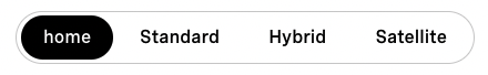
<vwc-button-toggle-group enlarged shape="pill">
  <vwc-button label="Home" selected enlarged layout="filled" type="submit"></vwc-button>
  <vwc-button label="Standard"  enlarged layout="filled" type="submit"></vwc-button>
  <vwc-button label="Hybrid"  enlarged layout="filled" type="submit"></vwc-button>
  <vwc-button label="Satellite"  enlarged layout="filled" type="submit"></vwc-button>
</vwc-button-toggle-group>
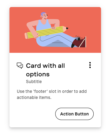
<vwc-card heading="Card with all options" icon="chat-line" subtitle="Subtitle" text="Use the 'footer' slot in order to add actionable items.">
<img slot="media" src="https://doodleipsum.com/300x150/flat?bg=EB765D&i=7d5ed3bc0c215d1359b2a63d03cf1540" alt="Sitting on Floor by Gustavo Pedrosa">
<vwc-icon-button-toggle onicon="more-vertical-solid" officon="more-vertical-solid" slot="meta"></vwc-icon-button-toggle>
<vwc-button slot="footer" shape="pill" layout="outlined" label="Action Button" type="submit" outlined=""></vwc-button>
</vwc-card>
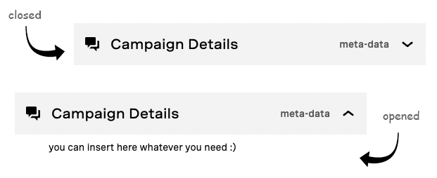
<vwc-expansion-panel header="Campaign Details" meta="meta-data" icon="chat-solid" open>
  <div>you can insert here whatever you need :)</div>
</vwc-expansion-panel>
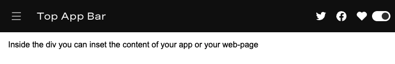
<vwc-top-app-bar-fixed alternate="true">
  <vwc-icon-button slot="navigationIcon" icon="menu-line"></vwc-icon-button>
  <span slot="title">Top App Bar</span>
  <vwc-icon-button slot="actionItems" icon="twitter-mono"></vwc-icon-button>
  <vwc-icon-button slot="actionItems" icon="facebook-mono"></vwc-icon-button>
  <vwc-icon-button slot="actionItems" icon="heart-solid"></vwc-icon-button>
  <vwc-theme-switch slot="actionItems"></vwc-theme-switch>
</vwc-top-app-bar-fixed>