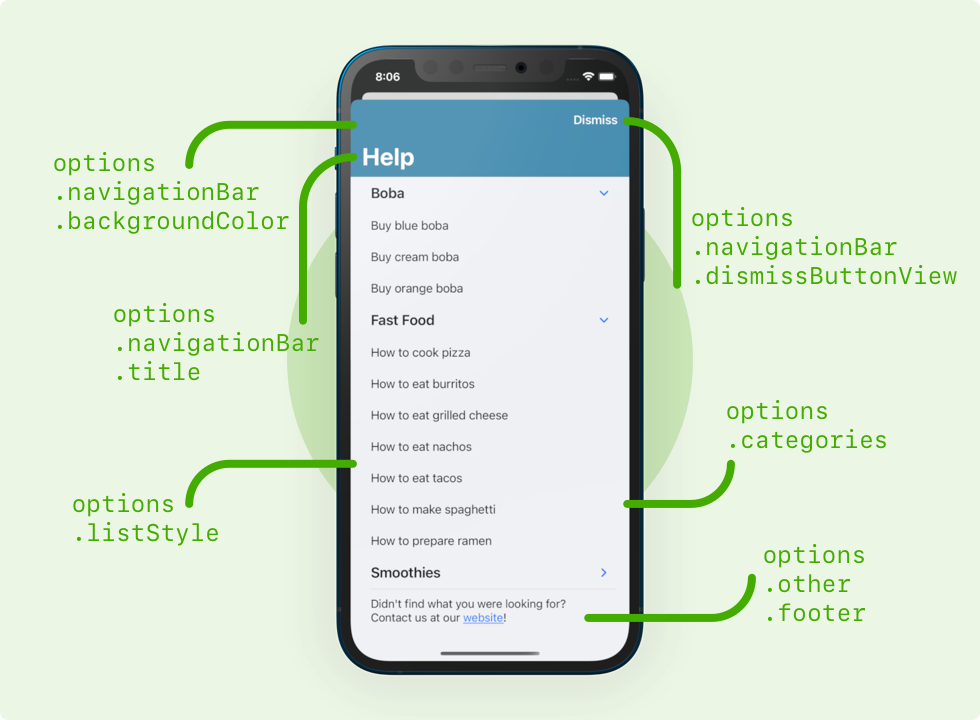
Almost everything in the SupportDocs library can be customized through the SupportOptions struct. To use, just make an instance of SupportOptions and configure what you want! You can find the declaration for the struct here.
| SwiftUI | UIKit |
import SwiftUI
import SupportDocs

struct ContentView: View {
    let dataSource = URL(string: "https://raw.githubusercontent.com/aheze/SupportDocs/DataSource/_data/supportdocs_datasource.json")!
    let options = SupportOptions(
        navigationBar: .init(
            title: "Support" /// Set navigation bar title to "Support"
        ),
        listStyle: .insetGroupedListStyle, /// Inset grouped list style (iOS 14+)
        other: .init(
            activityIndicatorStyle: UIActivityIndicatorView.Style.large, /// Large loading indicator
            error404: URL(string: "https://aheze.github.io/SupportDocs/404")! /// Custom 404 page (inside the DataSource branch)
        )
    )

    @State var supportDocsPresented: Bool = false
    var body: some View {
        Button("Present SupportDocs from SwiftUI!") { supportDocsPresented = true }
        .sheet(isPresented: $supportDocsPresented, content: {
            SupportDocsView(dataSource: dataSource, options: options, isPresented: $supportDocsPresented)
        })
    }
} |
class ViewController: UIViewController {

    @IBOutlet weak var presentButton: UIButton! /// Connect these in the storyboard.
    @IBAction func presentButtonPressed(_ sender: Any) {

        let dataSource = URL(string: "https://raw.githubusercontent.com/aheze/SupportDocs/DataSource/_data/supportdocs_datasource.json")!

        // MARK: - UIKit way to make `SupportOptions`
        var options = SupportOptions()
        options.navigationBar.title = "Support" /// Set navigation bar title to "Support"
        options.listStyle = .insetGroupedListStyle /// Inset grouped list style (iOS 14+)
        options.other.activityIndicatorStyle = .large /// Large loading indicator
        options.other.error404 = URL(string: "https://aheze.github.io/SupportDocs/404")! /// Custom 404 page (inside the DataSource branch)

        let supportDocsViewController = SupportDocsViewController(dataSourceURL: dataSource, options: options)
        self.present(supportDocsViewController, animated: true, completion: nil)

    }
} |
Here's some sample configurations to get you started.
- MinimalSupportDocs.swift -- the least code that you need to write. No
SupportOptionsare set. - SupportDocsWithCategories.swift -- displays 2 categories, one for all documents tagged with
boba, the otherfastFood. No otherSupportOptionsare set. - SupportOptions.swift -- sets every single property inside
SupportOptions, including a category of all documents tagged withboba.
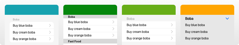
Group multiple documents in the same section. You make a category by specifying the tag(s), display name, and (optionally) color of the text in the category.
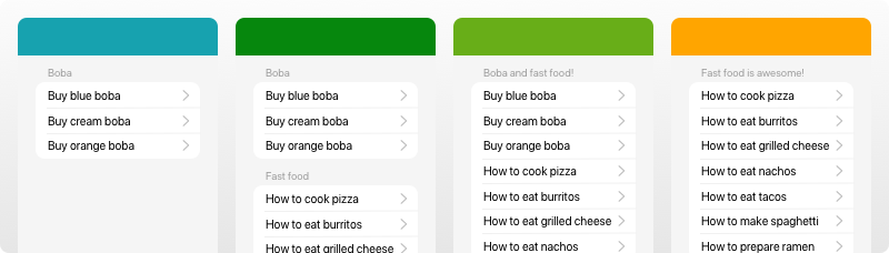
Make sure you have added the correct tags to the front matter inside your documents. See the Tag Your Documents section of the README.
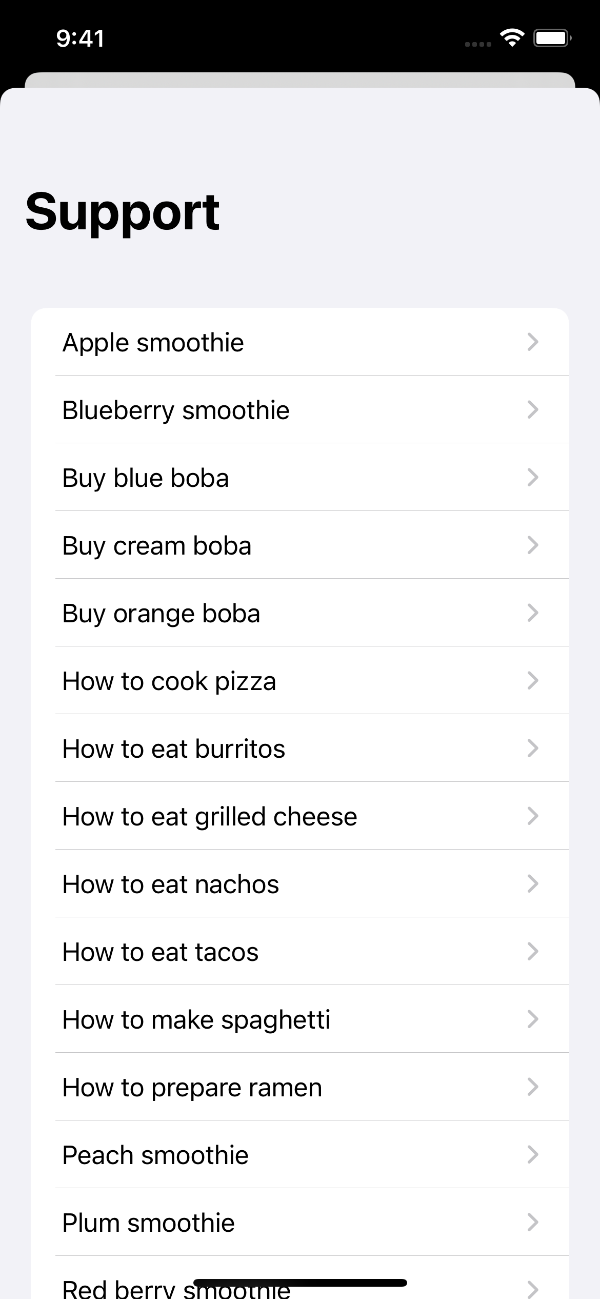
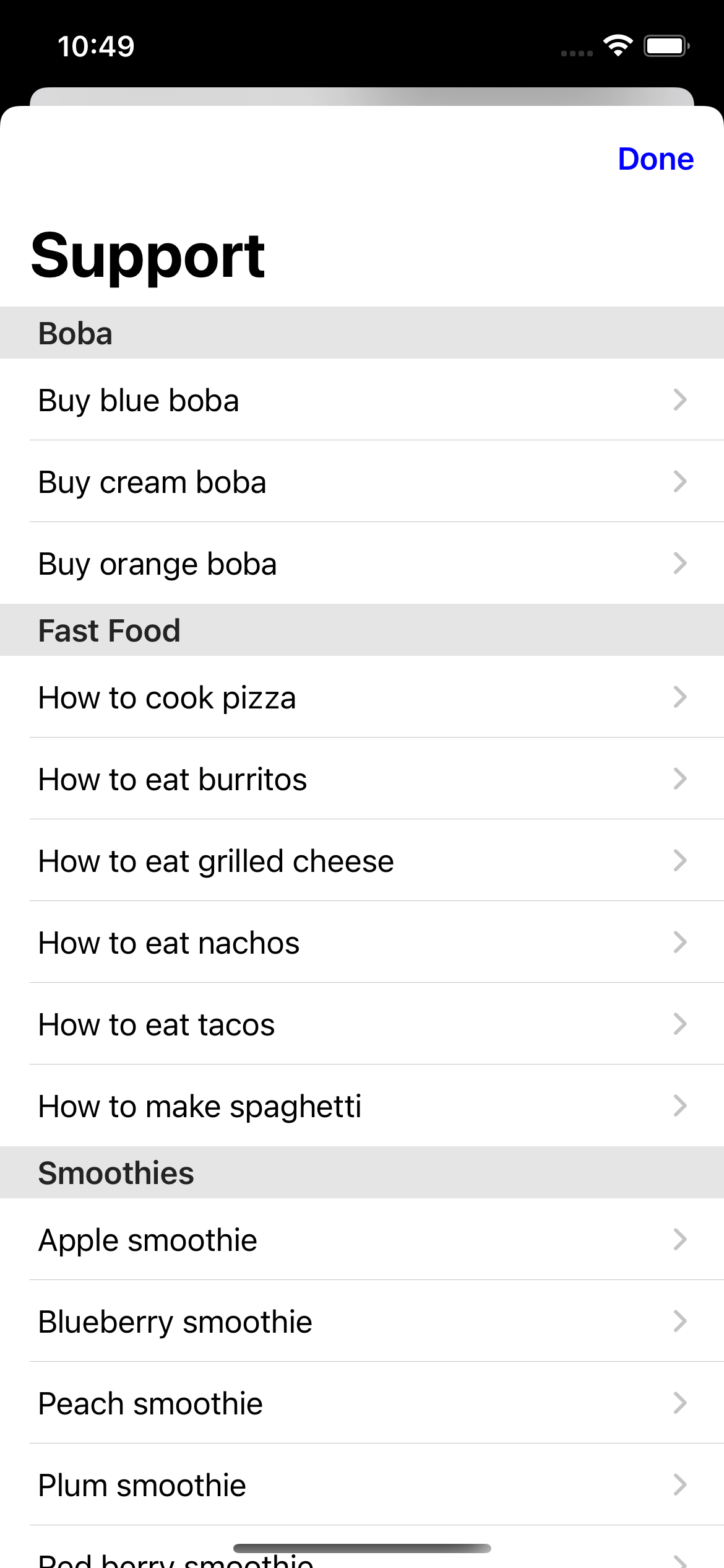
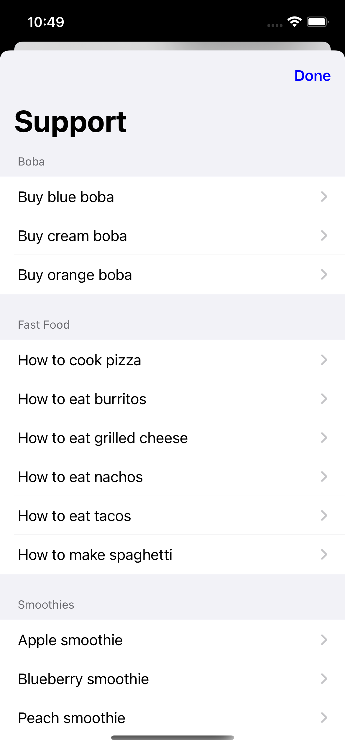
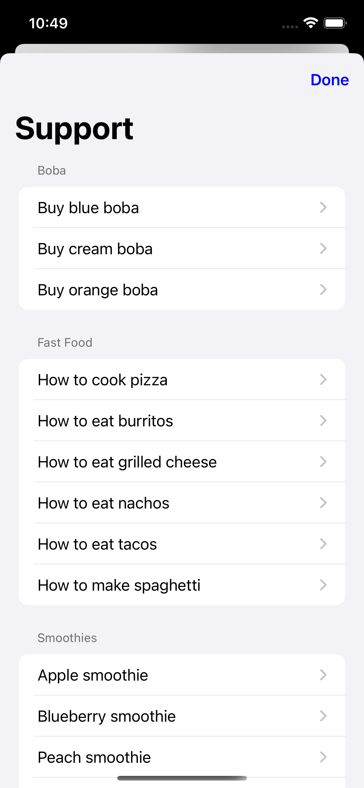
By default, the categories are set to nil, and every single document is displayed no matter their tags.
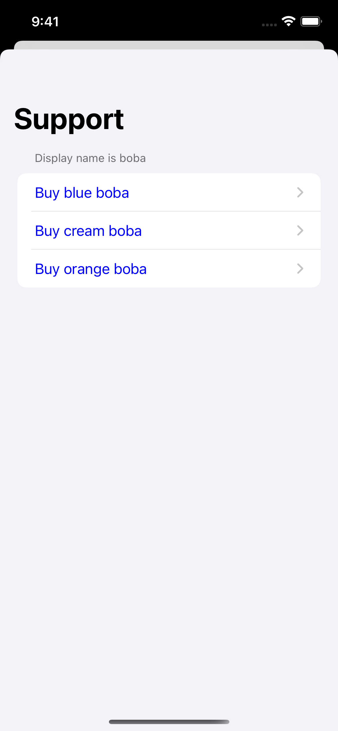
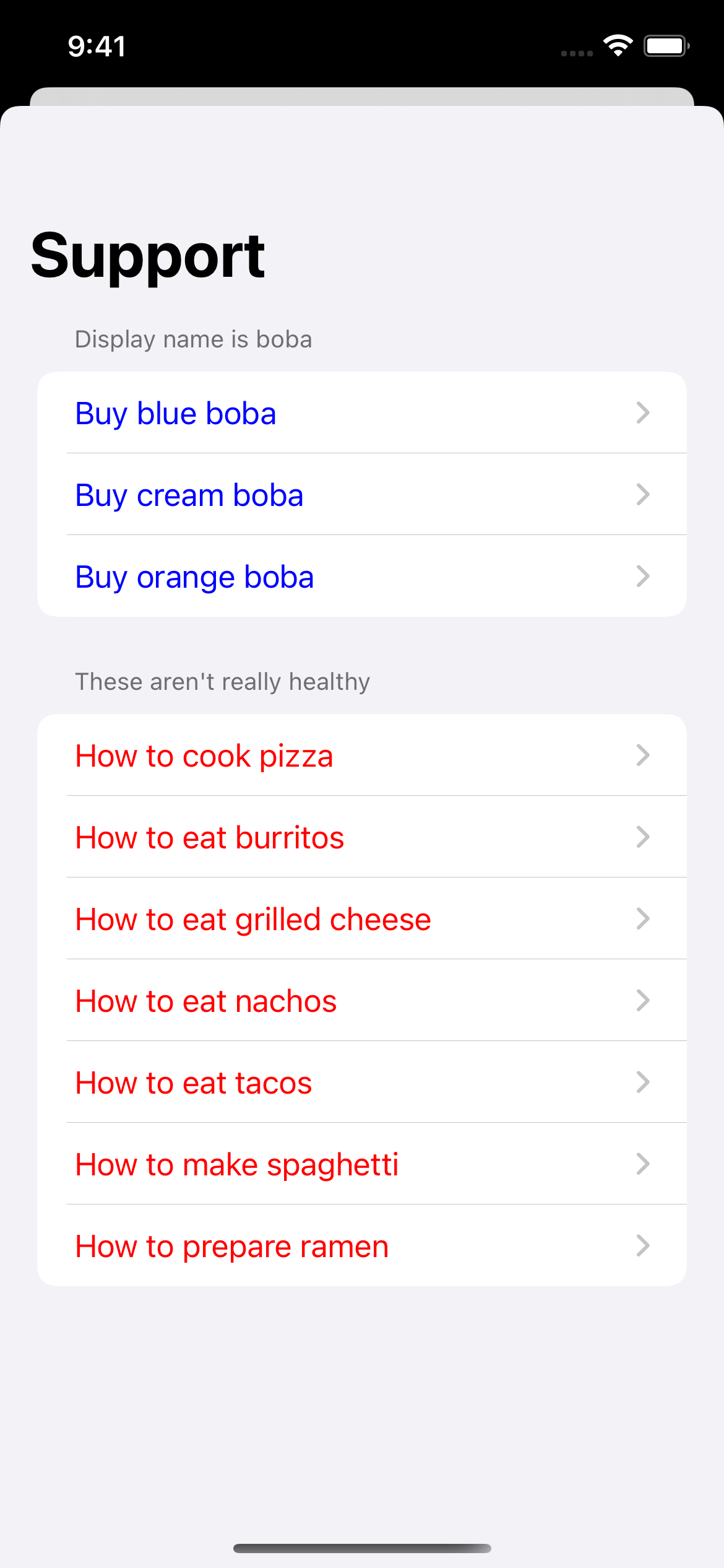
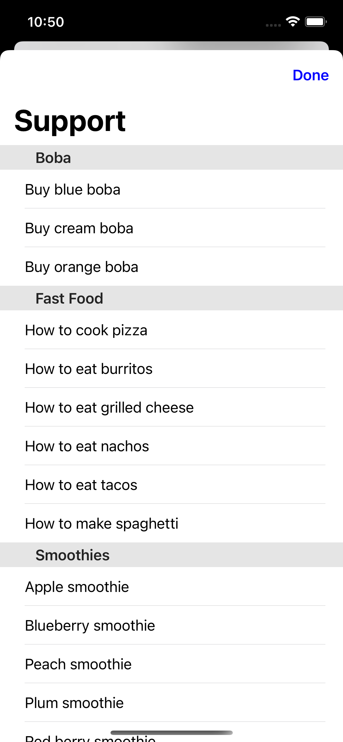
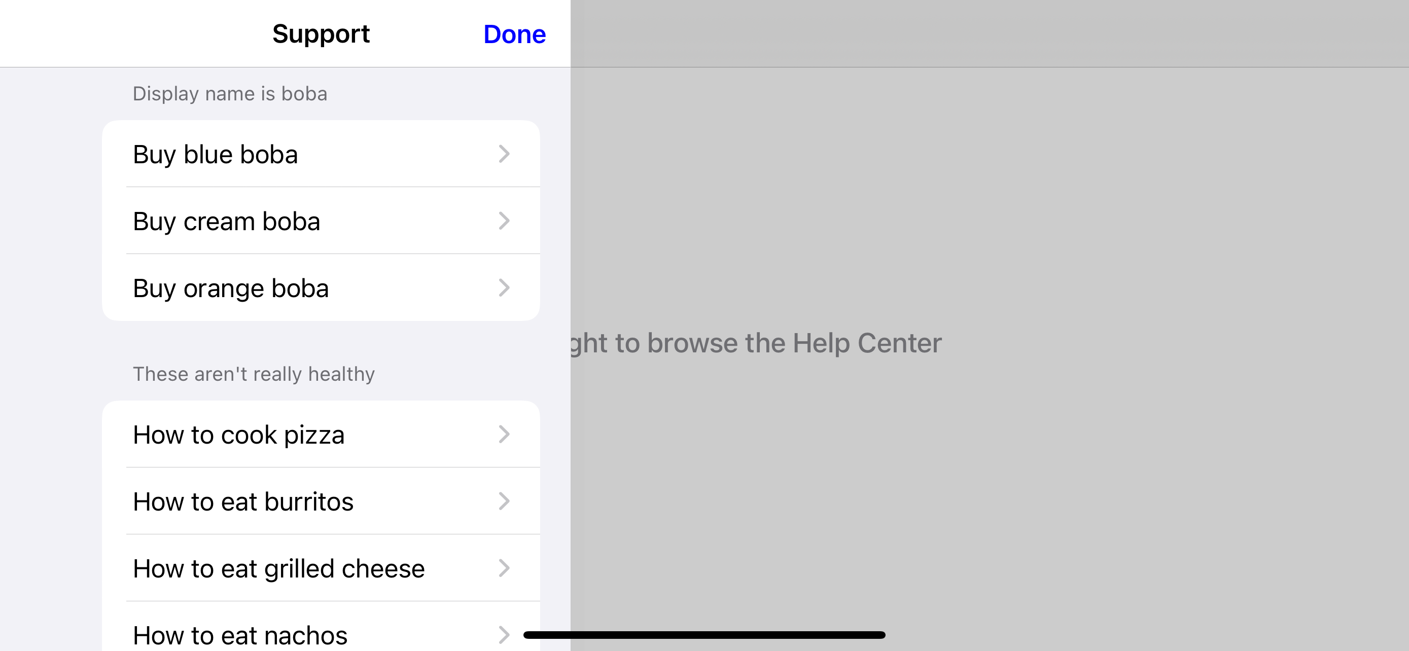
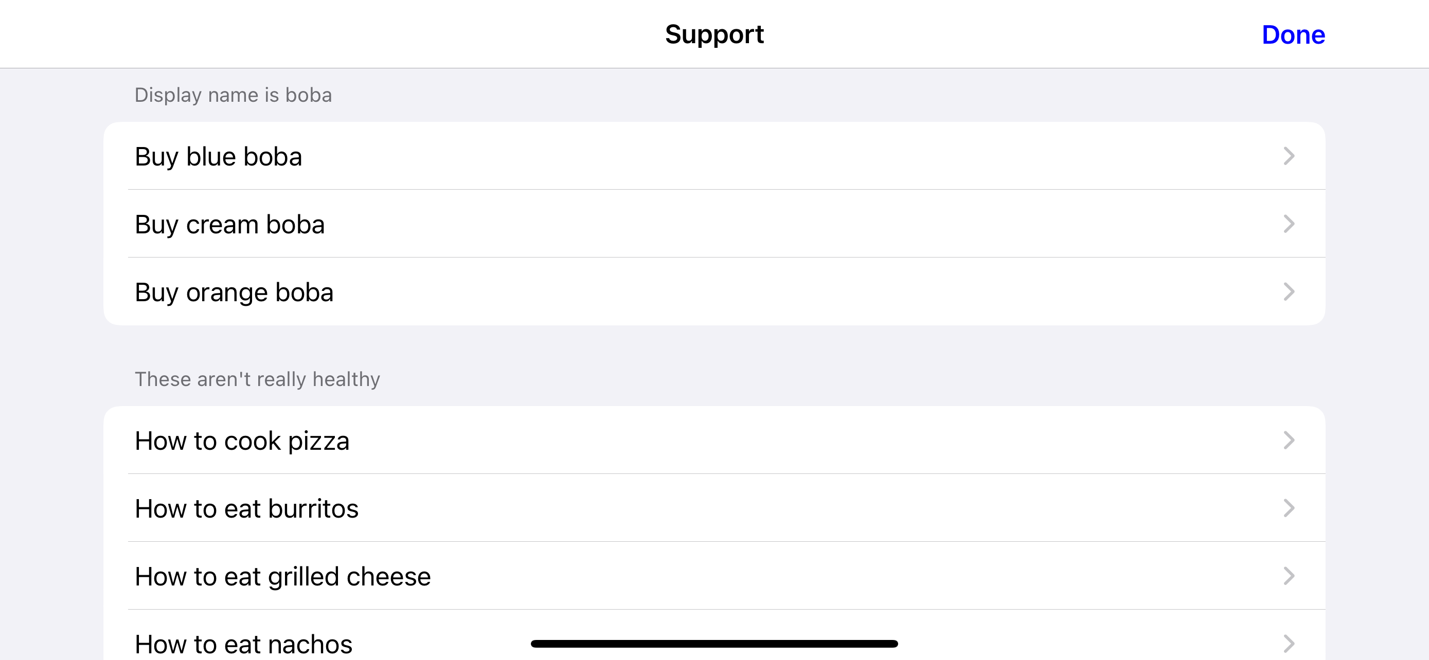
Here’s how to make SupportDocs display one category that contains all documents with the tag boba:
| SwiftUI | Result |
let options = SupportOptions(
    categories: [
        .init(
            tags: ["boba"],
            displayName: "Display name is boba",
            displayColor: UIColor.blue
        )
    ]
) |
|
| UIKit | |
var options = SupportOptions()
let bobaCategory = SupportOptions.Category(
    tags: ["boba"],
    displayName: "Display name is boba",
    displayColor: UIColor.blue
)

options.categories = [bobaCategory] |
Show full code
| SwiftUI |
struct SwiftUIExampleView_WithCategories: View {
    let dataSource = URL(string: "https://raw.githubusercontent.com/aheze/SupportDocs/DataSource/_data/supportdocs_datasource.json")!

    let options = SupportOptions(
        categories: [
            .init(
                tags: ["boba"],
                displayName: "Display name is boba",
                displayColor: UIColor.blue
            )
        ]
    )

    @State var supportDocsPresented = false

    var body: some View {
        Button("Present SupportDocs from SwiftUI!") { supportDocsPresented = true }
        .sheet(isPresented: $supportDocsPresented, content: {
            SupportDocsView(dataSource: dataSource, options: options)
        })
    }
} |
| UIKit |
class UIKitExampleController_WithCategories: UIViewController {

    /**
     Connect this inside the storyboard.

     This is just for demo purposes, so it's not connected yet.
     */
    @IBAction func presentButtonPressed(_ sender: Any) {

        let dataSource = URL(string: "https://raw.githubusercontent.com/aheze/SupportDocs/DataSource/_data/supportdocs_datasource.json")!

        var options = SupportOptions()
        let bobaCategory = SupportOptions.Category(
            tags: ["boba"],
            displayName: "Display name is boba",
            displayColor: UIColor.blue
        )

        options.categories = [bobaCategory]

        let supportDocsViewController = SupportDocsViewController(dataSource: dataSource, options: options)
        self.present(supportDocsViewController, animated: true, completion: nil)
    }
} |
This will display 2 categories, one for documents tagged with boba and another for those tagged with fastFood.
| SwiftUI | Result |
let options = SupportOptions(
    categories: [
        .init(
            tags: ["boba"],
            displayName: "Display name is boba",
            displayColor: UIColor.blue
        ),
        .init(
            tags: ["fastFood"],
            displayName: "These aren't really healthy",
            displayColor: UIColor.red
        )
    ]
) |
|
| UIKit | |
var options = SupportOptions()
let bobaCategory = SupportOptions.Category(
    tags: ["boba"],
    displayName: "Display name is boba",
    displayColor: UIColor.blue
)
let fastFoodCategory = SupportOptions.Category(
    tags: ["fastFood"],
    displayName: "These aren't really healthy",
    displayColor: UIColor.red
)

options.categories = [bobaCategory, fastFoodCategory] |
Show full code
| SwiftUI |
struct SwiftUIExampleView_WithCategories: View {
    let dataSource = URL(string: "https://raw.githubusercontent.com/aheze/SupportDocs/DataSource/_data/supportdocs_datasource.json")!

    let options = SupportOptions(
        categories: [
            .init(
                tags: ["boba"],
                displayName: "Display name is boba",
                displayColor: UIColor.blue
            ),
            .init(
                tags: ["fastFood"],
                displayName: "These aren't really healthy",
                displayColor: UIColor.red
            )
        ]
    )

    @State var supportDocsPresented = false

    var body: some View {
        Button("Present SupportDocs from SwiftUI!") { supportDocsPresented = true }
        .sheet(isPresented: $supportDocsPresented, content: {
            SupportDocsView(dataSource: dataSource, options: options)
        })
    }
} |
| UIKit |
class UIKitExampleControllerWithCategories: UIViewController {

    /**
     Connect this inside the storyboard.

     This is just for demo purposes, so it's not connected yet.
     */
    @IBAction func presentButtonPressed(_ sender: Any) {

        let dataSource = URL(string: "https://raw.githubusercontent.com/aheze/SupportDocs/DataSource/_data/supportdocs_datasource.json")!

        var options = SupportOptions()
        let bobaCategory = SupportOptions.Category(
            tags: ["boba"],
            displayName: "Display name is boba",
            displayColor: UIColor.blue
        )
        let fastFoodCategory = SupportOptions.Category(
            tags: ["fastFood"],
            displayName: "These aren't really healthy",
            displayColor: UIColor.red
        )

        options.categories = [bobaCategory, fastFoodCategory]

        let supportDocsViewController = SupportDocsViewController(dataSource: dataSource, options: options)
        self.present(supportDocsViewController, animated: true, completion: nil)
    }
} |
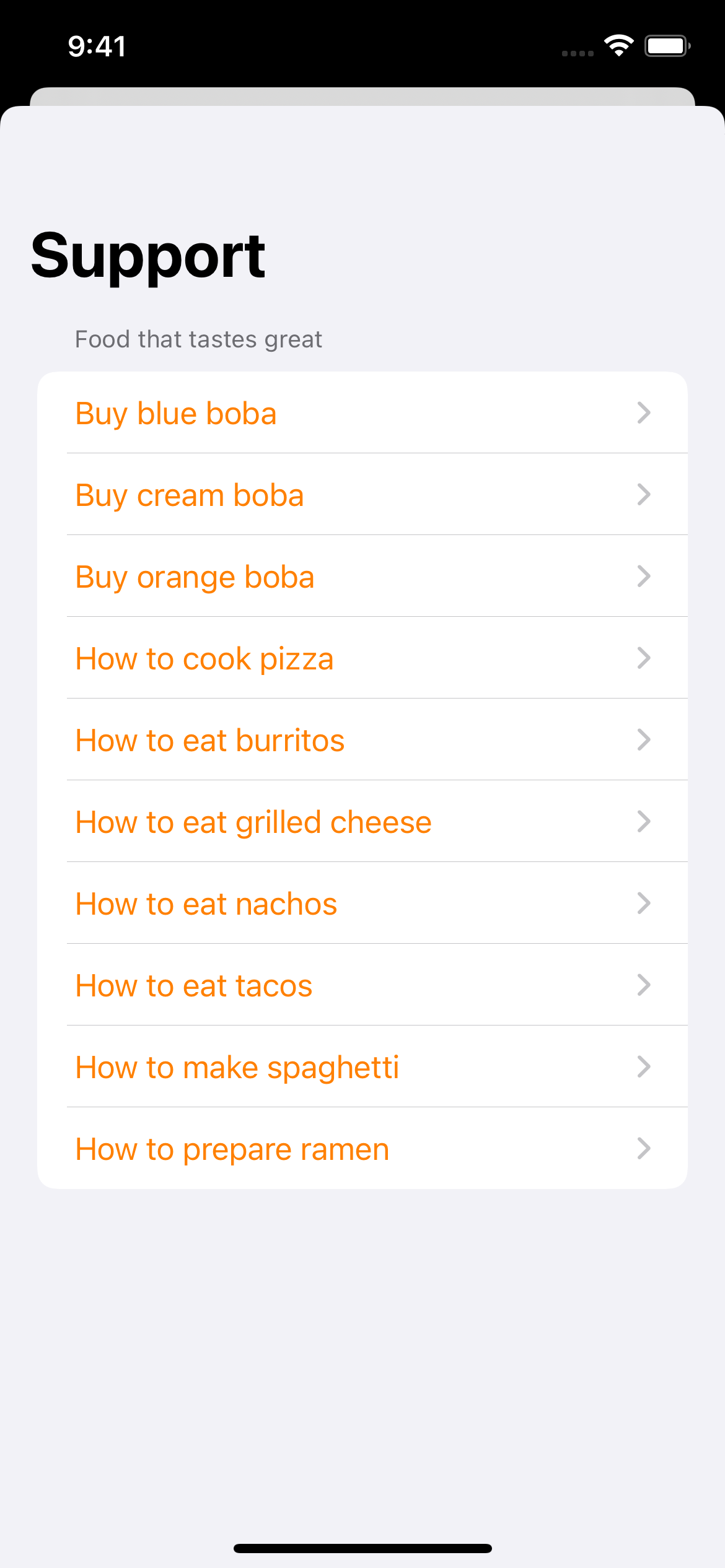
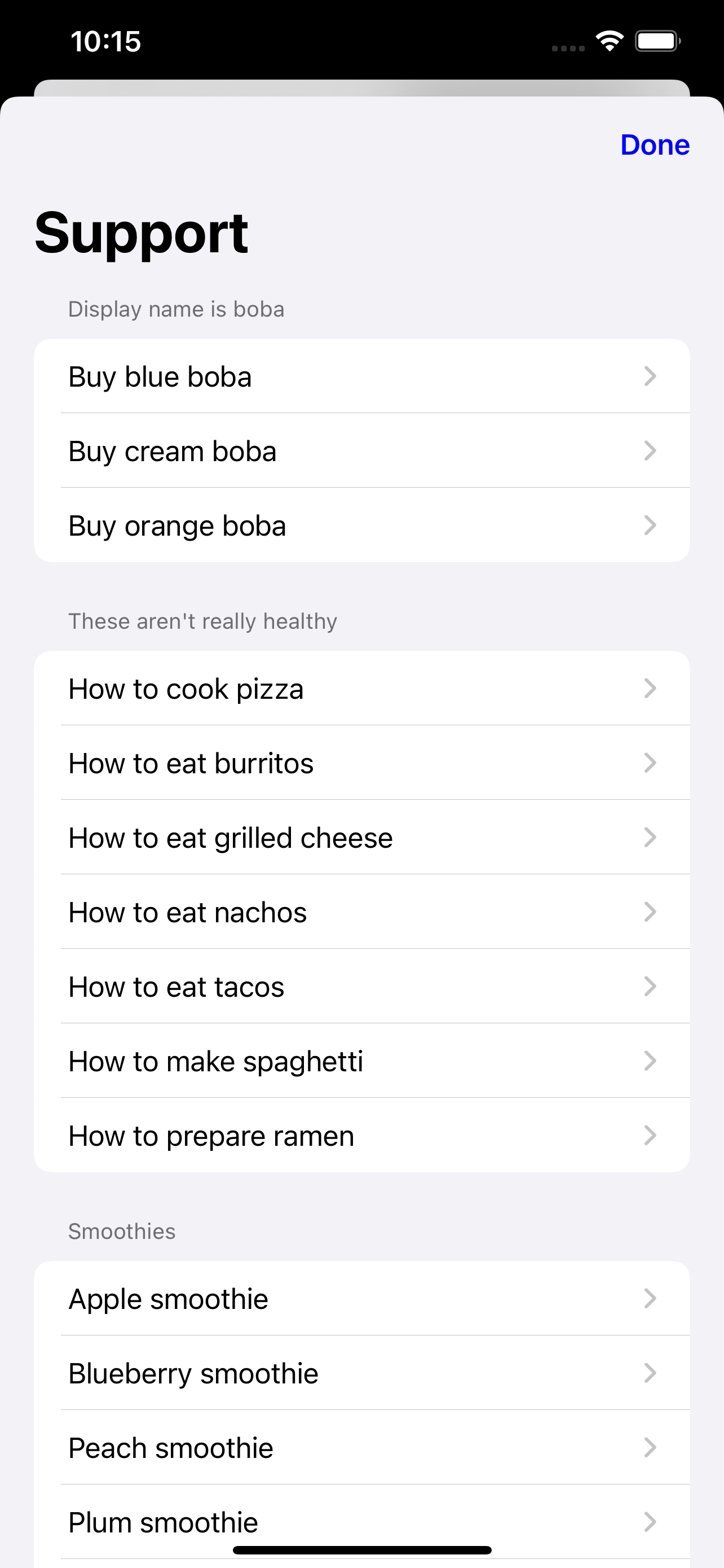
You can even combine multiple documents with different tags in the same category!
| SwiftUI | Result |
let options = SupportOptions(
    categories: [
        .init(
            tags: ["boba", "fastFood"],
            displayName: "Food that tastes great",
            displayColor: UIColor.orange
        )
    ]
) |
|
| UIKit | |
var options = SupportOptions()
let bobaAndFastFoodCategory = SupportOptions.Category(
    tags: ["boba", "fastFood"],
    displayName: "Food that tastes great",
    displayColor: UIColor.orange
)

options.categories = [bobaAndFastFoodCategory] |
Show full code
| SwiftUI |
struct SwiftUIExampleView_WithCategories: View {
    let dataSource = URL(string: "https://raw.githubusercontent.com/aheze/SupportDocs/DataSource/_data/supportdocs_datasource.json")!

    let options = SupportOptions(
        categories: [
            .init(
                tags: ["boba", "fastFood"],
                displayName: "Food that tastes great",
                displayColor: UIColor.orange
            )
        ]
    )

    @State var supportDocsPresented = false

    var body: some View {
        Button("Present SupportDocs from SwiftUI!") { supportDocsPresented = true }
        .sheet(isPresented: $supportDocsPresented, content: {
            SupportDocsView(dataSource: dataSource, options: options)
        })
    }
} |
| UIKit |
class UIKitExampleController_WithCategories: UIViewController {

    /**
     Connect this inside the storyboard.

     This is just for demo purposes, so it's not connected yet.
     */
    @IBAction func presentButtonPressed(_ sender: Any) {

        let dataSource = URL(string: "https://raw.githubusercontent.com/aheze/SupportDocs/DataSource/_data/supportdocs_datasource.json")!

        var options = SupportOptions()
        let bobaAndFastFoodCategory = SupportOptions.Category(
            tags: ["boba", "fastFood"],
            displayName: "Food that tastes great",
            displayColor: UIColor.orange
        )

        options.categories = [bobaAndFastFoodCategory]

        let supportDocsViewController = SupportDocsViewController(dataSource: dataSource, options: options)
        self.present(supportDocsViewController, animated: true, completion: nil)
    }
} |
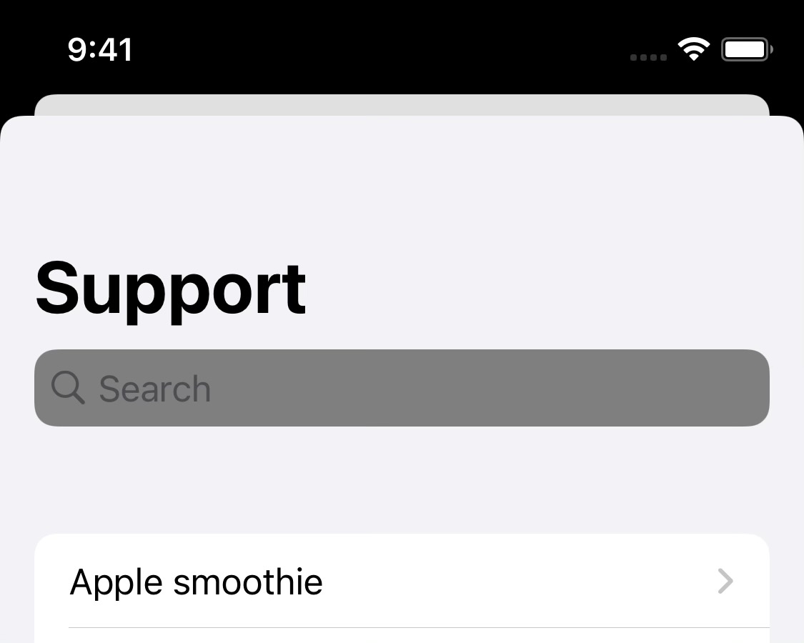
This is the bar that's shown at the top of the screen. You can customize quite a lot of its elements.

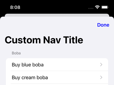
The title to display.
| SwiftUI | Result |
let options = SupportOptions(
  navigationBar: .init(
    title: "Custom Nav Title"
  )
) |
|
| UIKit | |
var options = SupportOptions()
options.navigationBar.title = "Custom Nav Title" |
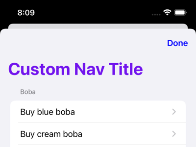
The color of the title.
| SwiftUI | Result |
let options = SupportOptions(
  navigationBar: .init(
    title: "Custom Nav Title",
    titleColor: UIColor.purple
  )
) |
|
| UIKit | |
var options = SupportOptions()
options.navigationBar.title = "Custom Nav Title"
options.navigationBar.titleColor = UIColor.purple |
With convenience overload: Dismiss Button Title
This is what will be shown as the dismiss button (press to dismiss SupportDocs), and leave it as nil to not show it at all.
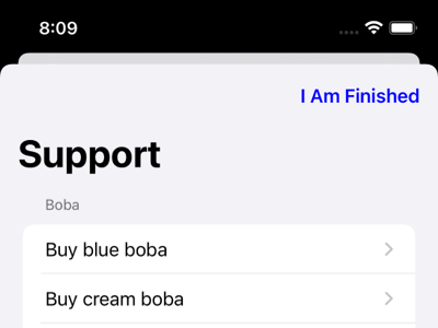
By default, you pass in an AnyView of your choice. This should either be an Image or a Text, but you can experiment with other elements. For example, both of these will work:
|
|
|
AnyView(Image(systemName: "xmark")) /// SF Symbols are best |
AnyView(Text("I Am Finished")) /// `Text` works just as well |
You then pass it into SupportOptions's navigationBar.dismissButtonView parameter.
| SwiftUI | Result |
let options = SupportOptions(
  navigationBar: .init(
    dismissButtonView: AnyView(Text("I Am Finished"))  /// or, AnyView(Image(systemName: "xmark"))
  )
) |
|
| UIKit | |
var options = SupportOptions()
options.navigationBar.dismissButtonView = AnyView(Text("I Am Finished")) /// or, AnyView(Image(systemName: "xmark")) |
However, if you're using SwiftUI, you have the option of supplying a plain String instead. This is a little easier to read than AnyView, but is limited to a String and SwiftUI.
let options = SupportOptions(
  navigationBar: .init(
    dismissButtonTitle: "I Am Finished" /// Just a normal String
  )
)The color of the dismiss button (if any) and the back button (appears once you tap on a row in the list).
| SwiftUI | Result |
let options = SupportOptions(
  navigationBar: .init(
    dismissButtonTitle: "I Am Finished",
    buttonTintColor: UIColor.green
  )
) |
Dismiss button ↓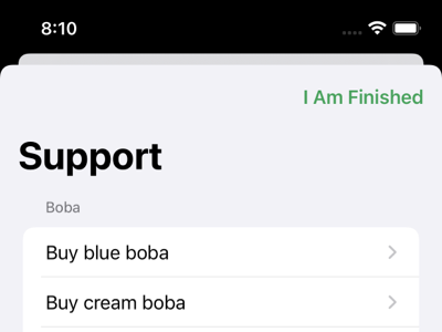 Back button (after selecting a document) ↓ 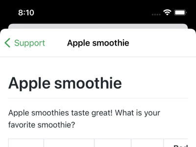
|
| UIKit | |
var options = SupportOptions()
options.navigationBar.dismissButtonTitle = "I Am Finished"
options.navigationBar.buttonTintColor = UIColor.green |
The background color of the navigation bar.
| SwiftUI | Result |
let options = SupportOptions(
  navigationBar: .init(
    backgroundColor: UIColor(
      red: 217 / 255,
      green: 247 / 255,
      blue: 255 / 255,
      alpha: 1
    )
  )
) |
Before scrolling ↓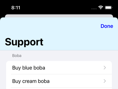 After scrolling ↓ 
|
| UIKit | |
var options = SupportOptions()
options.navigationBar.backgroundColor = UIColor(
  red: 217 / 255,
  green: 247 / 255,
  blue: 255 / 255,
  alpha: 1
) |
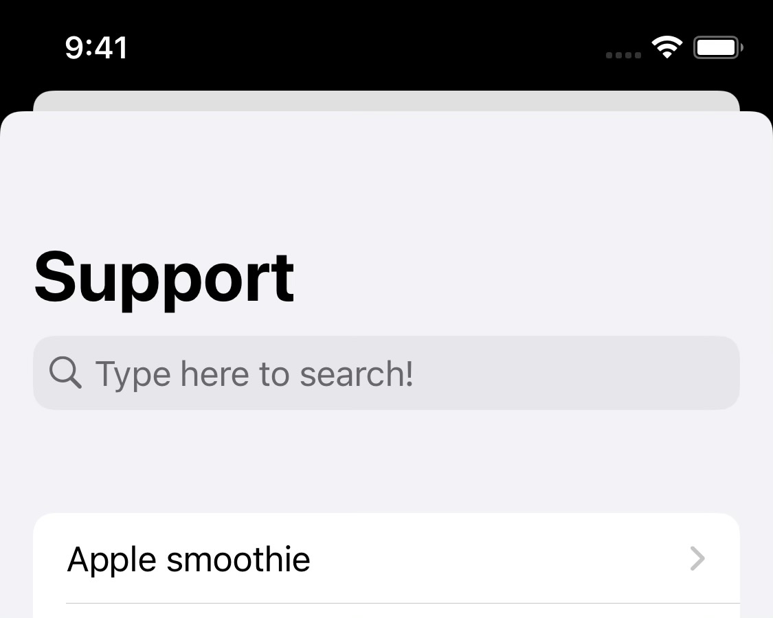
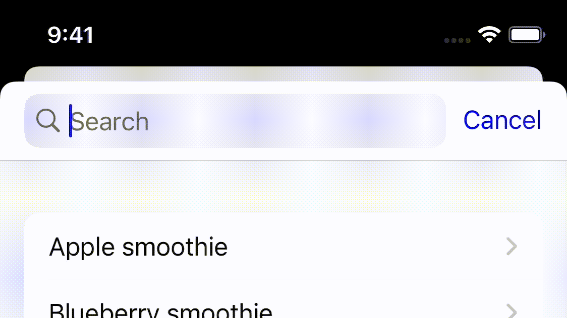
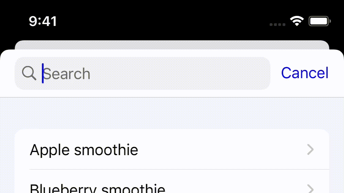
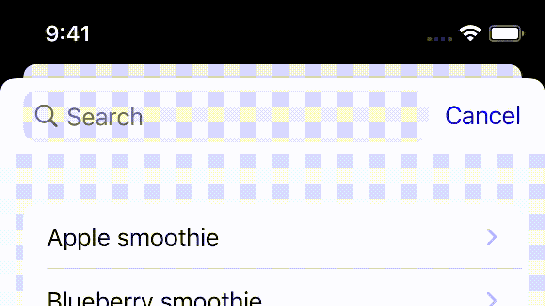
New in 1.1.0! This lets your users search the documents in your help center.
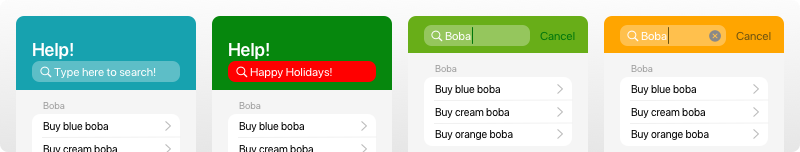
The placeholder to display when no text has been entered yet.
| SwiftUI | Result |
let options = SupportOptions(
    searchBar: .init(
        placeholder: "Type here to search!"
    )
) |
|
| UIKit | |
var options = SupportOptions()
options.searchBar.placeholder = "Type here to search!" |
The color of the placeholder.
| SwiftUI | Result |
let options = SupportOptions(
    searchBar: .init(
        placeholder: "Type here to search!",
        placeholderColor: UIColor.blue.withAlphaComponent(0.75)
    )
) |
|
| UIKit | |
var options = SupportOptions()
options.searchBar.placeholder = "Type here to search!"
options.searchBar.placeholderColor = UIColor.blue.withAlphaComponent(0.75) |
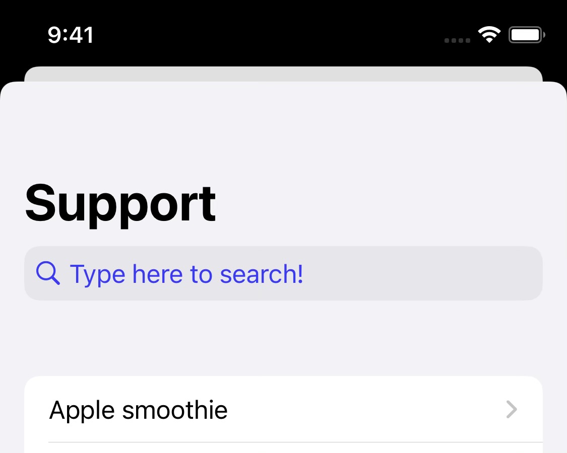
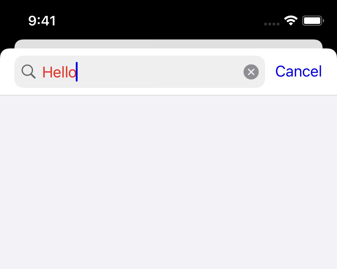
The color of the text entered in the search bar.
| SwiftUI | Result |
let options = SupportOptions(
    searchBar: .init(
        textColor: UIColor.red
    )
) |
|
| UIKit | |
var options = SupportOptions()
options.searchBar.textColor = UIColor.red |
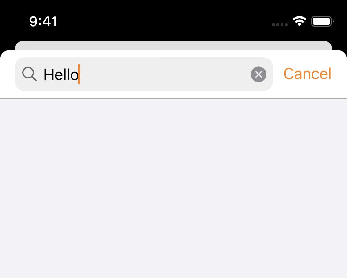
The color of the cursor and the "Cancel" button
| SwiftUI | Result |
let options = SupportOptions(
    searchBar: .init(
        tintColor: UIColor.orange
    )
) |
|
| UIKit | |
var options = SupportOptions()
options.searchBar.tintColor = UIColor.orange |
Background color of the search bar.
| SwiftUI | Result |
let options = SupportOptions(
    searchBar: .init(
        backgroundColor: UIColor.gray
    )
) |
|
| UIKit | |
var options = SupportOptions()
options.searchBar.backgroundColor = UIColor.gray |
When to show the clear button. This is one of Apple's built-in enums for text fields and search bars.
| SwiftUI | UIKit |
let options = SupportOptions(
    searchBar: .init(
        clearButtonMode: .whileEditing
    )
) |
var options = SupportOptions()
options.searchBar.clearButtonMode = .whileEditing |
.whileEditing |
.unlessEditing |
.always |
.never |
|---|---|---|---|
 |
 |
 |
 |
Note: It seems that .whileEditing and .always are the same thing. Similarly, .unlessEditing and .never are also interchangeable.
This shows up when the user has pressed a row in the list, waiting for the document to load.

The color of the moving part of the bar.
| SwiftUI | Result |
let options = SupportOptions(
  progressBar: .init(
    foregroundColor: UIColor.red
  )
) |
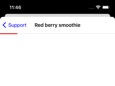
|
| UIKit | |
var options = SupportOptions()
options.progressBar.foregroundColor = UIColor.red |
The background color of the bar.
| SwiftUI | Result |
let options = SupportOptions(
  progressBar: .init(
    foregroundColor: UIColor.red,
    backgroundColor: UIColor.blue
  )
) |
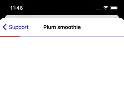
|
| UIKit | |
var options = SupportOptions()
options.progressBar.foregroundColor = UIColor.red
options.progressBar.backgroundColor = UIColor.blue |
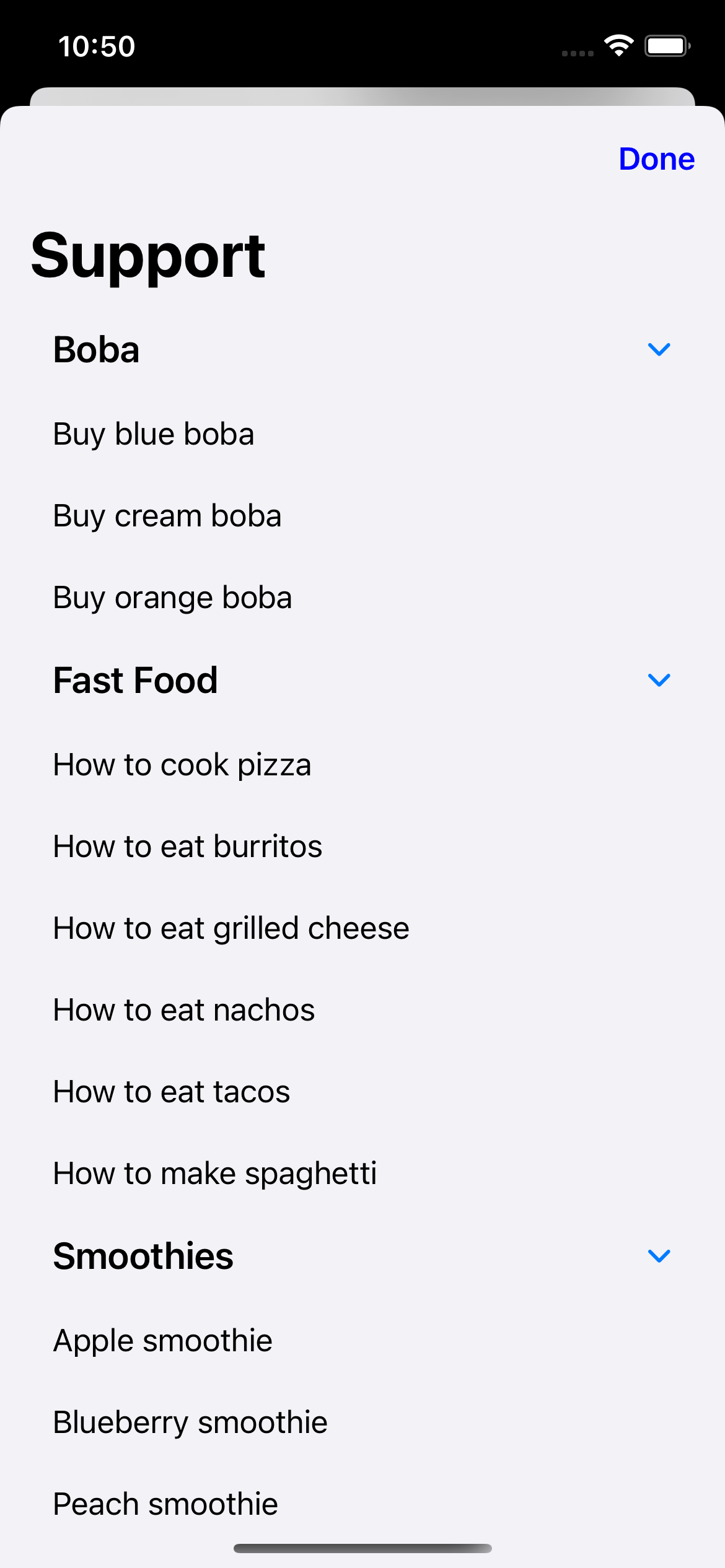
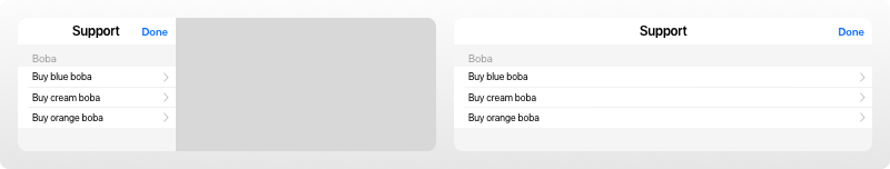
The SupportDocs library is written in SwiftUI, so you get access to SwiftUI's list styles! Customizing this changes the way the list is displayed.
| List Style | Result |
.defaultListStyle |
 |
| SwiftUI | |
let options = SupportOptions(
  listStyle: .defaultListStyle
) |
|
| UIKit | |
var options = SupportOptions()
options.listStyle = .defaultListStyle |
|
.plainListStyle |
 |
| SwiftUI | |
let options = SupportOptions(
  listStyle: .plainListStyle
) |
|
| UIKit | |
var options = SupportOptions()
options.listStyle = .plainListStyle |
|
.groupedListStyle |
 |
| SwiftUI | |
let options = SupportOptions(
  listStyle: .groupedListStyle
) |
|
| UIKit | |
var options = SupportOptions()
options.listStyle = .groupedListStyle |
|
.insetGroupedListStyle |
 |
| SwiftUI | |
let options = SupportOptions(
  listStyle: .insetGroupedListStyle
) |
|
| UIKit | |
var options = SupportOptions()
options.listStyle = .insetGroupedListStyle |
|
.insetListStyle |
 |
| SwiftUI | |
let options = SupportOptions(
  listStyle: .insetListStyle
) |
|
| UIKit | |
var options = SupportOptions()
options.listStyle = .insetListStyle |
|
.sidebarListStyle |
 |
| SwiftUI | |
let options = SupportOptions(
  listStyle: .sidebarListStyle
) |
|
| UIKit | |
var options = SupportOptions()
options.listStyle = .sidebarListStyle |
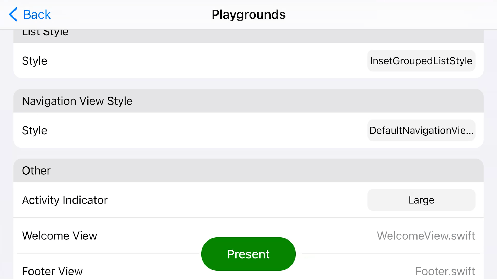
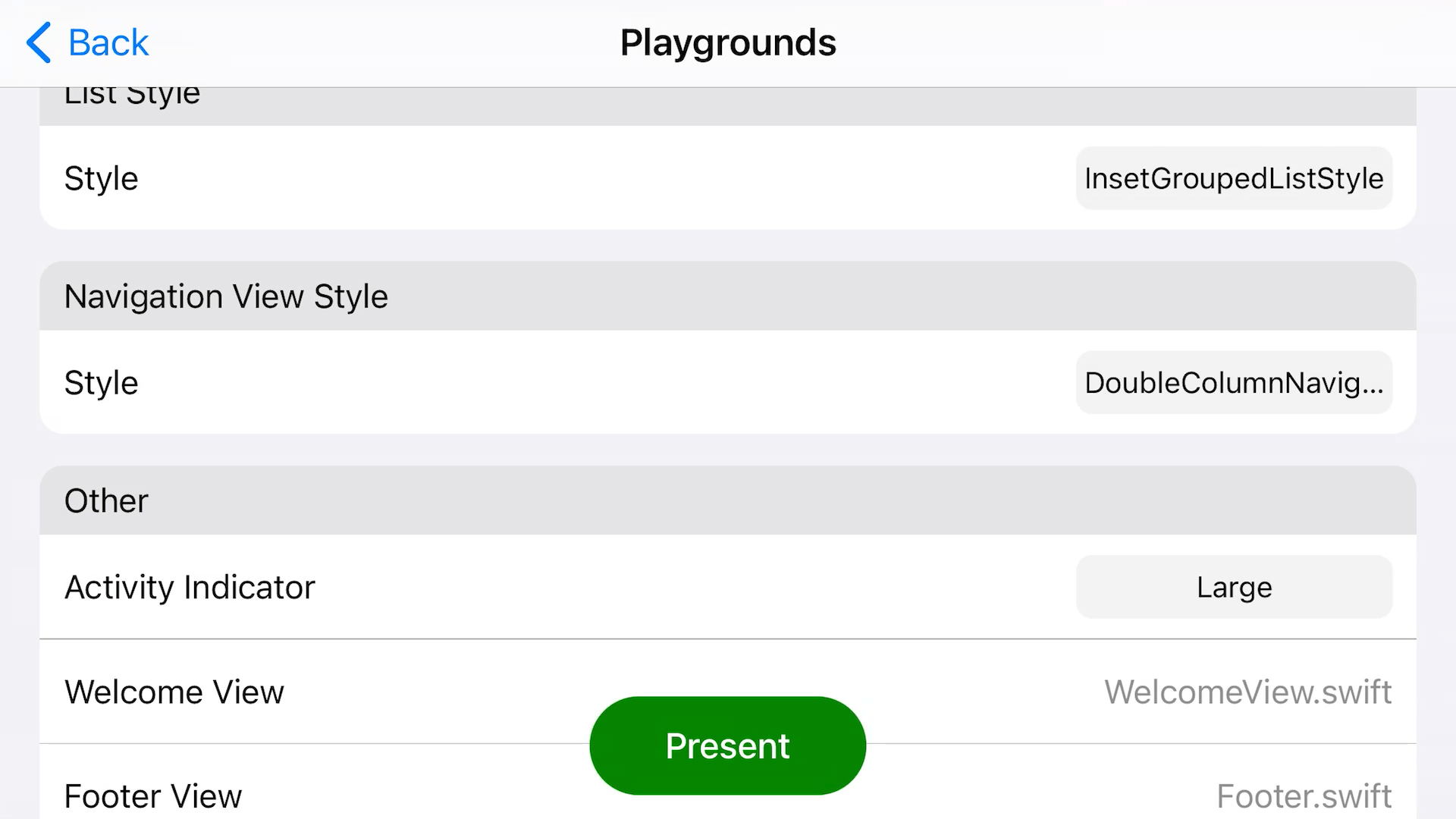
This is another thing that comes from SwiftUI, which controls the layout of the navigation view. This only applies to larger devices like the iPhone 7 Plus when they are in landscape, or iPads. If your app is portrait-only, you can ignore this.
| SwiftUI | UIKit |
let options = SupportOptions(
    navigationViewStyle: .defaultNavigationViewStyle
) |
var options = SupportOptions()
options.navigationViewStyle = .defaultNavigationViewStyle |
| Navigation View Style | Portrait Result | Landscape Result | Landscape Interaction |
|---|---|---|---|
.defaultNavigationViewStyle |
 |
 |
 |
.doubleColumnNavigationViewStyle |
|
 |
 |
.stackNavigationViewStyle |
|
 |
 |
Keep in mind, if you go with .defaultNavigationViewStyle or .doubleColumnNavigationViewStyle (they're actually the same thing), you should supply a welcomeView as well. This is what will be shown at the start, when no list row has been selected yet. Scroll down to Other to see more.
Some miscellaneous options for SupportDocs.

| SwiftUI | UIKit |
let options = SupportOptions(
    other: .init(
        activityIndicatorStyle: .medium,
        welcomeView: AnyView(Text("Swipe right")),
        footer: AnyView(Text("Contact us if you didn't find what you were looking for!")),
        error404: URL(string: "https://aheze.github.io/SupportDocs/404")!
    )
) |
var options = SupportOptions()
options.other.activityIndicatorStyle = .medium
options.other.welcomeView = AnyView(Text("Swipe right"))
options.other.footer = AnyView(Text("Contact us if you didn't find what you were looking for!"))
options.other.error404 = URL(string: "https://aheze.github.io/SupportDocs/404")! |
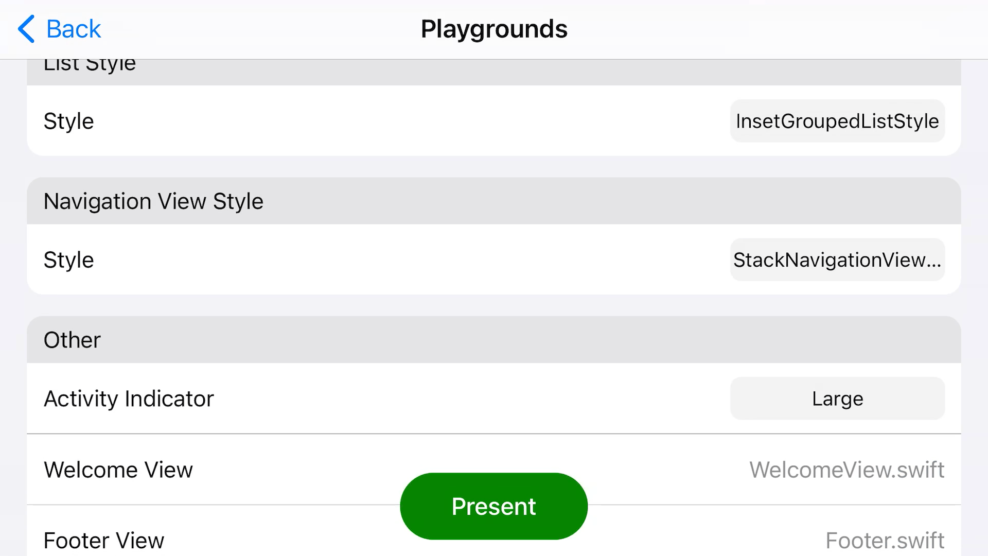
| Parameter | Type | Values | Default | Corresponding Graphic |
|---|---|---|---|---|
activityIndicatorStyle |
UIActivityIndicatorView.Style |
.large or .medium |
.medium |
Graphic #1 |
welcomeView |
AnyView |
-- | nil |
Graphic #2 |
footer |
AnyView |
-- | nil |
Graphic #3 |
error404 |
URL |
-- | URL(string: "https://aheze.github.io/SupportDocs/404")! |
Graphic #4 |
activityIndicatorStyle: Size of the activity indicator that's shown when the JSON is being downloaded. You can choose either.largeor.medium.welcomeView: A custom view that will be shown at first, but only in landscape on larger devices and iPads (see Navigation View Style). See Example/WelcomeView.swift for an example.footer: A custom view you can add to the bottom of the list. See Example/Footer.swift for an example.error404: A web page to display in case something cannot be found.