Inorder to setup the project we need to install react, material-ui & other necessary packages. First create a folder named mortgage-calculator and then run the following command in the terminal
npx create-react-app .
npm install @mui/material @emotion/react @emotion/styled
npm install --save chart.js react-chartjs-2We will be using the dark theme of material UI. For that we need to create a file named theme.js in the src folder and add the following code
import { createTheme } from '@mui/material/styles';

export const theme = createTheme({
  palette: {
    mode: 'dark',
  },
})Next up, we need to import the theme in the index.js file and wrap the app with the theme provider. follow along 👇
import { ThemeProvider } from "@mui/material/styles";
import CssBaseline from "@mui/material/CssBaseline";
import { theme } from "./theme";

<React.StrictMode>
  <ThemeProvider theme={theme}>
    <App />
    <CssBaseline />
  </ThemeProvider>
</React.StrictMode>
Note: If you don't pass the CssBaseline component we will not be able to see the MUI dark theme.
Next up, we will be creating a very simple Navbar to show the Logo. For that we need to create a file named Navbar.js in the src/Components folder and add the following code
import AppBar from "@mui/material/AppBar";
import Toolbar from "@mui/material/Toolbar";
import Typography from "@mui/material/Typography";
import { Container } from "@mui/system";

const Navbar = () => {
  return (
    <AppBar position="static">
      <Container maxWidth='xl'>
        <Toolbar>
          <Typography variant="h5">
            Bank of React
          </Typography>
        </Toolbar>
      </Container>
    </AppBar>
  );
};
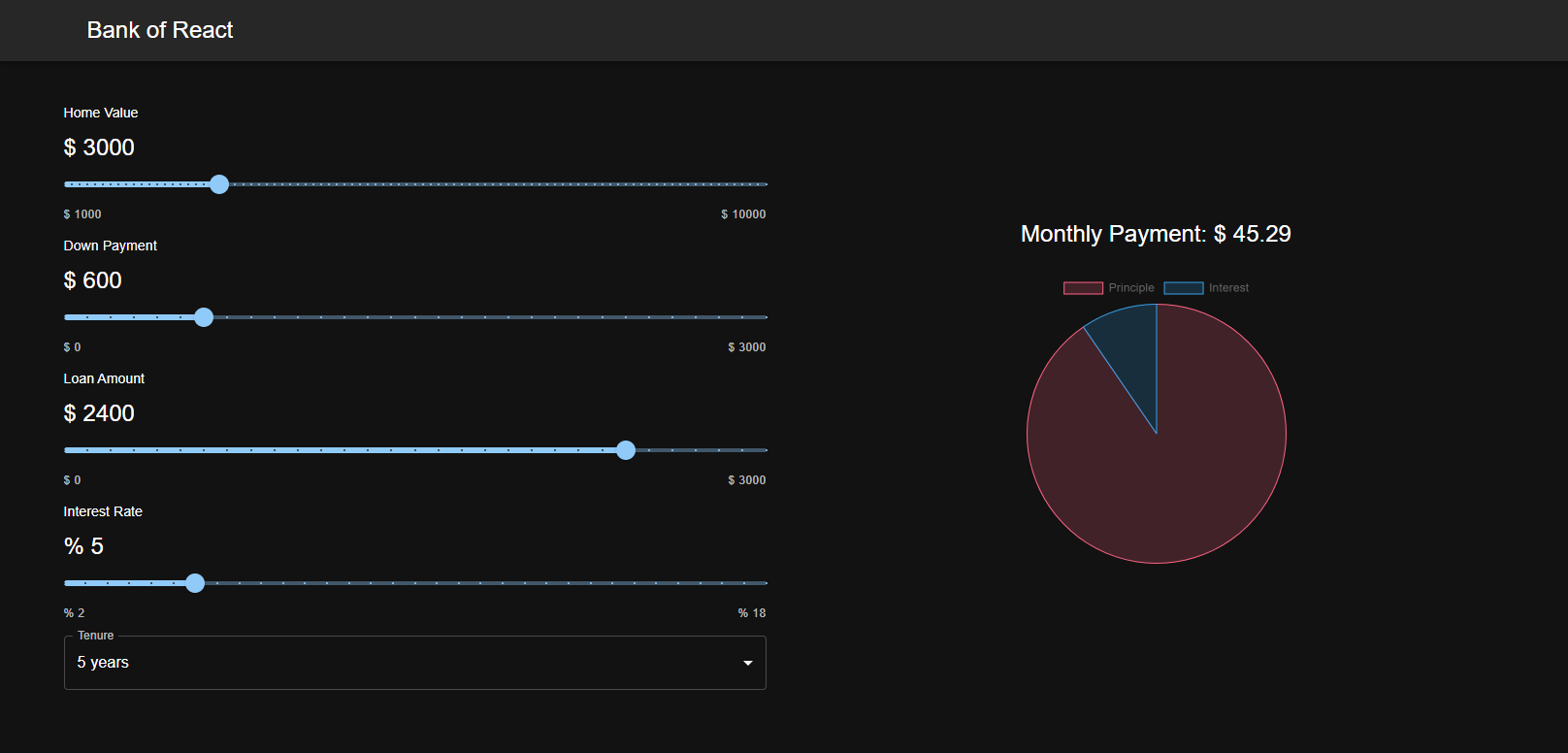
export default Navbar;next up, we will be creating a slider component to get the input amount from the user. It will look something like this 👇

For that we need to create a file named SliderComponent.js in the src/Components/Common folder. First lets list out all the props we need to pass to our re-usable slider component
onChange,
- label - The label of the slider
- min - The minimum value of the slider
- max - The maximum value of the slider
- defaultValue - The default value of the slider
- unit - The unit of the slider
- value - The value of the slider
- steps - The number of steps of the slider
- amount - The amount range of the slider
- onChange - The onChange function of the slider
lets get going, first of all, import the following components from MUI
import React from "react";
import Slider from "@mui/material/Slider";
import { Typography } from "@mui/material";
import { Stack } from "@mui/system";
We will be using the Stack component from MUI to stack the components vertically. my is the shorthand for marginY [margin-top & margin-bottom]. We will be using the Typography component from MUI to display the label, unit and other datas. We will be using the Slider component from MUI to display the slider.
write these small amounts of code first with our props destructured.
const SliderComponent = ({
  defaultValue,
  min,
  max,
  label,
  unit,
  onChange,
  amount,
  value,
  steps
}) => {
  return (
    <Stack my={1.4}>

    </Stack>
  )
}

export default SliderComponent<Stack gap={1}>
<Typography variant="subtitle2">{label}</Typography>
<Typography variant="h5">
{unit} {amount}
</Typography>
</Stack><Slider
min={min}
max={max}
defaultValue={defaultValue}
aria-label="Default"
valueLabelDisplay="auto"
onChange={onChange}
value={value}
marks
step={steps}
/><Stack direction="row" justifyContent="space-between">
<Typography variant="caption" color="text.secondary">
{unit} {min}
</Typography>
<Typography variant="caption" color="text.secondary">
{unit} {max}
</Typography>
</Stack>