Improvement of alt-text for data visualization in book/website/reproducible-research/open.md #2630
Comments
|
|

|
Hi @LizHareDogs, here's a first try for this alt-text. I don't know if I should try to gather the actual values for each area and if the description is enough. A plot of the relative citation rate (OA/non-OA), in the x axis, for different areas of knowledge, in the y axis. The areas of knowledge are organized from the highest to the lowest Relative Citation Rate in the following order: Agricultural Studies, Physics/Astronomy, Medicine, Computer Science, Sociology/Social Sciences, Psychology, Political Science, Management, Law, Economics, Mathematics, Health, Engineering, Philosphy, Education, Business, Communications Studies, Ecology, and Biology. The highest mean values are around 3.2 for Africultural Studies and the lowest are around 1.2.for Biology. |
|
Hi @AndreaSanchezTapia - It's great to see you here! This alt-text is great! It tells me what the pattern of the data is, which is really important. I think if you gave the values for each field, the alt-text would be too long because there are so many fields. I might say "... for 19 different areas of knowledge..." to give information about how many data points there are and then the reader would understand why they aren't each listed as well as having information about the size of the data set. Also for clarity with the screen reader, I might write "citation rate (OA divided by non-OA) rather than using the slash (/) . Screen readers aren't consistent about reading punctuation/math in the alt-text. Thanks so much! |
|
Thanks @LizHareDogs ! I did have a doubt about the math division because it was a colon originally but spelling it completely is a great tip. A correction then: A plot of the relative citation rate (OA divided by non-OA), in the x axis, for 19 different areas of knowledge, in the y axis. The areas of knowledge are organized from the highest to the lowest Relative Citation Rate in the following order: Agricultural Studies, Physics/Astronomy, Medicine, Computer Science, Sociology/Social Sciences, Psychology, Political Science, Management, Law, Economics, Mathematics, Health, Engineering, Philosophy, Education, Business, Communications Studies, Ecology, and Biology. The highest mean values are around 3.2 for Agricultural Studies, and the lowest are around 1.2 for Biology. |
|
We could have an improving alt-text activity in the next BookDash @aleesteele , what do you think? I remember we wrote the alt-text for the Translation and localisation figures we created with Scriberia last year but some older figures could be better described in general, especially the ones that have lots of text. |
|
Hi @LizHareDogs and @AndreaSanchezTapia! Great to see you here, my apologies for the extremely late response to your issue & tag. Thanks so much for bringing this important issue to the community, @LizHareDogs! Correct alt-text for data visualisations is so important, especially if TTW aims to make data science accessible and inclusive for all. Last week, I had a few conversations with people in real time about this issue, and about what we can do during the next Book Dash and otherwise to facilitate more conversations, knowledge & training around accessibility. What do you all think of the following options:
Also wanted to flag to you both that we have an #accessibility channel on Slack that we'll be looking to reactivate in the coming months, particularly for this work: https://theturingway.slack.com/archives/C01E654A42E |
|
@all-contributors please add @LizHareDogs for ideas 😄 |
|
I've put up a pull request to add @LizHareDogs! 🎉 |
|
Hi @aleesteele and @AndreaSanchezTapia,
Thanks so much for this. Making the edits was on my list of things to do but I hadn't gotten there, so I appreciate you doing it.
Your ideas are great; I'd definitely like to see more resources about how to make data analysis environments and data visualization more accessible. Even better, an organization like TTW can set expectations of inclusion across the community.
I'm willing to help out with the BookDash events and the other accessibility project depending on the timeline.
I have just written a chapter for a book that will be openly available in December about data visualization accessibility. My chapter is on alt-text, and some great authors have written about other aspects (tools for creating graphs that are navigable with screen readers, various adaptations for low vision access, cognitive accessibility, etc.)
Can you please let me know if I have to apply or register to participate in these?
Thanks again for your work on this issue!
Liz
… On Oct 3, 2022, at 1:09 PM, Anne Lee Steele ***@***.***> wrote:
Hi @LizHareDogs <https://github.com/LizHareDogs> and @AndreaSanchezTapia <https://github.com/AndreaSanchezTapia>! Great to see you here, my apologies for the extremely late response to your issue & tag. Thanks so much for bringing this important issue to the community, @LizHareDogs <https://github.com/LizHareDogs>! Correct alt-text for data visualisations is so important, especially if TTW aims to make data science accessible and inclusive for all.
Last week, I had a few conversations with people in real time about this issue, and about what we can do during the next Book Dash and otherwise to facilitate more conversations, knowledge & training around accessibility. What do you all think of the following options:
For Book Dash: We have four 1-1.5 hour "social call" times during that week. What would you both say to running a more general talk about accessibility during the Book Dash, that can be followed up with more targeted resources + training around accessibility?
I recently spoke with Mars Lee ***@***.*** <https://github.com/MarsBarLee>) at the 2022 RSE Asia Australia Unconference, and was looking at some of the resources she has about accessibility with the NumPy community. Maybe you'd be interested in joining in, Mars?
Thinking further, I also see space for documenting best practices for improving alt-text in the community handbook: https://the-turing-way.netlify.app/community-handbook/community-handbook.html <https://the-turing-way.netlify.app/community-handbook/community-handbook.html>
FYI - there is interest and need in creating another guide around Accessibility in the coming months, but this is a work in progress and won't be something we'll see until early 2023 at the latest (tagging @malvikasharan <https://github.com/malvikasharan> for more context).
Also wanted to flag to you both that we have an #accessibility channel on Slack that we'll be looking to reactivate in the coming months, particularly for this work: https://theturingway.slack.com/archives/C01E654A42E <https://theturingway.slack.com/archives/C01E654A42E>
—
Reply to this email directly, view it on GitHub <#2630 (comment)>, or unsubscribe <https://github.com/notifications/unsubscribe-auth/AMVDYUEQZMY3BSDLAHW6AJDWBMHM7ANCNFSM6AAAAAAQHCM64A>.
You are receiving this because you were mentioned.
|
|
Hi all! I’m Mars, I was pinged here by @aleesteele . Yes, I would be interested in joining a alt text Book Dash and other events. Yes to documenting best practices
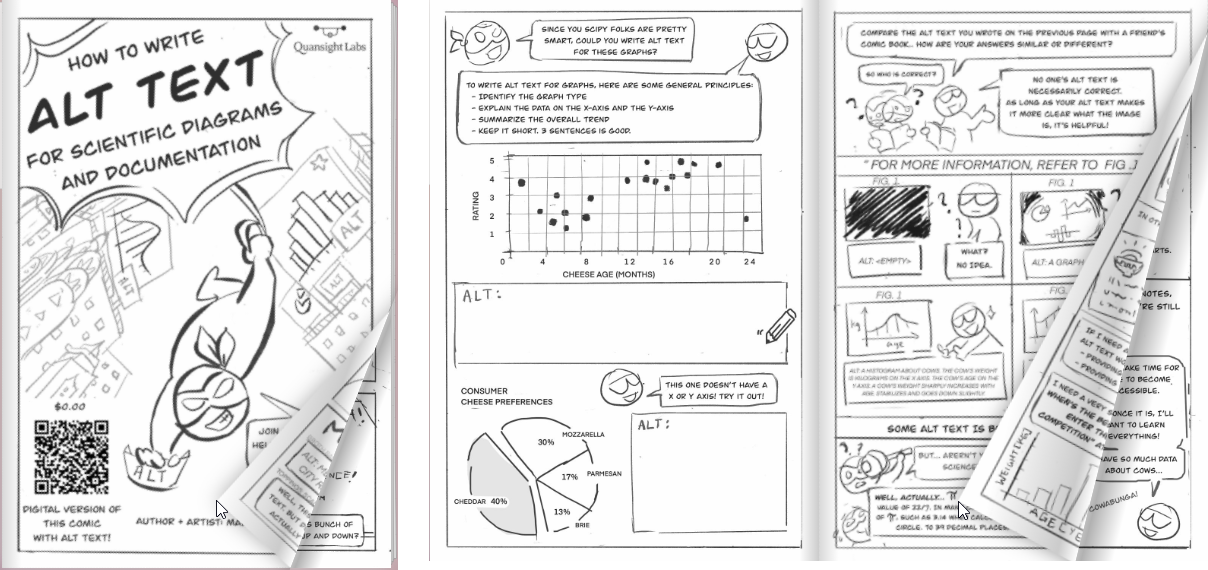
Alt Text Workshops in the Scientific Python space
Comics
What to detail in alt text for scientific diagrams
|


correct alt-text according to issue #2630
name: "\u2728 General"
about: Have a different idea?
title:
labels:
assignees: ''
Summary
Improvement of alt-text for data visualization in book/website/reproducible-research/open.md
Description
As a screen reader user, I appreciate the efforts that have been made to build an amazing
resource that is available to everyone, including alt-text for graphics.
I'm specifically writing about alt-text for data visualizations.
The ones in the open.md chapter get started well, but they leave me
wondering what the data are saying and why the graphic was included.
Example from line 69:
I can read that this is a scatter plot showing the relationship, but what relationship
does the graph show? This critical part of
data visualization alt-texts is often omitted,
but it's really important.
What needs to be done?
Some questions to answer while writing alt-text:
What kind of graph is it? [scatter plot]
What variables are on the x and y axes?
What range is depicted? Or what are the minimum and maximum values?
What does this plot say about the comparison of OA and non-OA
articles?
I'll post examples as separate issues as I find them.
Who can help?
I can't write the missing part of the alt-text because I can't see the graph.
But if someone wants to write the alt text, I can incorporate it into the file.
Updates
Lorem ipsum dolor sit amet, consectetur adipiscing.
The text was updated successfully, but these errors were encountered: