PapiPlot takes the output generated with Papify and generates graphs that can be used to evaluate the performance of your ORC-Apps. These graphs come served with a generated html where value tables are included for each graph, so you can check the specific value for each point or copy them into an excel/word document.
If you place the PapiPlot binary inside the papi-output dir, you can run it without any arguments: it will generate the graphs with default parameters. Other options available are:
-p [path]	 Set path to the papi-output folder generated with Papify. If not specified, current directory will be used.

-x [res_x]	 Change horizontal resolution. If not specified, default is 1680.

-y [res_y]	 Change vertical resolution. If not specified, default is 1050.

-t [font size]	 Change tics font size. If not specified, default is 8.

-l [font size]	 Change labels font size. If not specified, default is 8.

-n 	 	No labels will be printed

-h 	 	Print help
##Compile PapiPlot generates the graphs using gnuplot, so make sure it is installed:
sudo apt-get install gnuplot
It is possible to quickly compile papiplot using cmake:
$ git clone https://github.com/Papify/papiplot.git
$ cd papiplot/papiplot/
$ cmake .
$ make
You can also import the project into eclipse.
##Examples
An example of an html generated with PapiPlot has been set up at http://papify.github.io/papiplot. Note that this is just an example generated with the command ./papiplot (no parameters) using the data obtained after applying papify to all actions, all actors to the orc-app RVC, an app that has some actors with lots of actions, meaning some images are not properly adjusted to make them usable. This can be fixed using the resolution parameters integrated in PapiPlot, an example is shown below.
Here's what the graphs look like without labels ($ ./papiplot -n)

Sometimes it's possible for an actor to have a huge amount of actions papified and everything may look cramped like in the following example:
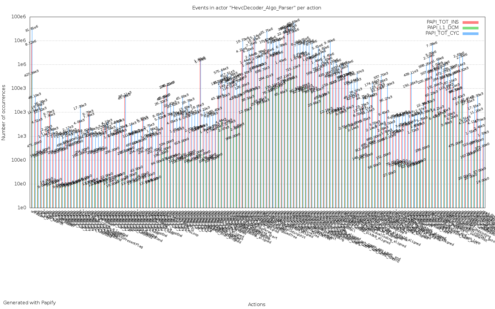
Now that's awful!
You might want to consider reducing the amount of actions papified in this actor and repeat the process several times to get the same stats grouped into different charts. But if you insist in having everything in a single graph, you may want to consider the following:
#####Increase horizontal resolution Increasing horizontal resolution will give PapiPlot more space to plot your data, making it more convenient to read. In the folowing example, the vertical resolution is also increased a little bit:
./papiplot -x 7000 -y 2000

Now that looks better, but the image size gets just too big (click on the image to see in full resolution).
It is also convenient to remove labels in order to get a cleaner graph:
./papiplot -x 7000 -y 2000 -n

##TODO #####More stats:
- Number of execs per action
- Number of execs per actor
- Average of event per action
- Average of event per actor
- Execs per second (First, papify needs to be updated to provide timestamps per action exec)