Header #97
Comments
 govuk-design-system
created this issue from a note
in GOV.UK Design System Community Backlog
(Agreed)
govuk-design-system
created this issue from a note
in GOV.UK Design System Community Backlog
(Agreed)
 timpaul
added
the
component
timpaul
added
the
component
This comment has been minimized.
This comment has been minimized.
This comment has been minimized.
This comment has been minimized.
This comment has been minimized.
This comment has been minimized.
This comment has been minimized.
This comment has been minimized.
This comment has been minimized.
This comment has been minimized.
This comment has been minimized.
This comment has been minimized.
This comment has been minimized.
This comment has been minimized.
This comment has been minimized.
This comment has been minimized.
This comment has been minimized.
This comment has been minimized.
This comment has been minimized.
This comment has been minimized.
|
Capturing alphagov/govuk-frontend#972 here - the extra space in the header on certain tablet breakpoint is something we should explore fixing but there is no straightforward way to do this because:
|
|
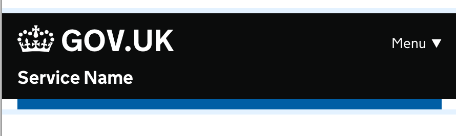
It's a small thing, but we (Digital Marketplace) just noticed that the header example in Design System is slightly different to the header used for the Design System; the service name ("Design System" in this case) is in a different place. In the header used, the service name is right next to the GOV.UK badge, and a lighter font. In the example header, the service name is in the middle of the header, and in a bold font. As there isn't any specific guidance on where the service name should be in the header does mean that the example is not definitive? |
|
Many HMRC services do not use the navigation but do have a 'Sign out' link on the right hand side of the header. Desktop Mobile This would be a good thing to include in the documentation and code, assuming this would help other government departments too. This could also be part of #95. |


|
@lfdebrux Hi Laurence, apologies for the the delay in responding to this. The header in the Design System is to be used by services. The service name is in bold, centred within the header and has independent links to both the first page of the service and the GOV.UK home page
The header used by the Design System is the header designed for GOV.UK products. It's currently in use on GOV.UK Service Manual, GOV.UK Service Toolkit, GOV.UK Notify, GOV.UK Pay, GOV.UK Verify, GOV.UK PaaS and Registers product pages. This has the product name directly next to GOV.UK and they are grouped together as one link that takes you to the product home page.
This design was initiated for the Government as a Platform products just under two years ago. It might be that it would be the better option for Digital Marketplace too. |


|
It would be great to have some padding between the ‘Menu’ link and the service name on the header seen on small screens. Having them butt up so close I think reduces readability. |

I think this might be the design from one of the old codebases. The current version in GOV.UK Frontend / Design System has the Menu button on the same line as GOV.UK, not the service name for this reason
|
 timpaul
moved this from In progress
to Published
in GOV.UK Design System Community Backlog
timpaul
moved this from In progress
to Published
in GOV.UK Design System Community Backlog
|
The header currently collapses nav links in to a menu on mobile (which is very nice) - but for my service the breakpoint it collapses at is var larger than necessary - our tablet users could get our full nav but right now they're not. It looks like the breakpoint is defined here. Would it be possible to allow this width to be overridden? |
|
On reviewing the header https://design-system.service.gov.uk/components/header/default/index.html# in NVDA for Windows the png Header – Example – GOV.UK Design System document To make NVDA ignore the |
|
Would it be possible in a future update the ability to change the SVG of the crown? At CH we don't use the crown for our services and there is no simple way to swap it out using Nunjucks |
@DavidMcClelland-uxm thanks for flagging this – I've raised an issue over in the GOV.UK Frontend repo to track this. If you want to stay updated, you can subscribe to notifications for the issue. |
@mgearon-ch I've raised an issue over in the GOV.UK Frontend repo to track this. If you want to stay updated, you can subscribe to notifications for the issue. |
|
Sharing an example of how my service's header looks: This is adapted from the HMCTS header with primary navigation combined with the Design System header pattern. Implementation details:
Overall I'd say this has tested very well. Our users seem to be able to use it well. Have not tested the mobile implementation (our user base does not tend to use mobiles) and I am wary of the collapsing. Our previous nav looked like this: This nav was not persistent and was only shown when on a top level page. It was using the HMCTS Sub navigation pattern. We previously relied heavily on back links and breadcrumbs for navigation. However some pages in our service could be very nested, making it very awkward to move between cases. The the revised header with persistent nav has made escaping much easier. I was initially hesitant to include the nav links within the black bar vs outside of them. However we plan to have secondary nav outside of the black bar related to individual cases. In this case it makes sense for the black bar to be 'global things' and stuff below it to be related to the case you're on. Mobile closed: Mobile open: |


|
During a signup journey (logged-out user state), the service name in the "Header with service name" component is clickable and by default returns the user to the start of the signup journey and clears their entered signup data. Our team are interested in what scenarios would this behaviour would be useful for the user? |
|
This is an example (below) of how the header looks in our service.
The first iteration did not have any navigation. User research showed users needed navigation so a later iteration (below) had navigation links in the black header. Unfortunately, we found that users did not see the links there.
We looked at other services including the Agent services account (many of our users are agents) and integrated an existing design with the navigation below the black header. Implementation details:
Users have found this iteration much easier to use and it has tested well. |


|
It would be good if the menu collapsing could be disabled / smarter. My service has a single item in that bit of the header, so collapsing it just puts it a further click away. I wonder if it could not collapse if there's just a single item. I'd guess we can probably hack the html to do it in the short term. Desktop: Mobile: |


|
I just wanted to add to this discussion to say that we also have found that users often do not see this header navigation on our service. We are working on the "Drive in a Clean Air Zone" service and we used this pattern whilst designing our check multiple vehicles service which is for business users to create an account. During our beta research found we found around 35% of a sample of 115 users did not see the navigation at all and this has been a recurring finding in just over a years worth of research. We have recently been testing a pattern with the navigation below the black header similar to HMRC's personal tax account header and have found this to be much more successful with our users. Although this does seem to be presenting us with some challenges for implementation for a mobile with JavaScript turned off. |
|
Hello! As part of discussions for the header component in the NHS digital service manual community backlog, it appears the examples and guidance for the GOV.UK Design System header component may be out of date when compared with the latest header which is live on GOV.UK |
|
Hi @henocookie 👋 The header on the GOV.UK website (www.gov.uk) is different to what's in the GOV.UK Design System. At the moment we don't have plans to update the header in the Design System as the navigation links exposed in the GOV.UK header are there to expose GOV.UKs information architecture to users and that's not necessarily useful information to those completing services. Services often have their own navigational elements (log in/out) etc which that design doesn't account for. |
|
For info. The service for 'Tax free childcare' has 'Sign out' on the right but below the header. I don't know why that design was chosen. I'm showing it here just for information, not as a recommendation. |

|
productName | string | Product name, used when the product name follows on directly from ‘GOV.UK’. For example, GOV.UK Pay or GOV.UK Design System. In most circumstances, you should use serviceName. Just wondering if the font weight actually offer any value to users and if testing was documented anywhere? |
|
We ran an external accessibility audit for some of the components and patterns in GOV.UK Frontend in May 2023. In that audit, we included an example of the Header component. We’re adding results from that audit here so that we can:
One usability issue raised''Show or hide menu' label is redundant since we use 'aria-expanded'. Change label to just 'Menu'
More detail in this issue: |
|
We have recently added a navigation bar to our service, and as part of this, we moved the "Sign out" link from the service navigation menu in the GOVUK header to the new navigation bar. One of the advantages to this is that it means we can drop the "Menu" toggle in the GOVUK header, which currently appears on mobile. Here’s the new design:
|

|
@frankieroberto would you mind adding this as a comment to our discussion about navigation too? |

 For 'Send an SR1 medical evidence form', the 'Header with service name and navigation' was tested with 50 users using different devices over 6 rounds of testing to understand user experience of navigating SREL journey whilst completing a set task in which they were asked to navigate into other pages.
The component has consistently failed in user testing as users across the digital familiarity scale have struggled to find those pages (listed as nav item in the header).
Research has shown that,
as the nav bar is embed into the header and there is no clear distinction between them (the title of the service and the nav items have the same font color and background color) users struggle to find the navigation,
the header is hidden on scroll - potentially a sticky navbar would work better.
For 'Send an SR1 medical evidence form', the 'Header with service name and navigation' was tested with 50 users using different devices over 6 rounds of testing to understand user experience of navigating SREL journey whilst completing a set task in which they were asked to navigate into other pages.
The component has consistently failed in user testing as users across the digital familiarity scale have struggled to find those pages (listed as nav item in the header).
Research has shown that,
as the nav bar is embed into the header and there is no clear distinction between them (the title of the service and the nav items have the same font color and background color) users struggle to find the navigation,
the header is hidden on scroll - potentially a sticky navbar would work better.
We've tested an header with a different layout (second image) and this performed better as items were more visible to users and better aligned. |
|
@mattia-gobbo thanks for sharing! This research finding matches research that previous teams have done too (as in thread above). You might also want to look at the proposed future header for GOV.UK services using One Login, which has the sign out link in the black bar, but the service name and navigation in a separate grey bar below. |
 and others
Use this issue to discuss the header component in the GOV.UK Design System.
What
Header for GOV.UK, including full-width, departmental, internal and service variants.
Why
Site headers are used on all web pages. There's also a need for consistent headers for departmental and internal services.
Anything else
Related patterns
The text was updated successfully, but these errors were encountered: