Skip to content
New issue

Have a question about this project? Sign up for a free GitHub account to open an issue and contact its maintainers and the community.

By clicking “Sign up for GitHub”, you agree to our terms of service and privacy statement. We’ll occasionally send you account related emails.

Already on GitHub? Sign in to your account

How to bin data before sending it to a chart? #1691

Closed
KoenBal opened this issue Sep 10, 2019 · 2 comments
Closed

How to bin data before sending it to a chart? #1691

KoenBal opened this issue Sep 10, 2019 · 2 comments
Labels

Comments

@KoenBal
Copy link

KoenBal commented Sep 10, 2019

Hello,

I'm trying to build a bar chart with on the x-axis a binned result_perc.
Because I have too many records I have to bin them first using pandas.
I do this by using an IntervalIndex:

width = 10
bins = pd.IntervalIndex.from_breaks([round(x, 1) for x in list(np.linspace(-width, width, (width*10+1), endpoint=True))])
# aggregate per bin
aggregations = {"amount_eur": ['sum']}
df = df[['result_perc_bin', 'amount_eur']].groupby(by=['result_perc_bin']).agg(aggregations)
df = df.reset_index()
df.columns = df.columns.get_level_values(0)

I now have a df with reduced records which I can use to create a bar chart.
But Altair gives the error:

TypeError: Object of type 'Interval' is not JSON serializable

To fix this I convert the dtype of result_perc_bin (the IntervalIndex) which looks like this

IntervalIndex([(-10.0, -9.8], (-9.8, -9.6], (-9.6, -9.4], (-9.4, -9.2], (-9.2, -9.0] ... (9.0, 9.2], (9.2, 9.4], (9.4, 9.6], (9.6, 9.8], (9.8, 10.0]],
              closed='right',
              dtype='interval[float64]')

df.result_perc_bin = df.result_perc_bin.astype('str').astype('category')

But this conversion screws up the order of the labels, so I need a sort_order:

result_perc_bin_sort_order = list(bins.astype(str))

The code to create the chart:

        chart = alt.Chart(data=df).mark_bar(
                opacity=0.3,
                color=color
            ).encode(
                alt.Y(field='amount_eur',
                      type='quantitative',
                     ),
                alt.X(field= "result_perc_bin",
                      sort= result_perc_bin_sort_order,
                      type = 'ordinal'
                     ),
                tooltip=[
                    alt.Tooltip('amount_eur:Q', format='.2f'),
                ]
            )

Question 1:
Is there a better way to work with bins? A way where I don't have to back up the sort_order?

The above code actually solves my problem but it breaks when I try to merge 2 charts.

chart = (chart_1 + chart_2).encode(alt.X(field= "result_perc_bin",
                      sort= result_perc_bin_sort_order,
                      type = 'ordinal'
                     )
                ).properties(
                    title = "result_perc_bin - buy(blue), sell(red)",
                    width = 1000, 
                    height = 100,
                ) 
display(chart)

The output is:
image

As you can see the chart lost the result_perc_bin_sort_order again.
Question 2:
How can I sort the x-axis correctly in this case?

,Thx for your ideas

@KoenBal KoenBal changed the title How to use a field with dtype='interval[float64]' in a chart? How to bin data before sending it to a chart? Sep 10, 2019
@KoenBal
Copy link
Author

KoenBal commented Sep 10, 2019

I solved question 2. Using
#820

That is using:

chart = (chart_1 + chart_2
        ).resolve_scale(x='independent')

and turning off one axis

alt.X(field = "result_perc_bin",
       sort = result_perc_bin_sort_order,
       type = 'ordinal',
       axis = alt.Axis(labels=show_x_labels, ticks=show_x_labels),
       )

Though it should not have occurred as I'm using version 3.2.

@jakevdp
Copy link
Collaborator

jakevdp commented Sep 10, 2019

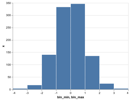
It's not super clean, but you can do it this way. Consider the following histogram:

import pandas as pd
import numpy as np
import altair as alt

df = pd.DataFrame({'x': np.random.randn(1000)})

alt.Chart(df).mark_bar().encode(
    alt.X('x', bin=True),
    y='count()'
)

visualization (8)

You can manually bin the data with pd.cut and construct the chart from the pre-binned data this way:

bins = np.arange(-4, 5)
binned = df.groupby(pd.cut(df.x, bins=bins)).count()
binned['bin_min'] = bins[:-1]
binned['bin_max'] = bins[1:]
binned = binned.reset_index(drop=True)

alt.Chart(binned).mark_bar().encode(
    x=alt.X('bin_min', bin='binned'),
    x2='bin_max',
    y='x'
)

visualization (9)

There's some ongoing work in the altair-transform repo to allow pushing these kinds of data transformations directly from the Altair grammar into Pandas, but it's not quite fully-featured yet.


Edit: note that this second approach is similar to how you must express the spec if you use an explicit bin transform; for example:

alt.Chart(df).transform_bin(
    "bin", "x",
).mark_bar().encode(
    x=alt.X('bin:Q', bin='binned'),
    x2='bin_end:Q',
    y='count():Q'
)

Sign up for free to join this conversation on GitHub. Already have an account? Sign in to comment
Labels
Projects
None yet
Development

No branches or pull requests

2 participants