Skip to content
New issue

Have a question about this project? Sign up for a free GitHub account to open an issue and contact its maintainers and the community.

By clicking “Sign up for GitHub”, you agree to our terms of service and privacy statement. We’ll occasionally send you account related emails.

Already on GitHub? Sign in to your account

Color and Shape Legends Not Combined in Line Chart or Multiple Charts #1785

Closed
dovahcrow opened this issue Nov 12, 2019 · 6 comments
Closed

Comments

@dovahcrow
Copy link

dovahcrow commented Nov 12, 2019

Code to reproduce:

In line chart:

df = pd.DataFrame(
    data=[[0, 10, "a"], [1, 20, "a"], [0, 15, "b"], [1, 25, "b"]],
    columns=["x", "y", "c"]
)
alt.Chart(df).mark_line().encode(
    x="x",
    y="y",
    color="c",
    shape="c"
)

image

Multi Charts:

df = pd.DataFrame(data=[[0, 10, "a"], [1, 20, "a"], [0, 15, "b"], [1, 25, "b"]], columns=["x", "y", "c"])
points = alt.Chart(df).mark_point().encode(x="x", y="y", color="c", shape="c")
lines = alt.Chart(df).mark_line().encode(x="x", y="y", color=alt.Color("c", legend=None))
points + lines

image

Expected behaviour

The legend should be like this:
image

@jakevdp
Copy link
Collaborator

jakevdp commented Nov 12, 2019

I think the behavior of the first chart is expected, because lines don't have a shape, and therefore the line legend is separate from the shape legend.

The second example is unexpected to me. You can work around it by making the legend scales independent:

alt.layer(
    points, lines
).resolve_scale(
    color='independent',
    shape='independent'
)

visualization (37)

But I would not expect this to be necessary when the line legend is set to None. It may be worth reporting this as a bug or feature request within the Vega-Lite repository.

@ilyagr
Copy link

ilyagr commented Jan 5, 2020

For a sufficiently complicated diagram (layered & faceted), the workaround makes things worse. Before the workaround, I was in the same situation as the OP. After the workaround, I get:
image

It also depends on where to put the resolve_scale. Putting it after the faceting has no effect at all, putting it before the faceting results in the screenshot above. (Sorry I don't have a nice minimal example at this point).

@ehudkr
Copy link
Contributor

ehudkr commented Jan 6, 2020

If I may add, regarding the comment:

I think the behavior of the first chart is expected, because lines don't have a shape, and therefore the line legend is separate from the shape legend.

it does seem altair's mark_line() treats different property-channels differently, although they are common to all types of marks. This can create a rather inconsistent behavior, especially when combining multiple property-channels.
For example, let's take mark_line and examine the following data:

import numpy as np
import pandas as pd
import altair as alt

n = 10
x = np.arange(n)
squared = x ** 2
cubed = x ** 3
squared_shifted = squared + 200
cubed_shifted = cubed + 200

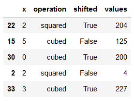
source = pd.DataFrame(
    {"x": np.concatenate([x, x, x, x]),
     "operation": (['squared'] * n + ['cubed'] * n) * 2,
     "shifted": [False]*(n*2) + [True]*(n*2),
     "values": np.concatenate([squared, cubed, squared_shifted, cubed_shifted])}
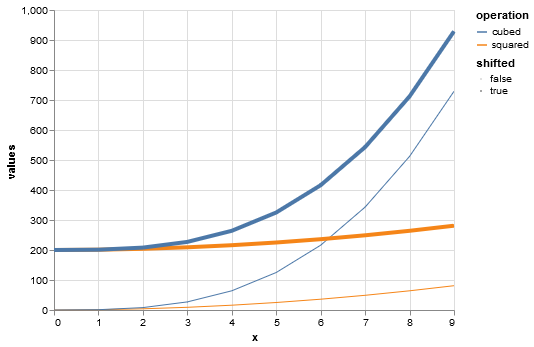
)

which baiscally creates 4 combinations of operation (squared/cubed) and shifted (shifted/non-shifted).
print(source.sample(n=5, random_state=2020)) gives:
image

Now plotting the data, we can use operation and shift as property-channels.
My intuition is that the chart should result in 4 curves, 1 for each operation-shift combination.

This is indeed the case when using common properties that are "inherent" to lines, such as color and size (and also opacity):

alt.Chart(source).mark_line().encode(
    x='x:Q',
    y='values:Q',
    color='operation:N',
    size='shifted:N'
)

visualization

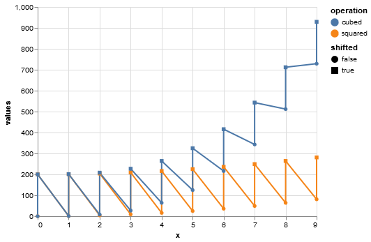
However, when using properties that you claim to not be inherent to lines (although mark_lines can still use them), such as shape, it results in only 2 curves, with a line connecting between different kinds of shapes:

alt.Chart(source).mark_line().encode(
    x='x:Q',
    y='values:Q',
    color='operation:N',
    shape='shifted:N'
)

visualization(1)

At first I thought it was a bug, but given Jake's answer I suspect it is by-design, in which case I think better documentation may be needed.

@jakevdp
Copy link
Collaborator

jakevdp commented Jan 7, 2020

These are probably questions to raise in the Vega-Lite forums.

One note: the last chart will work as expected if you use a detail encoding as well, which controls how data is grouped without adding a visual attribute:

alt.Chart(source).mark_line().encode(
    x='x:Q',
    y='values:Q',
    color='operation:N',
    shape='shifted:N',
    detail='shifted:N'
)

visualization (38)

@joelostblom
Copy link
Contributor

For reference, the corresponding Vega-Lite issue is here vega/vega-lite#5996

@joelostblom
Copy link
Contributor

Closing as this is tracked in the VL issue linked above and there is nothing that can be done from the altair side of things to fix it.

Sign up for free to join this conversation on GitHub. Already have an account? Sign in to comment
Projects
None yet
Development

No branches or pull requests

5 participants