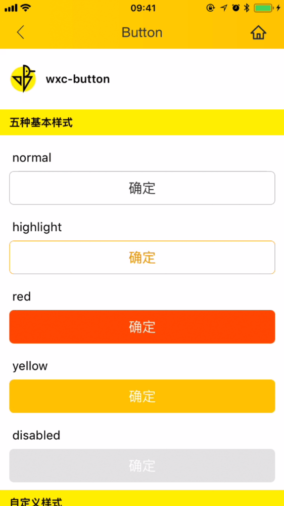
Basic button with 4 built-in types, supports custom style

<template>
  <wxc-button text="Confirm"
              @wxcButtonClicked="wxcButtonClicked"></wxc-button>
</template>

<script>
  import { WxcButton } from 'weex-ui'
  export default {
    components: { WxcButton },
    methods: {
      wxcButtonClicked (e) {
        console.log(e)
      }
    }
  }
</script>
More details can be found in here
| Prop | Type | Required | Default | Description |
|---|---|---|---|---|
text |
string |
Y |
- |
the text of button |
type |
enum |
N |
red |
can be set to normal/ highlight/red/yellow |
disabled |
bool |
N |
false |
set disabled(*1) |
btnStyle |
object |
N |
{} |
custom style about button(*2) |
textStyle |
object |
N |
{} |
custom style about text (*3) |
- *1:
disabledwill override the default style. - *2:Detailed style can be referenced here
- *3:Detailed style can be referenced here
// `@wxcButtonClicked="wxcButtonClicked"`
will return e, type, disabled