aio + api/docs: header "link" icons overwrite other visual elements #22131
Comments
|
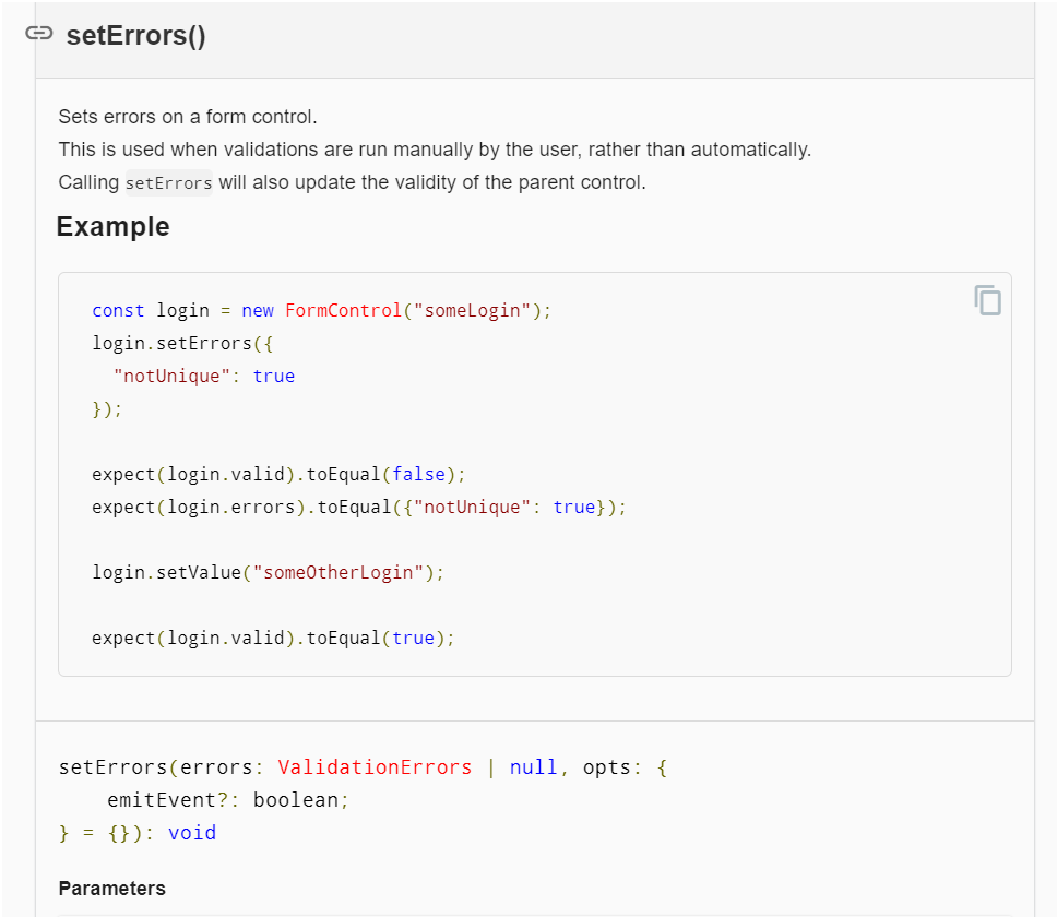
The .header-link that appears when hovering over the heading does not blend well with the card border.
|

|
|
|
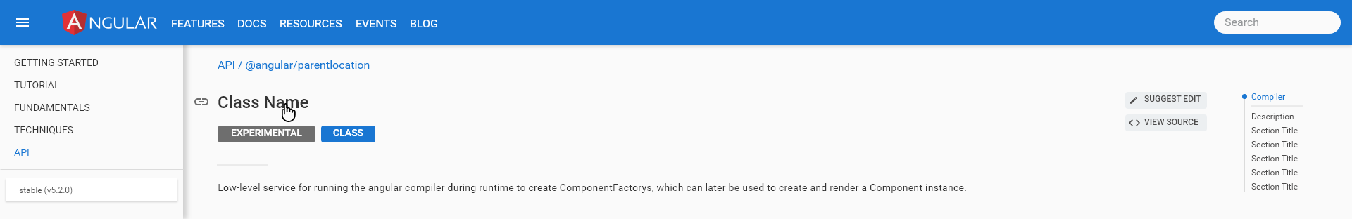
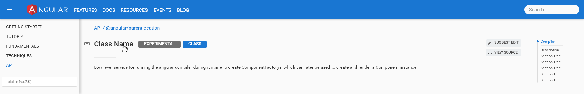
@IgorMinar thoughts? Page Title (API Name)
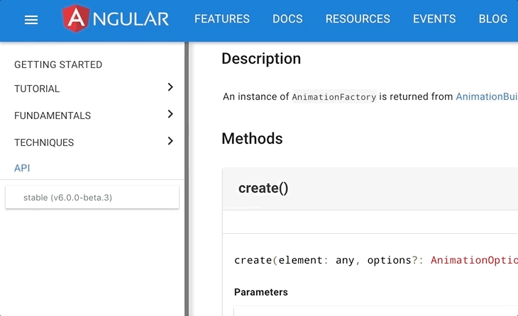
Headings in Tables Formatting We can consider other options if these don't work. |
|
I generally find the ability to link to specific methods useful (I've used them extensively when answering AngularJS questions on StackOverflow, Gitter, etc 😁). How about we place the link icon on the right for headings inside tables? (This is the same we do for all headings on narrow screens btw.) |
|
Option 1: Moving them to the right of the class name as we had originally (I would recommend this) Option 2: Moving them underneath the header element As always, we can explore additional options. |
|
Moving the badges only solves the problem for this instance. There are other situations where the heading is within a container and the link partially "falls outside" the container. E.g. #22131 (comment) |
|
@sjtrimble I think you meant your comment to go on #22130 ?? |
|
@petebacondarwin I sure did. Should I delete and add over there? :/ |
|
On this thread ... are we okay just removing the link visual for these API pages? |
|
I am not OK with removing the link visual. Sorry :-) |
|
@petebacondarwin Fair enough, just want to make sure I understand the limitations :) |
This approach simplifies the styling needed considerably.
Previously, we had to make room on the left for heading that
are in visual containers. Also we had to apply a `float:right`
when on narrow screens as the gutter not available then.
This float didn't render nicely if the heading text was longer
than could be rendered on a single line.

Closes angular#22131
|
This issue has been automatically locked due to inactivity. Read more about our automatic conversation locking policy. This action has been performed automatically by a bot. |
In #21874 (comment) @gkalpak noted:
The .header-link that appears when hovering over the main doc heading is overlaid onto the badge.
The text was updated successfully, but these errors were encountered: