
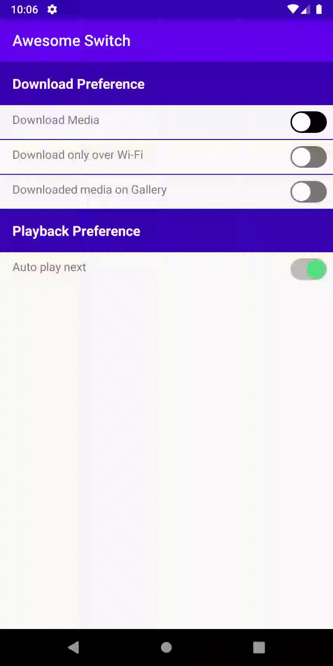
AwesomeSwitch is a replacement for the standard Switch(View) android offers, and it offers much more customization than the standard switch component.
Add below code to your root build.gradle file (if you have multiple modules and only one of them require AwesomeSwitch, add the jcenter() repository only in that module's build.gradle).
allprojects {
    repositories {
        jcenter()
    }
}
And add the following dependency code to your module's build.gradle file.
dependencies {
    implementation "ss.anoop:awesome-switch:${latest-version}"
}
AwesomeSWitch can be included in your layout xml like any other view. Below is a simple example
<ss.anoop.awesomeswitch.AwesomeSwitch
    android:layout_width="wrap_content"
    android:layout_height="wrap_content"
    app:radius="12dp"
    app:checkedColor="#53e079"
    app:backgroundColor="#000"
    app:checkedBackgroundColor="#53e079"
/>Table below descripes the properties available to customize the AwesomeSwitch
| Property Name | Format | Description |
|---|---|---|
| radius | dimension | Defines the size of the circle in the AwesomeSwitch |
| checkedColor | color | defines the color of the circle when the switch is in checked (on) state. Default color is white. If checked and unchecked(off) have different colors, there will be color transition animation when states change |
| uncheckedColor | color | defines the color of the circle when the switch is in unchecked (off) state. Default color is white. If checked(on) and unchecked have different colors, there will be color transition animation when states change |
| backgroundColor | color | defines the color of the switch background shape. The same will be used for checked and unchecked state unless checkedBackgroundColor is mentioned |
| checkedBackgroundColor | color | defines the color of the switch background shape in checked(on) state. |
| innerPadding | dimension | defines the padding applied to the background shape, ie, the space between the circle and the background shape |
| isChecked | boolean | to set the state to checked(on) or unchecked(off) at the time of inflation. Default value of this field is false |
| animationDuration | integer | defines the duration of unchecked to checked or the opposite animation duration in milliseconds. By default it is 300 milliseconds |
AwesomeSwitch offers an OnCheckedListener that informs when checked state is changed. The callback has a boolean field which indicates checked(on) state when value is true, false indicates unchecked(off) state.
awesomeSwitch.setOnCheckedListener { state -> processState(state) }
Support it by joining stargazers for this repository. ⭐
Copyright 2019 anoop44 (Anoop)

Licensed under the Apache License, Version 2.0 (the "License");
you may not use this file except in compliance with the License.
You may obtain a copy of the License at

   http://www.apache.org/licenses/LICENSE-2.0

Unless required by applicable law or agreed to in writing, software
distributed under the License is distributed on an "AS IS" BASIS,
WITHOUT WARRANTIES OR CONDITIONS OF ANY KIND, either express or implied.
See the License for the specific language governing permissions and
limitations under the License.