颜色图例 #4600
Assignees

Labels
Comments
|
重合问题 GUI 这边基本上解决了,样式上的话,像这种刻度线必要性大吗,如果要做的话连续图例需要稍微调整一下 |
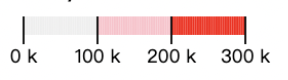
我感觉还是有必要的,就像坐标轴一下不仅仅展示首位的刻度。这样更容易感知不同颜色对应的数据。 |
OK, 那 GUI 这边我调整下 |
|
Threshold 的图例稍微有点问题, |

嗯嗯,是的,sparrow 里面的那个例子确实有问题 |
5 tasks
Sign up for free
to join this conversation on GitHub.
Already have an account?
Sign in to comment
颜色图例
目前 G2 5.0 中颜色通道只有当对应比例尺是 oridnal 比例尺的时候,才如下展现了图例。
期望当为如下比例尺的时候,也能展现对应的图例。
实现思路
实现上参考 d3 的 color legend,如果没有更好的设计,可以完全或者尽量保持一致。
接下来的案例只是一个说明,不用遵循。
案例
Linear
threshold
参考 sparrow
quantize
参考 sparrow
quantile
参考 sparrow
sequential
TODO
对于上述的例子,分别创建一个集成测试去测试:如果是 API 改成 Spec 的形式,同时把远程的数据保存在本地;否者直接测试。
The text was updated successfully, but these errors were encountered: