Please add support for slice visibility threshold in Pie Chart #14684
Comments
|
It could be nice to have to options:
|
|
@Ovilia if the request is aligned with your product strategy, we(Apache Superset) are happy to contribute this feature :) |
|
@villebro I think there may also be cases where slices should be merged if the slice amount reachs a threshold. For example, if data values could be |
|
Or, would it be helpful if we provide a |
Excellent point @Ovilia , and now that you mention it, actually something I've run into.
Yes, this is an even better design, as it will make it easy to customize. I'll start working on a callback based approach. |
|
Another consideration is, should |
I think it could default to grey or some other "downgraded" color, of course with the option to define a custom one. Regarding tooltip/legend, we can experiment with different options and see what looks best (we can potentially ask our design team to come up with a few suggestions if you'd like). |
|
I set out to implement |
|
@villebro Yes, |
|
This issue has been automatically marked as stale because it did not have recent activity. It will be closed in 7 days if no further activity occurs. If you wish not to mark it as stale, please leave a comment in this issue. |
|
This issue has been automatically closed because it did not have recent activity. If this remains to be a problem with the latest version of Apache ECharts, please open a new issue and link this to it. Thanks! |
|
Bump, I needed this feature today, but was able to get the result I needed with a custom query (based on http://www.silota.com/docs/recipes/sql-top-n-aggregate-rest-other.html) the work arounds mentioned in #19182 |
What problem does this feature solve?
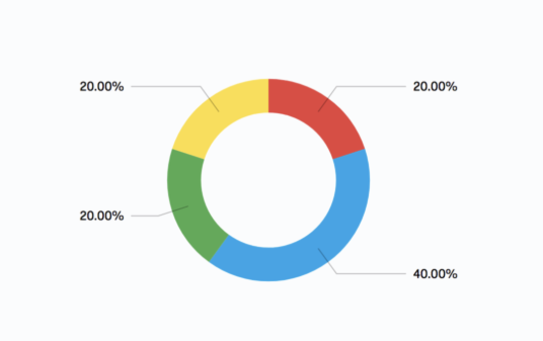
Let’s say that some “slices” of your pie are very small. You might be fine with these options being grouped together so that people reading your report can focus on the big results. The Grouping Percentage Threshold allows you to establish the minimum percentage a portion of the pie chart should have before it gets lumped into an “All Others” category.
Example: In a pie chart “category A” makes up 20% of the pie, as do “category B” and “category C” If we set the Grouping Percentage Threshold to 25%, “category A” “category B”and “category C” would be grouped into one category called “All Others” that took up the collective 60% of the pie.
The text was updated successfully, but these errors were encountered: