feat: owners profile icon on dataset list view #10041
Conversation
 lilykuang
force-pushed
the
lily/datasets/owner-profile-icon
branch
from
lilykuang
force-pushed
the
lily/datasets/owner-profile-icon
branch
from
fcfef3f
to
43e81a0
Compare
Codecov Report
@@            Coverage Diff             @@
##           master   #10041      +/-   ##
==========================================
+ Coverage   68.88%   70.49%   +1.61%
==========================================
  Files         584      585       +1
  Lines       31058    31074      +16
  Branches     3180     3185       +5
==========================================
+ Hits        21393    21905     +512
+ Misses       9555     9060     -495
+ Partials      110      109       -1
Continue to review full report at Codecov.
|

| const { tableName, firstName, lastName, userName, iconSize } = this.props; | ||
| const uniqueKey = tableName.concat('_', userName); | ||
| const fullName = firstName.concat(' ', lastName); | ||
| const colors = [ |
There was a problem hiding this comment.
can we pull this array out into a constant so that it doesn't get rebuilt on every render?
There was a problem hiding this comment.
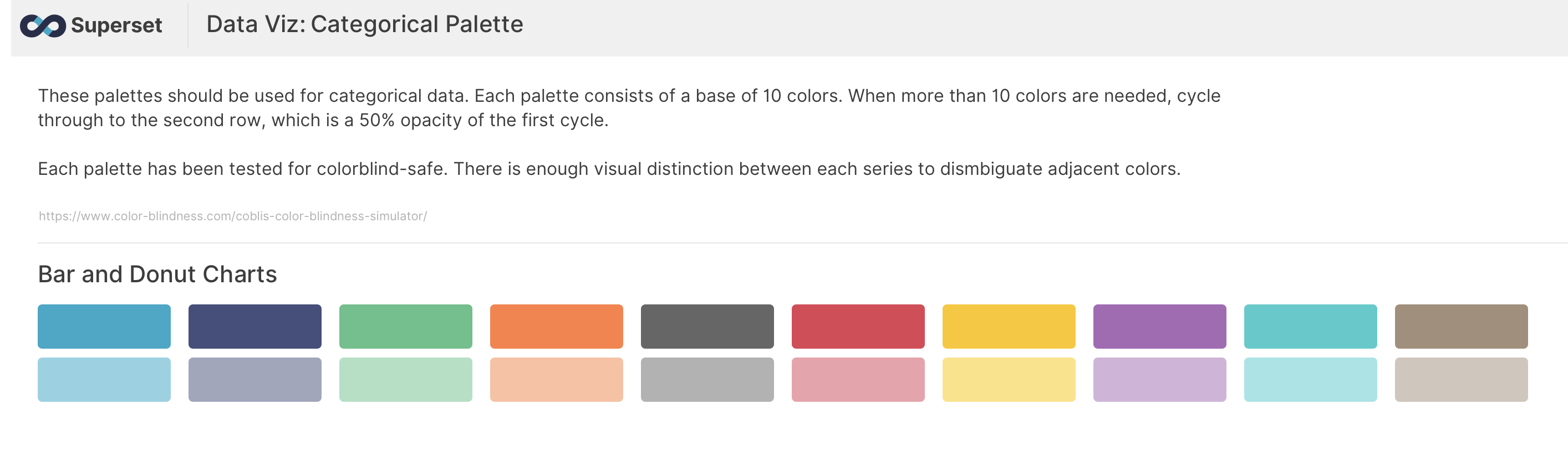
Curious where those colors came from. We should use the main palette (https://github.com/apache-superset/superset-ui/blob/master/packages/superset-ui-color/src/colorSchemes/categorical/airbnb.ts) for now and eventually the pretty SIP-34 ones.
| name={fullName} | ||
| size={iconSize} | ||
| round | ||
| style={{ margin: '0px 5px' }} |
There was a problem hiding this comment.
can we use the className attribute and apply a class to this instead of inlining styles?
There was a problem hiding this comment.
Since we may want consistent avatar styles, any additional CSS will likely need to be set globally. If margin is the only style we will set for the avatar (which probably can be changed to either a variable or proportional to iconSize), I think it's OK to use inline style.
There was a problem hiding this comment.
Actually, looking at this closer, it seems like this styling should be on a wrapper around the avatar, perhaps an AvatarGroup component? Since it seems like this styling is only needed when displaying multiple avatars next to each other
|
|
||
| interface Props { | ||
| firstName: string; | ||
| iconSize: string; |
There was a problem hiding this comment.
can this be a number instead? Seems a bit odd as a string and react-avatar seems to accept either a number of a string
There was a problem hiding this comment.
@etr2460 I have tried using a number but size of react-avatar could only accept string
| userName: string; | ||
| } | ||
|
|
||
| export default class AvatarIcon extends PureComponent<Props> { |
There was a problem hiding this comment.
Since this component only has a render function, maybe we should make it a functional component instead?
| export default class AvatarIcon extends PureComponent<Props> { | ||
| render() { | ||
| const { tableName, firstName, lastName, userName, iconSize } = this.props; | ||
| const uniqueKey = tableName.concat('_', userName); |
There was a problem hiding this comment.
since unique key is only used in one place, instead of defining as a constant it might be cleaner to set it directly on the key attribute
There was a problem hiding this comment.
@etr2460 uniqueKey is also used as key for <Avatar> https://github.com/apache/incubator-superset/blob/43e81a0f9d6e20d95a33f4a2f98664505a32c3f8/superset-frontend/src/components/AvatarIcon.tsx#L51
| export default class AvatarIcon extends PureComponent<Props> { | ||
| render() { | ||
| const { tableName, firstName, lastName, userName, iconSize } = this.props; | ||
| const uniqueKey = tableName.concat('_', userName); |
There was a problem hiding this comment.
nit: prefer ${tableName}_${userName}
| render() { | ||
| const { tableName, firstName, lastName, userName, iconSize } = this.props; | ||
| const uniqueKey = tableName.concat('_', userName); | ||
| const fullName = firstName.concat(' ', lastName); |
There was a problem hiding this comment.
nit: prefer ${firstName} ${lastName}
| @@ -140,6 +140,7 @@ | |||
| "re-resizable": "^4.3.1", | |||
| "react": "^16.13.0", | |||
| "react-ace": "^5.10.0", | |||
| "react-avatar": "^3.9.7", | |||
There was a problem hiding this comment.
Is this something that we might want to migrate away from in the future if the Antd discussions we were talking about in the meetup today come to fruition? I see that antd has an avatar component already: https://ant.design/components/avatar/
There was a problem hiding this comment.
Possibly, but we can't block forward progress based on a pre-SIP discussion for something that may or may not pass a vote. Should AntD come to fruition, we can swap out components later.
There was a problem hiding this comment.
I'm not saying to block progress, moreso wondering if since we're adding a new library anyway if we should think ahead. Either way, whichever you think is best works
| @@ -140,6 +140,7 @@ | |||
| "re-resizable": "^4.3.1", | |||
| "react": "^16.13.0", | |||
| "react-ace": "^5.10.0", | |||
| "react-avatar": "^3.9.7", | |||
There was a problem hiding this comment.
I'm not saying to block progress, moreso wondering if since we're adding a new library anyway if we should think ahead. Either way, whichever you think is best works
| const fullName = `${firstName} ${lastName}`; | ||
|
|
||
| return ( | ||
| <ConfigProvider colors={colorList && colorList.colors}> |
There was a problem hiding this comment.
what happens if this is undefined? Does react-avatar have a sane fallback?
There was a problem hiding this comment.
react-avatar has fallback colors
| overlay={<Tooltip id={`${uniqueKey}-tooltip`}>{fullName}</Tooltip>} | ||
| > | ||
| <StyledAvatar | ||
| key={`${uniqueKey}`} |
| <StyledAvatar | ||
| key={`${uniqueKey}`} | ||
| name={fullName} | ||
| size={`${iconSize}`} |
| @@ -54,13 +62,14 @@ interface State { | |||
| } | |||
|
|
|||
| interface Dataset { | |||
| changed_by: string; | |||
 mistercrunch
added
🏷️ bot
mistercrunch
added
🏷️ bot
SUMMARY
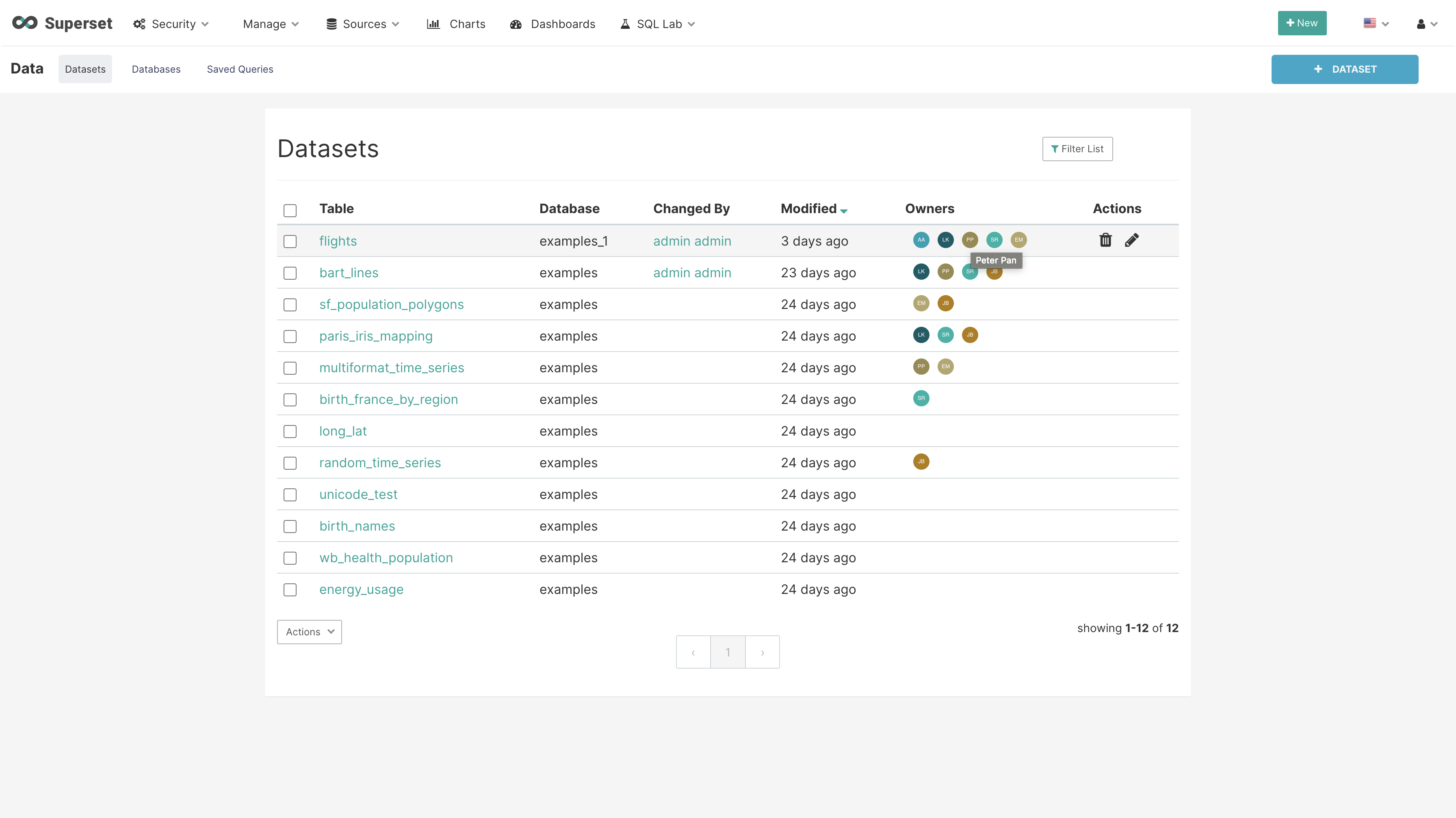
This profile icon is part of the dataset redesign SIP-34.
ownerscolumn to dataset list viewownerscolumn displays maximum of 5 icons:hover, tooltip should contain the owner's nameBEFORE/AFTER SCREENSHOTS OR ANIMATED GIF
updated color scheme:
TEST PLAN
ADDITIONAL INFORMATION