style: push bootstrap theme towards SIP-34 styles #10056
Conversation
Codecov Report
@@            Coverage Diff             @@
##           master   #10056      +/-   ##
==========================================
- Coverage   70.49%   65.79%   -4.70%
==========================================
  Files         585      586       +1
  Lines       31074    31114      +40
  Branches     3185     3197      +12
==========================================
- Hits        21905    20472    -1433
- Misses       9060    10464    +1404
- Partials      109      178      +69
Continue to review full report at Codecov.
|

 mistercrunch
changed the title
mistercrunch
changed the title
|
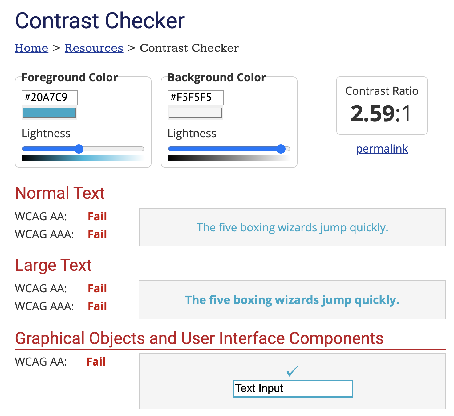
I don't want to rain on this parade too much, but I noticed that the tab titles were a bit hard to read on the gray background. After double checking, it seems like the brand primary color isn't accessible when used on the gray background (https://webaim.org/resources/contrastchecker/?fcolor=20A7C9&bcolor=F5F5F5). Did the SIP-34 designs solve for this? If so, we should probably add that part of the designs into this PR too so we don't regress a11y |
|
@etr2460 good catch, bolded it here -> |

|
The bolded text still fails the contrast checker according to Erik’s screenshot. Can we keep all text with white/gray background black and change only the high-contrast primary button? I don’t remember seeing this color in light background in SIP-34. |
|
@mistercrunch do you think that bolding it is enough? According to the contrast checker, even larger, bolded text with these colors fail accessibility guidelines. Note that to pass the |
|
|

| * specific language governing permissions and limitations | ||
| * under the License. | ||
| */ | ||
| .save-btn { |
There was a problem hiding this comment.
should we be using a styled component here? @rusackas
| @@ -66,9 +66,14 @@ | |||
|
|
|||
| // Buttons ==================================================================== | |||
|
|
|||
| .btn { | |||
There was a problem hiding this comment.
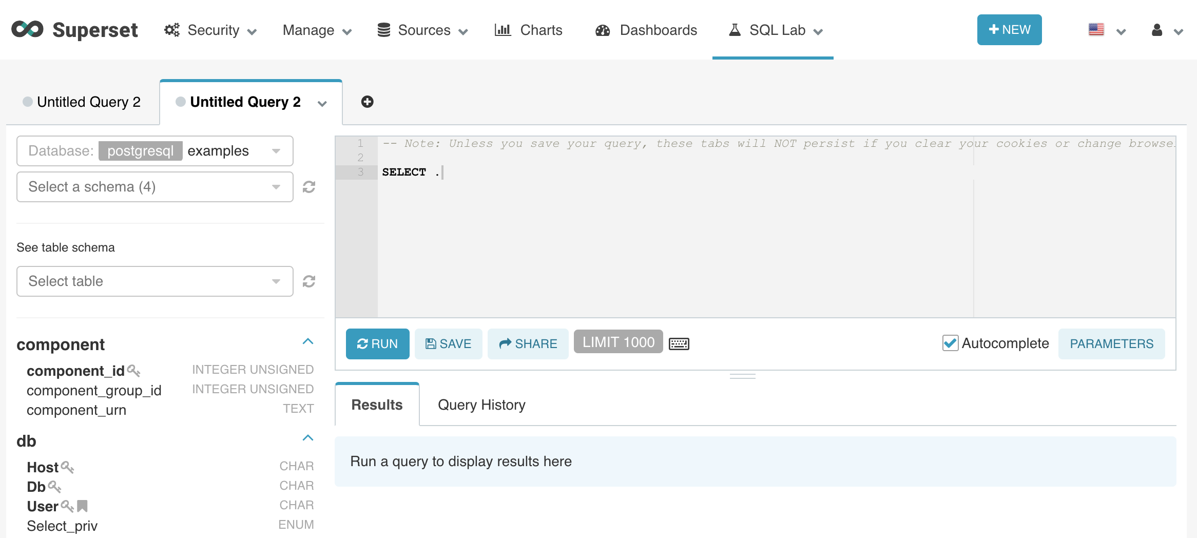
this will change buttons everywhere right? Can we see other screenshots of the ui in addition to SQL Lab?
There was a problem hiding this comment.
yes let me take a few screenshots
mistercrunch
force-pushed
the
cartel
branch
5 times, most recently
from
4d7df7d
to
0f40ce3
Compare
|
There are still a couple of places that have the light blue in light background, most noticeably the btn-default and text links. I think SIP-34 design mostly used what it calls "SECONDARY" buttons in replacement of the I updated the CSS a little so hopefully it made things a little bit better:
Would be nice if there're design mockups for the intermediate state between current Superset and SIP-34 so we could have a better idea how to replace different elements with a11y in mind. |
|
@ktmud thanks for the feedback, yeah the reason I used what SIP-34 calls "button tertiary" instead of "button secondary" is because we currently use a lot of Happy to go either way. Clearly this is just the first of many PRs in that general SIP-34 theme direction. Thoughts? |
|
Coupling this PR where we change the logo to use our new primary brand color. #10090 , we should merge the two at ~the same time. |
|
Also note that our primary color should be ok on white (or is it not?). It was bad against a grey but should be ok on white. It's our link color too btw. |
The text color on that "tertiary" button is actually darker than the primary brand color (I used screen color pickers). Kind of feel the colors listed in UI Colors is just for visuals, not really of any practical purposes (the hex codes are also different than the actual colors beneath it). |
|
If this is not blocking anything, I'd recommend asking for some designers' help to get properly annotated colors (text/background/border for buttons, links, hover/active/focus state, etc, in the context of current Superset design), or putting things in a feature branch to hammer the details out (e.g., workarounds for button groups). |
I noticed that and used the colors, not the hex A bigger question is how we roll this out. I'm not against maturing this in a feature branch, but I think this is better than what we have now. I'm pretty sure the current colors are Airbnb's kazan/beach/raush, ... I really feel like it's overdue to move away from that and onto the SIP-34 palette. What's the proper merge point? |
I also like the new colors. Just felt having a11y regression or two noticeably incompatible styles is worse than having an outdated style. How about we reduce the scope of this PR a little to only change the primary color from kazan to cartel blue + darker blue for text and leave btn-default and others untouched? |
agreed
rolling back btn-default changes to keep the previous gray tone one, but I'd like to move forward with everything else in here though |
|
I doubled checked in Figma and found that links are actually darker than buttons, specified that darker blue in the theme. |
|
|


There was a problem hiding this comment.
Looks good!
In my previous link, I also updated the info box in my branch

to make it more in line with the Cartel design:


Could you slip this in as well? Or feel free to do it in another PR.
|
Let's go little by little, I prefer seeing a storm of small |
| @@ -66,6 +66,10 @@ | |||
|
|
|||
| // Buttons ==================================================================== | |||
|
|
|||
| .btn { | |||
| text-transform: uppercase; | |||
There was a problem hiding this comment.
Note: this also transforms datasource names in chart control panel:

which is probably not what we want.
* feat: cartel theme

* piling

* more tweaks

* Make things look better

* lint

* fix tests

* paint it black

* tweaks
mistercrunch
added
🏷️ bot
Spent 1-2 hours playing around to get a sense of how much we can push towards
SIP-34's look & feel with limited effort.BEFORE
AFTER
TODO
@brand-primarycolor!btn-smisn't aligned, the new font we use isn't aligned with the pixels it reservesbtn-groupand have buttons side by side (with a gap) and the extra buttons into dropdowns - but this requires touching layouts (not just CSS). Bootstrap offersbtn-primaryandbtn-default, but no tierciary. For now I rolled with using what SIP-34 defines as tierciary onbtn-defaultto work around the group issue