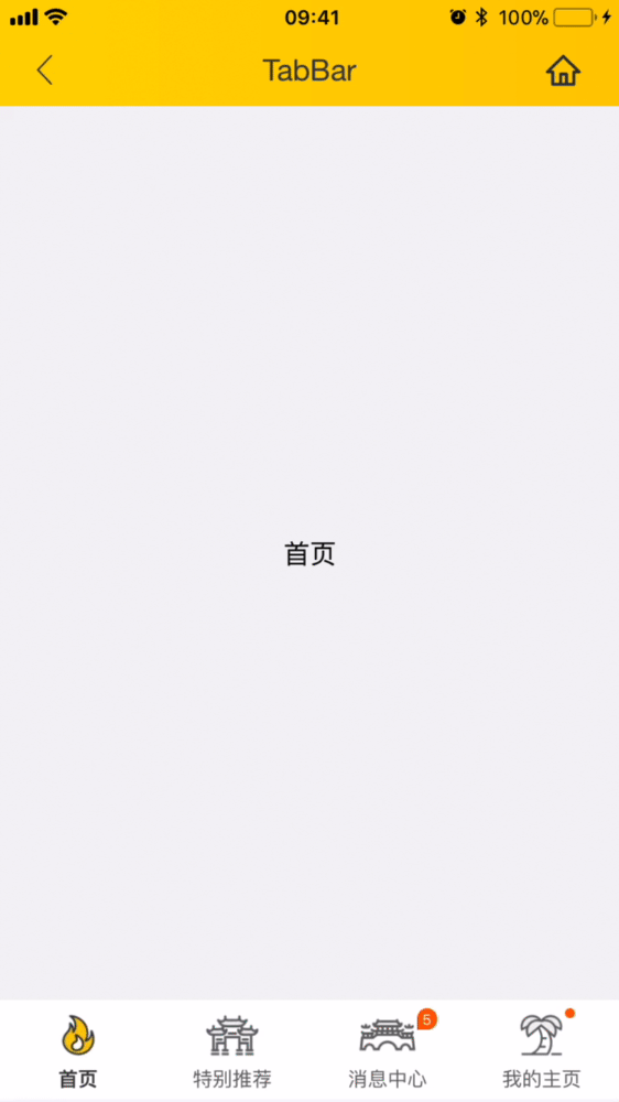
Bottom tab bar
- For the bottom Tab slider page, currently support **icon, text, iconFont ** form of the bottom bar.

<template>
  <wxc-tab-bar :tab-titles="tabTitles"
               :tab-styles="tabStyles"
               title-type="icon"
               @wxcTabBarCurrentTabSelected="wxcTabBarCurrentTabSelected">
    <!--The first page content-->
    <div class="item-container" :style="contentStyle"><text>Home</text></div>

    <!--The second page content-->
    <div class="item-container" :style="contentStyle"><text>Hot</text></div>

    <!-- The third page content-->
    <div class="item-container" :style="contentStyle"><text>Message</text></div>

    <!-- The fourth page content-->
    <div class="item-container" :style="contentStyle"><text>My</text></div>
  </wxc-tab-bar>
</template>

<style scoped>
  .item-container {
    width: 750px;
    background-color: #f2f3f4;
    align-items: center;
    justify-content: center;
  }
</style>
<script>
  import { WxcTabBar, Utils } from 'weex-ui';

  // https://github.com/apache/incubator-weex-ui/blob/master/example/tab-bar/config.js
  import Config from './config'

  export default {
    components: { WxcTabBar },
    data: () => ({
      tabTitles: Config.tabTitles,
      tabStyles: Config.tabStyles
    }),
    created () {
      const tabPageHeight = Utils.env.getPageHeight();
      // If the page doesn't have a navigation bar
      // const tabPageHeight = env.deviceHeight / env.deviceWidth * 750;
      const { tabStyles } = this;
      this.contentStyle = { height: (tabPageHeight - tabStyles.height) + 'px' };
    },
    methods: {
      wxcTabBarCurrentTabSelected (e) {
        const index = e.page;
        // console.log(index);
      }
    }
  };
</script>
More details can be found in here
| Prop | Type | Required | Default | Description |
|---|---|---|---|---|
| tab-titles | Array |
Y |
[] |
Tab list config |
| title-type | String |
N |
icon |
type icon/text/iconFont (*1) |
| tab-styles | Array |
N |
[] |
bottom Tab config |
| is-tab-view | Boolean |
N |
true |
if set false,add tab-titles config with url can be jumped out |
| title-use-slot | Boolean |
N |
false |
configure title using slot (*2) |
| duration | Number |
N |
300 |
page slider time of animation |
| timing-function | String |
N |
- |
page slider function of animation |
| wrap-bg-color | String |
N |
#F2F3F4 |
page background color |
| support-x-bar | Boolean |
Y |
true |
if set false,the iPhone X Bar will not go into effect |
- After Weex Ui version about
0.3.8, we can useiconFontto represent our title image, you can use like this:
 // https://github.com/apache/incubator-weex-ui/blob/master/example/tab-bar/config.js#L51
 // '' -> '\ue608'
  tabIconFontTitles: [
    {
      title: 'Home',
      codePoint: '\ue608'
    },
    {
      title: 'Message',
      codePoint: '\ue752',
      badge: 5
    },
   // .... more
  ],
  // https://github.com/apache/incubator-weex-ui/blob/master/example/tab-page/config.js#L72
  tabIconFontStyles: {
      bgColor: '#FFFFFF',
      titleColor: '#666666',
      activeTitleColor: '#3D3D3D',
      activeBgColor: '#FFFFFF',
      isActiveTitleBold: true,
      width: 160,
      height: 120,
      fontSize: 24,
      textPaddingLeft: 10,
      textPaddingRight: 10,
      iconFontSize: 50,
      iconFontColor: '#333333',
      iconFontMarginBottom: 8,
      activeIconFontColor: 'red',
      iconFontUrl: '//at.alicdn.com/t/font_501019_mauqv15evc1pp66r.ttf'
    }
- When configuring head navigation in the way of slot, we need to make sure that the original simple configuration is no longer able to meet the existing needs, and can be used to import param
:title-use-slot="true", At the same time, the following slot corresponding nodes are introduced into the wxc-tab-bar component - It can be generated by traversing the way and determining the current selection page according to
wxcTabBarCurrentTabSelected, and you need manage the color.
<div slot="tab-title-0"><text>111</text></div>
<div slot="tab-title-1"><text>222</text></div>
<div slot="tab-title-2"><text>333</text></div>
// <wxc-tab-bar ref="wxc-tab-bar">
// set the third page
this.$refs['wxc-tab-bar'].setPage(2)

// set the third page with no animation
this.$refs['wxc-tab-bar'].setPage(2,null,false);
// @wxcTabBarCurrentTabSelected="wxcTabBarCurrentTabSelected"
// will return the selected index