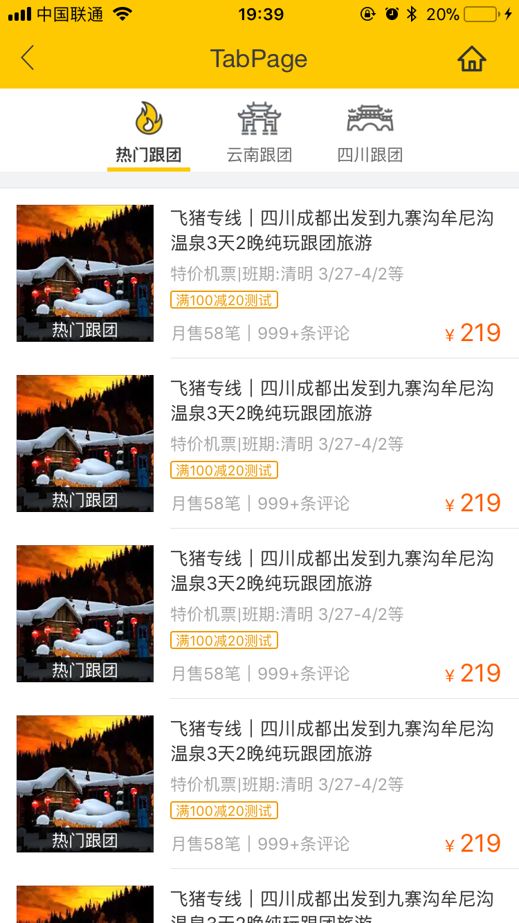
Tab page make it easy to switch between different views
!> The effect of sliding with hand is based on BindingX feature. Make sure your app install it.
!> The 0.6.1 version add the new immersive full screen effect tabPage named wxc-full-page,the following documents can be seen in detail.
- Allow configuration of the head, support
Bindinggesture to follow the effect. - Commonly used in Tab switch pages, currently supports icon 、text and iconFont form the top bar, You can see in here
- If the child element has click event, because of the reason in android, You now need to bind the expression event in child element, Weex Ui has provided wxc-pan-cell to solve this issue,you can see more in here.
- Support the tab center style, You need set
leftOffsetintabStyleswith the correct value.


<template>
  <wxc-tab-page ref="wxc-tab-page"
                :tab-titles="tabTitles"
                :tab-styles="tabStyles"
                title-type="icon"
                :tab-page-height="tabPageHeight"
                @wxcTabPageCurrentTabSelected="wxcTabPageCurrentTabSelected">
    <list v-for="(v,index) in tabList"
          :key="index"
          class="item-container"
          :style="{ height: (tabPageHeight - tabStyles.height) + 'px' }">
      <cell class="border-cell"></cell>
      <cell v-for="(demo,key) in v"
            class="cell"
            :key="key">
        <wxc-pan-item :ext-id="'1-' + (v) + '-' + (key)"
                      url="https://h5.m.taobao.com/trip/ticket/detail/index.html?scenicId=2675"
                      @wxcPanItemPan="wxcPanItemPan">
         <div class="content">
            <text>{{key}}</text>
         </div>
        </wxc-pan-item>
      </cell>
    </list>
  </wxc-tab-page>
</template>

<style scoped>
  .item-container {
    width: 750px;
    background-color: #f2f3f4;
  }

  .border-cell {
    background-color: #f2f3f4;
    width: 750px;
    height: 24px;
    align-items: center;
    justify-content: center;
    border-bottom-width: 1px;
    border-style: solid;
    border-color: #e0e0e0;
  }

  .cell {
    background-color: #ffffff;
  }

  .content{
    width:750px;
    height:300px;
    border-bottom-width:1px;
    align-items: center;
    justify-content: center;
  }
</style>
<script>
  const dom = weex.requireModule('dom');
  import { WxcTabPage, WxcPanItem, Utils, BindEnv } from 'weex-ui';

  // https://github.com/apache/incubator-weex-ui/blob/master/example/tab-page/config.js
  import Config from './config'

  export default {
    components: { WxcTabPage, WxcPanItem },
    data: () => ({
      tabTitles: Config.tabTitles,
      tabStyles: Config.tabStyles,
      tabList: [],
      demoList: [1, 2, 3, 4, 5, 6, 7, 8, 9],
      tabPageHeight: 1334
    }),
    created () {
      this.tabPageHeight = Utils.env.getPageHeight();
      this.tabList = [...Array(this.tabTitles.length).keys()].map(i => []);
      Vue.set(this.tabList, 0, this.demoList);
    },
    methods: {
      wxcTabPageCurrentTabSelected (e) {
        const self = this;
        const index = e.page;
        /* Unloaded tab analog data request */
        if (!Utils.isNonEmptyArray(self.tabList[index])) {
          setTimeout(() => {
            Vue.set(self.tabList, index, self.demoList);
          }, 100);
        }
      },
      wxcPanItemPan (e) {
        if (BindEnv.supportsEBForAndroid()) {
          this.$refs['wxc-tab-page'].bindExp(e.element);
        }
      }
    }
  };
</script>
More details can be found in here
| Prop | Type | Required | Default | Description |
|---|---|---|---|---|
| tab-titles | Array |
Y |
[] |
Tab list config |
| title-type | String |
N |
icon |
title type icon/text/iconFont(*1) |
| tab-styles | Object |
N |
{} |
style config |
| tab-page-height | Number |
N |
1334 |
Tab page height |
| is-tab-view | Boolean |
N |
true |
if set false,add tab-titles config with url can be jumped out |
| pan-dist | Number |
N |
200 |
how many scrolls to switch to the next screen |
| duration | Number |
N |
300 |
page slider function of time |
| timing-function | String |
N |
- |
page slider function of animation |
| title-use-slot | Boolean |
N |
false |
configure title using slot (*2) |
| wrap-bg-color | String |
N |
#F2F3F4 |
page background color |
| need-slider | Boolean |
N |
true |
whether to slide with gestures |
| click-animation | Boolean |
N |
{} |
have to use animation when you click the tab bar |
| right-icon-style | Object |
N |
{} |
right icon styles |
- After Weex Ui version about
0.3.8, we can useiconFontto represent our title image, you can use like this:
 // https://github.com/apache/incubator-weex-ui/blob/master/example/tab-page/config.js#L67
 // '' -> '\ue608'
  tabTitles: [
    {
      title: 'Home',
      codePoint: '\ue608'
    },
    {
      title: 'Message',
      codePoint: '\ue752',
      badge: 5
    },
    // .... more
  ],
  // https://github.com/apache/incubator-weex-ui/blob/master/example/tab-page/config.js#L87
  tabIconFontStyles: {
      bgColor: '#FFFFFF',
      titleColor: '#666666',
      activeTitleColor: '#3D3D3D',
      activeBgColor: '#FFFFFF',
      isActiveTitleBold: true,
      width: 160,
      height: 120,
      fontSize: 24,
      textPaddingLeft: 10,
      textPaddingRight: 10,
      iconFontSize: 50,
      iconFontMarginBottom: 8,
      iconFontColor: '#333333',
      activeIconFontColor: 'red',
      iconFontUrl: '//at.alicdn.com/t/font_501019_mauqv15evc1pp66r.ttf'
    }
- When configuring head navigation in the way of slot, we need to make sure that the original simple configuration is no longer able to meet the existing needs, and can be used to import param
:title-use-slot="true", At the same time, the following slot corresponding nodes are introduced into the wxc-tab-page component - It can be generated by traversing the way and determining the current selection page according to
wxcTabPageCurrentTabSelected, and you need manage the color.
<div slot="tab-title-0"><text>111</text></div>
<div slot="tab-title-1"><text>222</text></div>
<div slot="tab-title-2"><text>333</text></div>
// <wxc-tab-page ref="wxc-tab-page">
// set the third page
this.$refs['wxc-tab-page'].setPage(2)

// set the third page with no animation
this.$refs['wxc-tab-page'].setPage(2,null,false);
@wxcTabPageCurrentTabSelected="wxcTabPageCurrentTabSelected"
- Import:
import { WxcFullPage} from 'weex-ui'; - Params are consistent with
wxcTabPage,more you can see 【demo/full-page】 - It is recommended to hide the head navigation bar for use,also can usewxc-slide-nav
!>In weex-ui V0.6.0 version above, in order to reduce packaging size, Binding related judgments are transferred from Utils.env to BindEnv.
| Prop | Type | Required | Default | Description |
|---|---|---|---|---|
| url | String |
N |
- |
jump link, own processing can not be passed |
// how to use
<wxc-pan-item
    :url="url"
    @wxcPanItemClicked="wxcPanItemClicked"
    @wxcPanItemPan="wxcPanItemPan">
      <your-item>....</your-item>
    </pan-item>

// Import
import { WxcPanItem, BindEnv } from 'weex-ui';

//Callback
wxcPanItemPan (e) {
    if (BindEnv.supportsEBForAndroid()) {
      this.$refs['wxc-tab-page'].bindExp(e.element);
    }
 }